2 Data Exploration
Common wisdom dictates that a picture is worth a thousand words. Not surprisingly, the same holds true in data analysis as data-driven pictures can provoke valuable insights. For instance, Hans Rosling18 is - among other things - known for amazing visualizations through which he is bringing insights from the world of data and statistics to the general public19.
Thus, learning how to visualize data might be a good (and hopefully fun) way to start our journey into R and data science.
Therefore, we dedicate this chapter to dive into ggplot2 which is the graphical package from the tidyverse.
This will help us to generate popular diagrams from descriptive statistics in order to better understand our data.
Furthermore, ggplot2 allows us to create beautiful graphics which can even be easily converted into animations if one is interested in doing so.
For instance, in homage to Hans Rosling’s visualization of the evolution of life expectancy and GDP per capita for countries around the world, here is an animation I created using ggplots.
The data itself is contained in the gapminder package.
 for countries around the world. The different sizes of the bubbles indicate the size of a country's population.](Images/gapminder.gif)
Figure 2.1: A homage to Hans Rosling’s visualization of the evolution of life expectancy and GDP per capita for countries around the world. The different sizes of the bubbles indicate the size of a country’s population.
The whole goal of this chapter is to equip you with the necessary tools to do this on your own.
However, covering animations as well as all the basics of ggplot2 will only enlarge the ground we have to cover.
Therefore, we will only go as far as constructing a snapshot of the animation like so
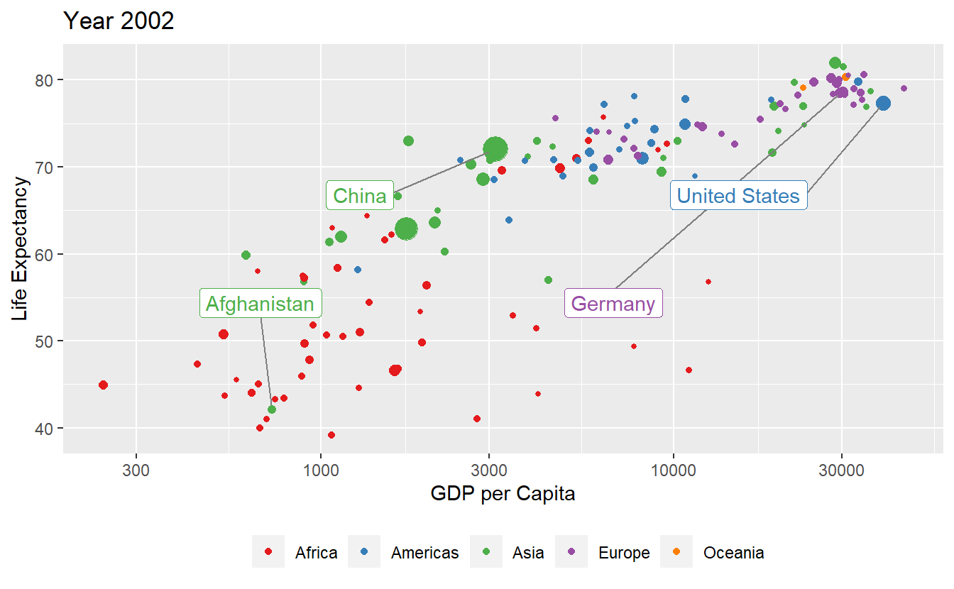
Figure 2.2: A snapshot of the above animation. This is as far as we’ll go here.
While it might feel disheartening that we omit the last step (especially if you’re enthusiastic about animations), rest assured that once you are able to generate Figure 2.2 on your own, it is an easy task to use the gganimate package20 to go from static picture to animation. So without further ado, let us get started.
2.1 Layers, Geoms and Aesthetics
We start off by finding an interesting data set.
Here, we simply take the data from the gapminder package, which you need to install via install.packages() as described in Chapter 1.
Once you attached the package via library() you will have access to the gapminder variable which is a tibble (i.e. the format the tidyverse uses to store tables) of the data we want to plot.
We save it into a variable tib and let R print the first few lines of tib for us (by surrounding the declaration by ()).
library(gapminder)
(tib <- gapminder)
#> # A tibble: 1,704 x 6
#>   country     continent  year lifeExp      pop gdpPercap
#>   <fct>       <fct>     <int>   <dbl>    <int>     <dbl>
#> 1 Afghanistan Asia       1952    28.8  8425333      779.
#> 2 Afghanistan Asia       1957    30.3  9240934      821.
#> 3 Afghanistan Asia       1962    32.0 10267083      853.
#> 4 Afghanistan Asia       1967    34.0 11537966      836.
#> 5 Afghanistan Asia       1972    36.1 13079460      740.
#> 6 Afghanistan Asia       1977    38.4 14880372      786.
#> # ... with 1,698 more rows
This output contains a lot of information.
For starters, it tells us that tib is a tibble with 1704 rows and 6 columns.
The latter consists of the following variables:
colnames(tib)
#> [1] "country"   "continent" "year"      "lifeExp"   "pop"       "gdpPercap"
We can find out what each column name means by looking at the documentation of the gapminder package21.
Also, the tibble’s output shows how R interprets the values in each column.
For instance, the columns country and continent are interpreted as being full of factors (indicated by <fcts>).
Similarly, the columns year and pop (population) contain integers whereas lifeExp (life expectancy at birth) and gdpPercap (GDP per capita in US$ and inflation-adjusted) are doubles.
For our first ggplot, it should be enough to look at only a single year first instead of all of them.
Consequently, let us remove all but one year which we will call current_year.
We can do this through filtering using the filter() function from the tidyverse.
library(tidyverse)
# Pick a year to look at
current_year <- 2007
# Filter using filter
tib_filtered <- filter(tib, year == current_year)
# Alternatively, use a pipe
(tib_filtered <- tib %>% filter(year == current_year))
#> # A tibble: 142 x 6
#>   country     continent  year lifeExp      pop gdpPercap
#>   <fct>       <fct>     <int>   <dbl>    <int>     <dbl>
#> 1 Afghanistan Asia       2007    43.8 31889923      975.
#> 2 Albania     Europe     2007    76.4  3600523     5937.
#> 3 Algeria     Africa     2007    72.3 33333216     6223.
#> 4 Angola      Africa     2007    42.7 12420476     4797.
#> 5 Argentina   Americas   2007    75.3 40301927    12779.
#> 6 Australia   Oceania    2007    81.2 20434176    34435.
#> # ... with 136 more rows
Here, we used the filter() function to keep all rows of tib for which the values in the year column is equal to current_year, here 2007, indicated by ==22.
Alright, we want to visualize this data now.
A fairly simple (but still often effective) visualization would be a scatter plot (i.e. a bunch of dots in the plane) to show the relationship between life expectancy at birth lifeExp and GDP per capita gdpPercap in 2007.
Using functions from the ggplot2 package, this is a pretty simple task.
All we need to do is to give the ggplot() function a tibble containing the data which initializes a blank canvas and then add a layer of geometric objects which we want to plot (e.g. points, lines, polygons, labels, etc.23).
Naturally, we need to specify which column of the tibble relates to what “visual attribute” of the geometric objects.
Here, “visual attributes” means that we need to specify what columns of tib_filtered will be used for the x-, the y-coordinates of the points.
More technically speaking, we determine the mapping from tibble columns to aesthetics.
In practice, this looks like this.
ggplot(data = tib_filtered) +
  geom_point(mapping = aes(x = gdpPercap, y = lifeExp))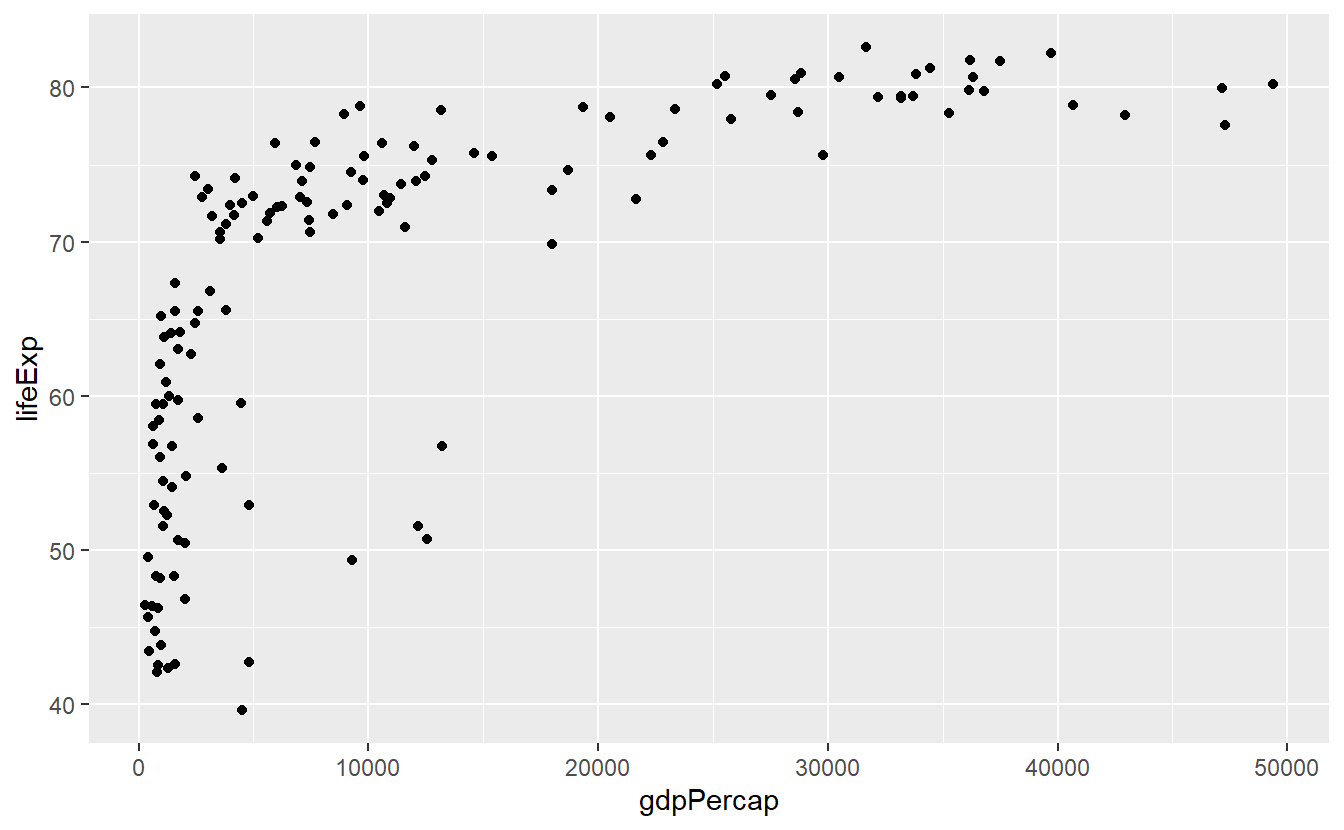
Each part of the above code relates to the previous explanations.
ggplot(data = tib_filtered) initializes an empty plot because we told R only that we want to use tib_filtered but nothing more.
Then, we added a layer of points to the empty plot by adding geom_point()24.
Finally, we specified what variables from the tib_filtered are to be used for the x- and y-coordinates of the points.
We did this by filling the mapping argument through the aes() function.
This additional aes() function might feel weird at first.
Nevertheless, this function is crucial as its purpose is to differentiate between when a visual attribute of the plot is related to data or not.
For instance, say we want to make all points in the previous plot blue.
This visual change of the points has nothing to do with our data.
Thus, we need to tell geom_point() that the color is not part of the aesthetic (aes) mapping.
ggplot(data = tib_filtered) +
  geom_point(
    mapping = aes(x = gdpPercap, y = lifeExp),
    color = "blue"
  )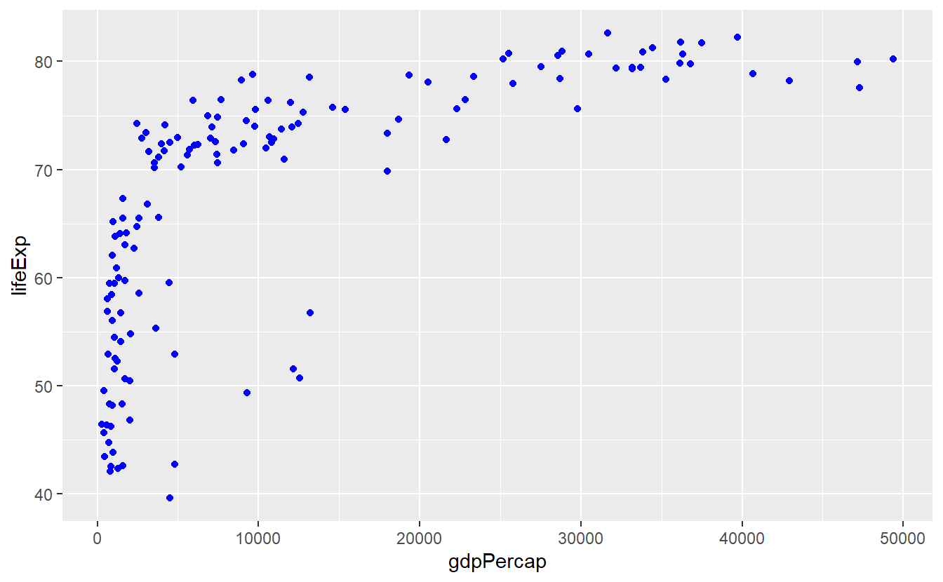
Notice that color = "blue" is outside of aes().
Let’s see what happens when we put it inside.
ggplot(data = tib_filtered) +
  geom_point(mapping = aes(x = gdpPercap, y = lifeExp, color = "blue"))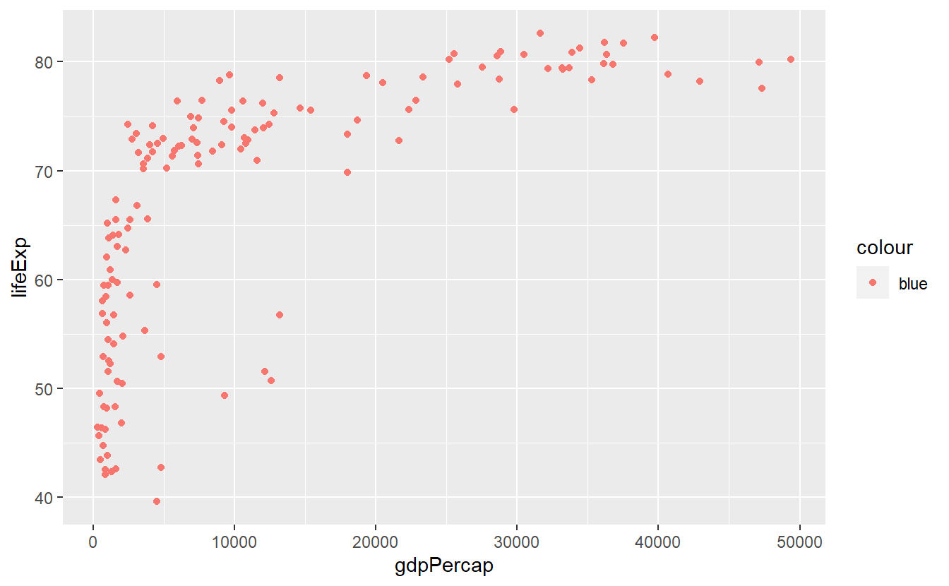
Well, this does not look too good.
For starters, the points are anything but blue.
Also, where is this legend coming from?
The answer to our bamboozlement25 lies in how the color aesthetic is interpreted within the aes() function.
As was already said, aes() implies that data is used for the visual properties.
This allows for stunts like this:
ggplot(data = tib_filtered) +
  geom_point(
    mapping = aes(
      x = gdpPercap,
      y = lifeExp,
      color = continent
    )
  )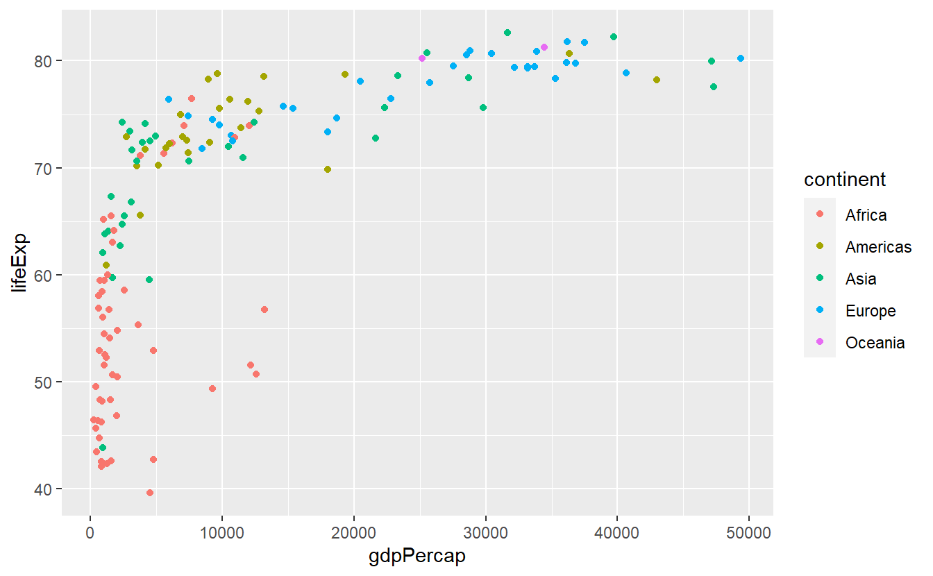
Here, we used continent as our color aesthetic which might feel strange at first given that probably no one has ever heard of a color called “Americas”.
In fact, what ggplot does, is first taking all the values from the continent column to check how many unique continents there are in this data set.
Then, each of these distinct values is assigned a color automatically which is then linked to the data points of each continent, respectively.
As a result, the above plot emerges.
Similarly, the same concept works when we do not use discrete values (such as continent) but continuous variables (e.g. life expectancy lifeExp) as color aesthetic.
However, now the colors are assigned as part of a gradient between highest and lowest values of the data.
ggplot(data = tib_filtered) +
geom_point(
mapping = aes(
x = gdpPercap,
y = lifeExp,
color = lifeExp
)
)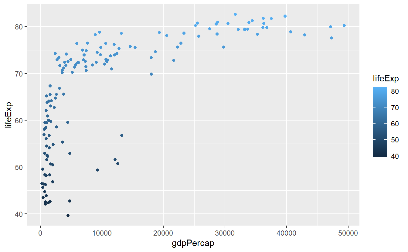 In the case of setting
 color = "blue" within the aes() function, you can think of ggplot acting like this:
It recycles the value “blue” to form a new column whose values are all “blue”.
Now, this new column is used as color aesthetic the same way continent was in the earlier example and because this column has only one distinct value, only one color (which is not necessarily blue) gets automatically assigned to all the points.
We will cover why this is a useful feature (in case you are wondering) in the next section on transformations. For now, let us generate another fairly simple plot. Let us extract a couple of countries from our data set, say five, and plot a line diagram depicting the evolution of each country’s life expectancy over time.
Thus, let us start by selecting a few countries.
We can do this by using filter() again.
If we want to use more than one country, we can link multiple filtering conditions using the logical “or” operator |.
For more than two conditions this quickly becomes tedious and instead we can use the “in” operator %in% in combination with a vector of filtering values.
Here, this might look like this.
# With the | operator
selectedCountries <- tib %>%
  filter((country == "Germany") | (country == "Afghanistan"))

# Or with the %in% operator
selectedCountries <- tib %>%
  filter(country %in% c("Germany", "Afghanistan"))

# The %in% operator can be easily scaled to more than two conditions
## Collect the countries you want to look at
country_filter <- c(
  "Germany",
  "Australia",
  "United States",
  "Afghanistan",
  "Bangladesh"
)
## Filter using the previously created vector and display result
selectedCountries <- tib %>%
  filter(country %in% country_filter)
selectedCountries
#> # A tibble: 60 x 6
#>   country     continent  year lifeExp      pop gdpPercap
#>   <fct>       <fct>     <int>   <dbl>    <int>     <dbl>
#> 1 Afghanistan Asia       1952    28.8  8425333      779.
#> 2 Afghanistan Asia       1957    30.3  9240934      821.
#> 3 Afghanistan Asia       1962    32.0 10267083      853.
#> 4 Afghanistan Asia       1967    34.0 11537966      836.
#> 5 Afghanistan Asia       1972    36.1 13079460      740.
#> 6 Afghanistan Asia       1977    38.4 14880372      786.
#> # ... with 54 more rows
Notice that we had to put the countries’ names into quotation marks whereas the variable name country does not need them.
This is because the filter() function treats everything in quotes as a character value and everything else as a variable from the data set, i.e. from the data’s column names.
Now, we can generate line diagrams using geom_line() in the same way we used geom_point() earlier.
ggplot(data = selectedCountries) +
geom_line(mapping = aes(x = year, y = lifeExp, color = country)) 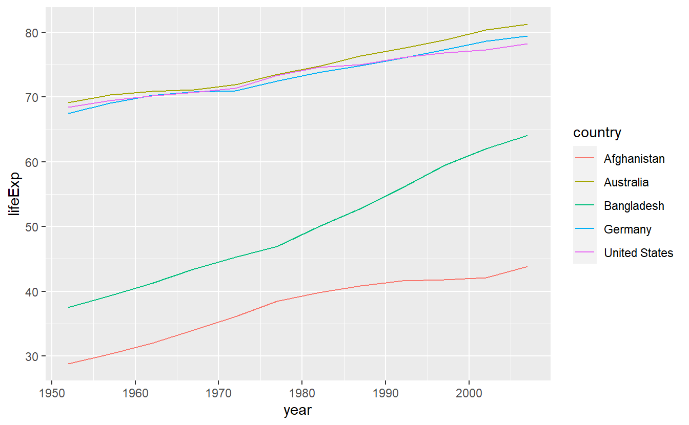
Although this is a text intended to teach you about how to use R, for a couple of (brief) moments you might want to ponder on the clear gap that is displayed in this simple plot.
After all, we use data from the gapminder package here.
Coming back to R related topics, in this plot it might be of advantage to not only display the lines generated by connecting the data points but also the points themselves so that the plot shows what data we actually have and what is interpolated via straight lines.
We can do this quite easily by adding another layer to the already existing plot.
Here, we add a layer of points by adding geom_point().
ggplot(data = selectedCountries) +
  geom_line(mapping = aes(x = year, y = lifeExp, color = country)) +
geom_point(mapping = aes(x = year, y = lifeExp, color = country)) 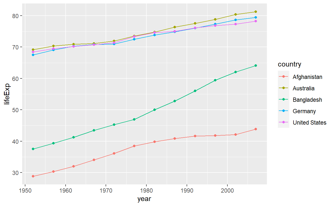
As you just saw, ggplots are created by stacking layers of geometric objects. This is one of the key ideas of the so-called layered grammar of graphics. This concept asserts that all plots can be decomposed as layers where each layer is described by a combination of
- data,
- geometric object (geom),
- mapping,
- statistical transformation (stat),
- position adjustment,
- coordinate system,
- faceting scheme.
The syntax of ggplot2 is tailored to this way of thinking.
However, you might object that the code we have written so far only dealt with the first three components.
This is because ggplots are equipped with a lot of useful default options.
For instance, the coordinate system is by default chosen as the common Cartesian coordinate system.
We will see how to change the defaults in the next sections.
Further, our previous code might imply that it is not in fact the geom_ layers we added that can contain data but only the initial ggplot() layer.
However, this is a misconception since we could have also written
ggplot() +
  geom_line(
    data = selectedCountries,
    mapping = aes(x = year, y = lifeExp, color = country)
  ) +
  geom_point(
    data = selectedCountries,
    mapping = aes(x = year, y = lifeExp, color = country)
  )
However, our original code worked and is actually preferable to this version because everything that is not specified in the individual layers is inherited from the initial layer. This reduces the amount of duplicated code which is always a good idea. In fact, we can make our original code more concise by using the idea of inheritance more extensively and keeping only what is unique in the individual layers. In this case, this gives us
ggplot(
  data = selectedCountries,
  mapping = aes(x = year, y = lifeExp, color = country)
) +
  geom_line() +
  geom_point()
Here, all aesthetics of the geoms are determined in the initial layer.
However, we could easily individualize e.g. the point layer by making the point shape26 dependent on the countries’ corresponding continents like so
ggplot(data = selectedCountries,
       mapping = aes(x = year, y = lifeExp, color = country)) +
  geom_line() +
geom_point(aes(shape = continent)) 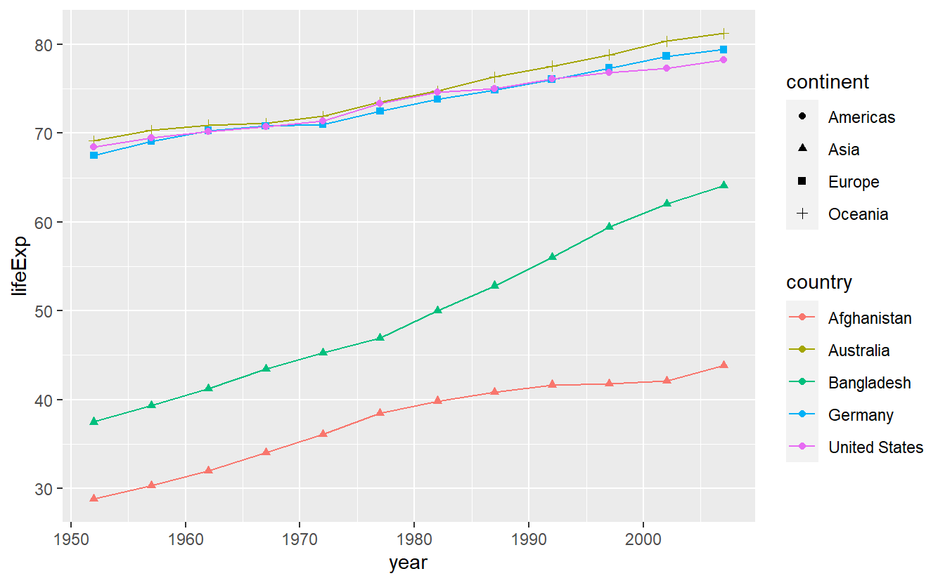
Notice that I did not write mapping = in the point layer.
This is due to the fact R will understand my input as relating to the mapping automatically since I used aes().
Similarly, a variable containing a tibble will be understood as relating to data =.
Also, the x- and y-mapping can be inferred from the order in which I state the variables.
Therefore, we could make our code even more concise by omitting the things R understands on its own.
Here, this would mean writing
ggplot(selectedCountries, aes(year, lifeExp, color = country)) +
  geom_line() +
  geom_point(aes(shape = continent))
This saves some tedious typing but requires the human reader of said code to be familiar with the syntax.
Therefore, for the remainder of this chapter I will continue the use of mapping = and alike so that you can get familiar with the syntax but starting next chapter I will stick to the shorter form.
2.2 Statistical Transformations
In the last plot, we drew lines from one point to the next. This could be interpreted as thinking of our data as being exact measurements depicting the real world and the lines in between the points as interpolation of those exact measurements. Instead, we could think of our data as “noisy” measurements of the underlying real world behavior which is probably more realistic.
Consequently, instead of drawing a line through each and every point, we could draw a line that accounts for the insecurities in our measurements and as a result does not adhere to the data precisely. Nevertheless, our line should not deviate “too much” from the points as we still think of our data as somewhat accurate with respect to the underlying quantity we want to measure.
In situation like these, we speak of fitting a line to our data and we can do that by adding a stat_smooth() layer to the plot.
Often, the line that is to be fitted is supposed to be straight in which case we usually say that we are fitting a linear model to the data.
stat_smooth() will by default not adhere to restricting itself to fitting a straight line but we can make it do so by specifying method = "lm".
First, let us check out what stat_smooth() does in its out-of-the-box state.
ggplot(
  data = selectedCountries,
  mapping = aes(x = year, y = lifeExp, color = country)
) +
  geom_point() +
  stat_smooth()
#> `geom_smooth()` using method = 'loess' and formula 'y ~ x'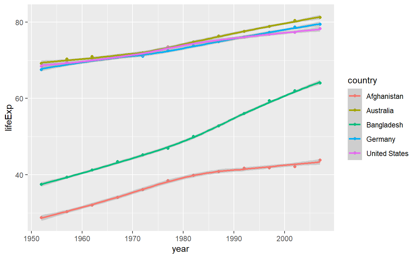
We notice three things:
- As expected, the fitted lines are not straight
- A message is generated indicating that the method “loess” was used. This relates to what method was used to calculate the fitted line. You do not have to concern yourself with the “loess” method right now. All you need to know is that it does not restrict the trade-off lines to be straight contrary to the method “lm” which we will use next.
- If you look closely, you can see that there are shaded areas around the lines which indicate so-called confidence bands.
These shaded areas can also be seen by the grey background in the legend.
We do not want to deal with those here, so we set
se = FALSEor, shorter,se = F.
Making all the necessary changes leads to
ggplot(
  data = selectedCountries,
  mapping = aes(x = year, y = lifeExp, color = country)
) +
  geom_point() +
  stat_smooth(method = "lm", se = F)
#> `geom_smooth()` using formula 'y ~ x'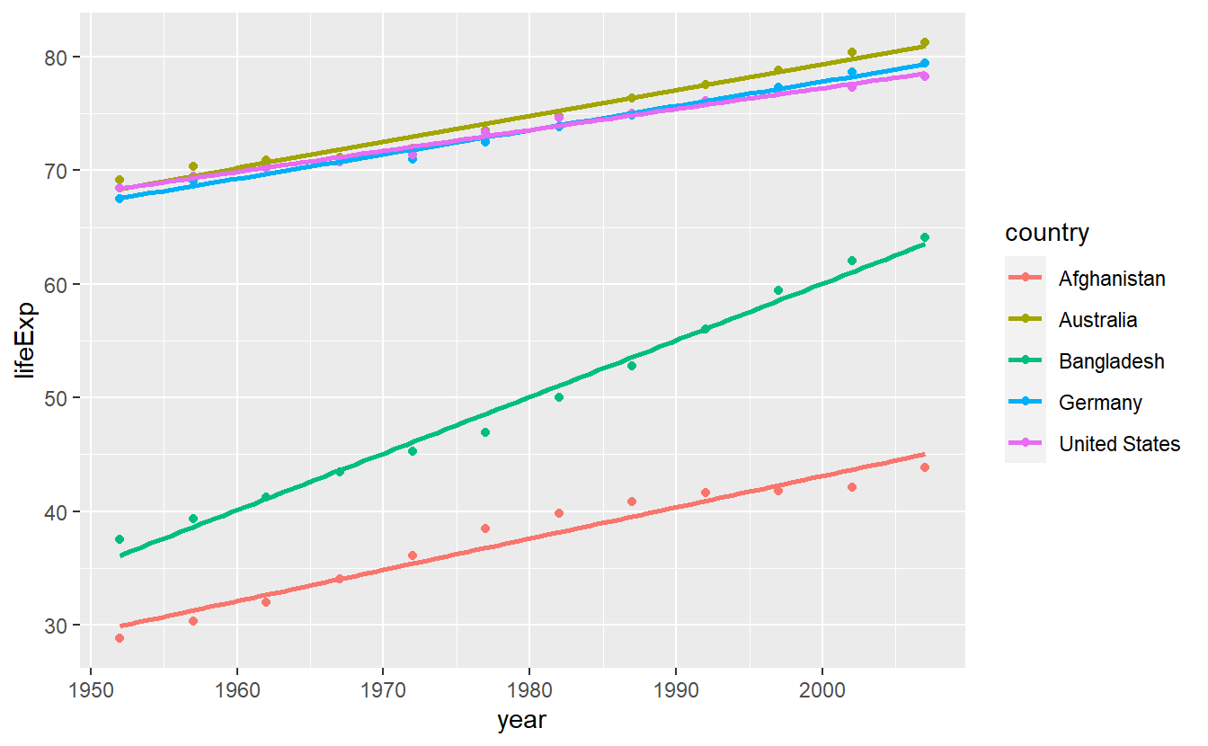
Notice that if you think about it, both, this and the previous plot, are somewhat odd as it is unclear what data was actually plotted.
Here, the data which corresponds to the straight lines is not actually in the data set.
In fact, what happens here is that stat_smooth() does not plot the aesthetics defined by aes() but rather uses them for computations and plots these computed values instead.
This is what we call a statistical transformation or stat for short.
Earlier, we pointed out that the layered grammar of graphics assumes that each layer consists of, among other things, a statistical transformation.
Here, we saw this in action most obviously.
However, implicitly we have used statistical transformations all along.
If you look into the documentation of say geom_point() you will find that its default value of stat is given by stat = "identity", which is effectively not changing anything but still a transformation nevertheless.
This is why the stat_smooth() layer begins with stat instead of geom so that it is obvious which layers plot the data directly and which apply a non-identical transformation to the data.
In practice however, for each stat_ layer there is a corresponding geom_ layer as well, i.e. you might as well write
ggplot(
  data = selectedCountries,
  mapping = aes(year, lifeExp, color = country)
) +
  geom_point() +
  geom_smooth(method = "lm", se = F)
and generate the same plot.
Thus, you can also write geom_* when statistical transformations are involved if you do not want to explicitly show the transformations in your code.
However, if you want to change the default geom that is used to display the results of a statistical transformation (here, basically line), you will have to use the stat_* version and specify the geom argument manually, e.g.
ggplot(
  data = selectedCountries,
  mapping = aes(year, lifeExp, color = country)
) +
  # Point layer removed here
  stat_smooth(method = "lm", se = F, geom = "point")
#> `geom_smooth()` using formula 'y ~ x'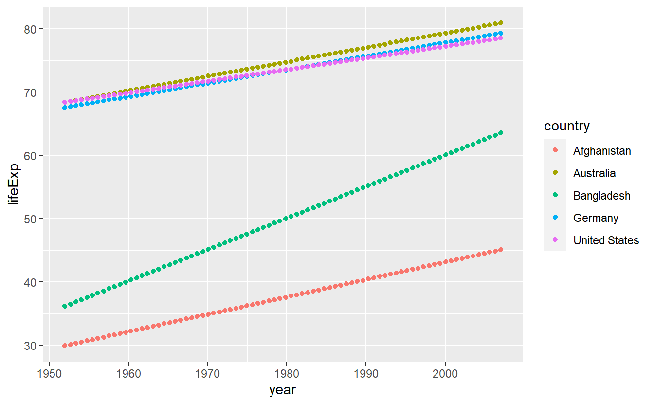
Statistical transformations are an excellent tool to gain insights into a data set and there are a couple of common transformations we should look at.
Let us do precisely that in the next couple of segments.
Though, before we do that I still owe you an explanation why it might me a good idea to map a single string to the color aesthetic within aes() like we did with color = "blue".
Mainly this is a neat feature because it allows for a quick comparison of two competing statistical transformations like so
ggplot(
  data = tib_filtered,
  mapping = aes(x = gdpPercap, y = lifeExp)
) +
  geom_point()  +
  geom_smooth(mapping = aes(color = "Automatic approach")) +
  geom_smooth(
    mapping = aes(color = "Straight line approach"),
    method = "lm"
  )
#> `geom_smooth()` using method = 'loess' and formula 'y ~ x'
#> `geom_smooth()` using formula 'y ~ x'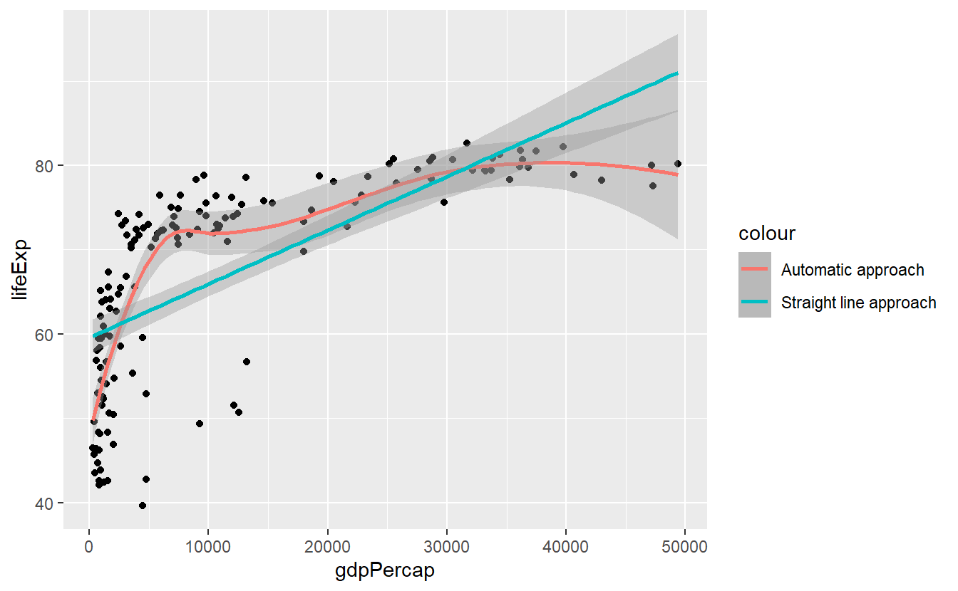
2.2.1 Histogram and Density
If you want to get a quick glance of the range and the counts of values within a given data set, a histogram can help you.
Histograms can be generated with help from geom_histogram() resp. stat_histogram().
tib_2007 <- tib %>%
filter(year == 2007)
ggplot(data = tib_2007, mapping = aes(x = lifeExp)) +
geom_histogram()
#> `stat_bin()` using `bins = 30`. Pick better value with `binwidth`.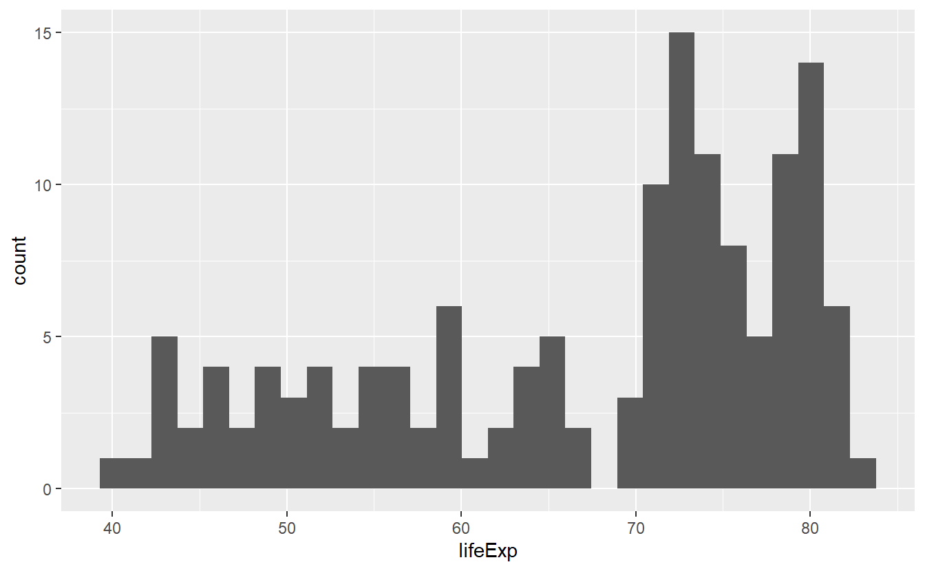 Here, the range of the life expectancies in 2007 was split up into 30 bins (as indicated by the generated message) so that one could count how many values fall into each bin.
The counting is done by R automatically, which is why we did not specify the y-aesthetic in the previous code.
If we are not happy with the automatic value of 30 bins we can either change the
Here, the range of the life expectancies in 2007 was split up into 30 bins (as indicated by the generated message) so that one could count how many values fall into each bin.
The counting is done by R automatically, which is why we did not specify the y-aesthetic in the previous code.
If we are not happy with the automatic value of 30 bins we can either change the bins option directly or determine how wide a bin is supposed to be by declaring the binwidth.
ggplot(data = tib_2007, mapping = aes(x = lifeExp)) +
  geom_histogram(bins = 10)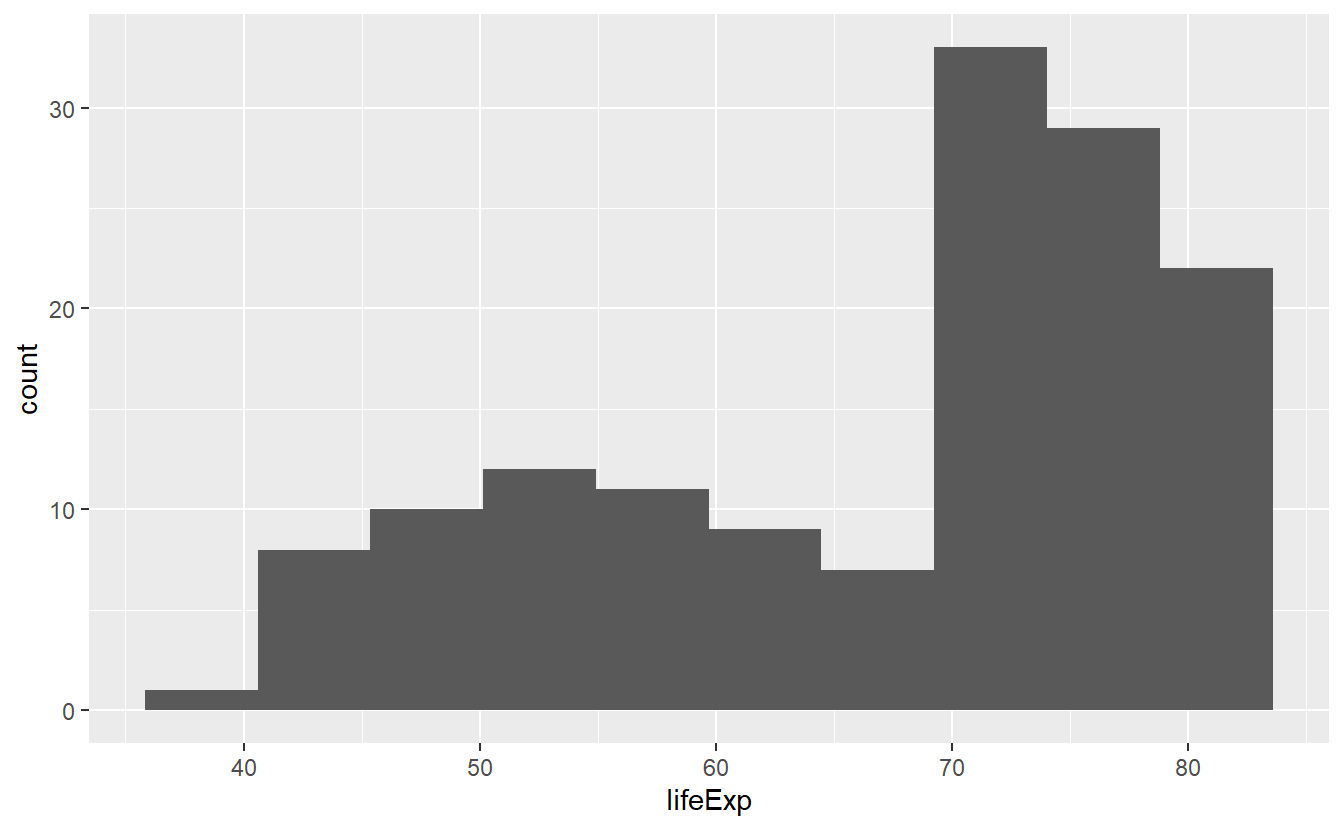
Notice that bins was not defined within an aes() because it is not something which depends on a variable from our data set.
The same applies to binwidth.
ggplot(data = tib_2007, mapping = aes(x = lifeExp)) +
geom_histogram(binwidth = 2.5) 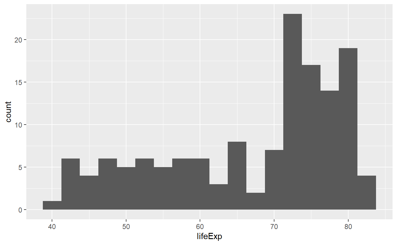
In all three pictures it looks like the majority of the life expectancies range from 70 to 80 years but there is also a significant amount of life expectancies in the 40 to 60 year range. Let’s see if we can incorporate a bit more details from our data into this picture by coloring the bars based on a country’s continent.
ggplot(data = tib_2007, mapping = aes(x = lifeExp)) +
  geom_histogram(mapping = aes(fill = continent))
#> `stat_bin()` using `bins = 30`. Pick better value with `binwidth`.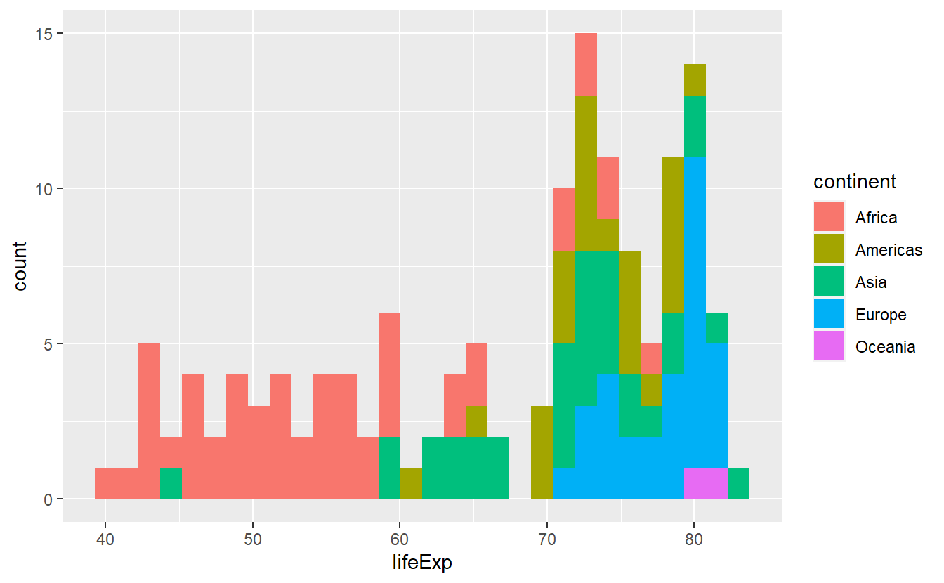
As was obvious from the start, this plot reveals clear differences of life expectancies between continents. However, the histogram looks really messy and is a lot to take in, mainly because the differently colored bars are stacked on top of each other. There are a couple of things we can do to try to make this plot more “readable”.
We either play around with the options bins or binwidth in the hopes of improving the overall impression or we tweak the position option for a different output (this is a classical example of the position adjustment as part of the layered grammar of graphics).
In the exercises, you will get to play around with the position options identity, stack (which is the default), dodge and fill.
Here, just let us incorporate one position adjustment to see how the position change works in principle.
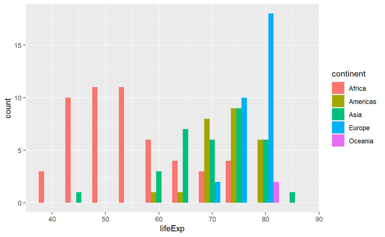
ggplot(data = tib_2007, mapping = aes(x = lifeExp)) +
  geom_histogram(
    mapping = aes(fill = continent),
    binwidth = 5,
    position = "dodge"
) 
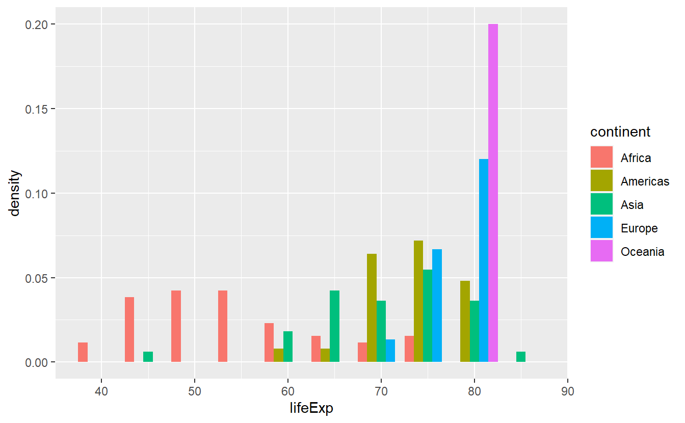
With respect to probability theory, you can think of histograms as approximations to a variable’s distribution. For instance, the last plot can give us some intuition on the conditional distribution of the life expectancy given the continent. More precisely, as the life expectancy cannot be thought of as a discrete value, here what we actually mean is the conditional density of life expectancy given continent. This would be more obvious if the y-axis was actually depicting something more along the lines of a density instead of a count.
However, as per geom_histogram()’s documentation, this layer computes the variables count, density, ncount and ndensity and plots the count per default.
Thus, it is only a matter of telling geom_histogram to use density as y-aesthetic instead.
We can access internally computed variables by putting the variable’s name between two ...
ggplot(data = tib_2007, mapping = aes(x = lifeExp)) +
  geom_histogram(
    mapping = aes(y = ..density.., fill = continent),
    binwidth = 5,
    position = "dodge"
) 
Alternatively, instead of looking at histograms, we can also use geom_density() to estimate the density directly.
This will generate a line diagramm like so
ggplot(data = tib_2007, mapping = aes(x = lifeExp)) +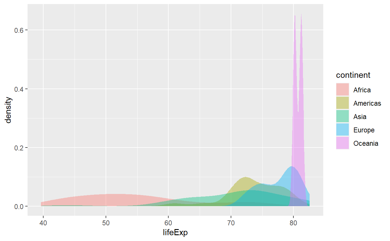
geom_density(mapping = aes(color = continent)) 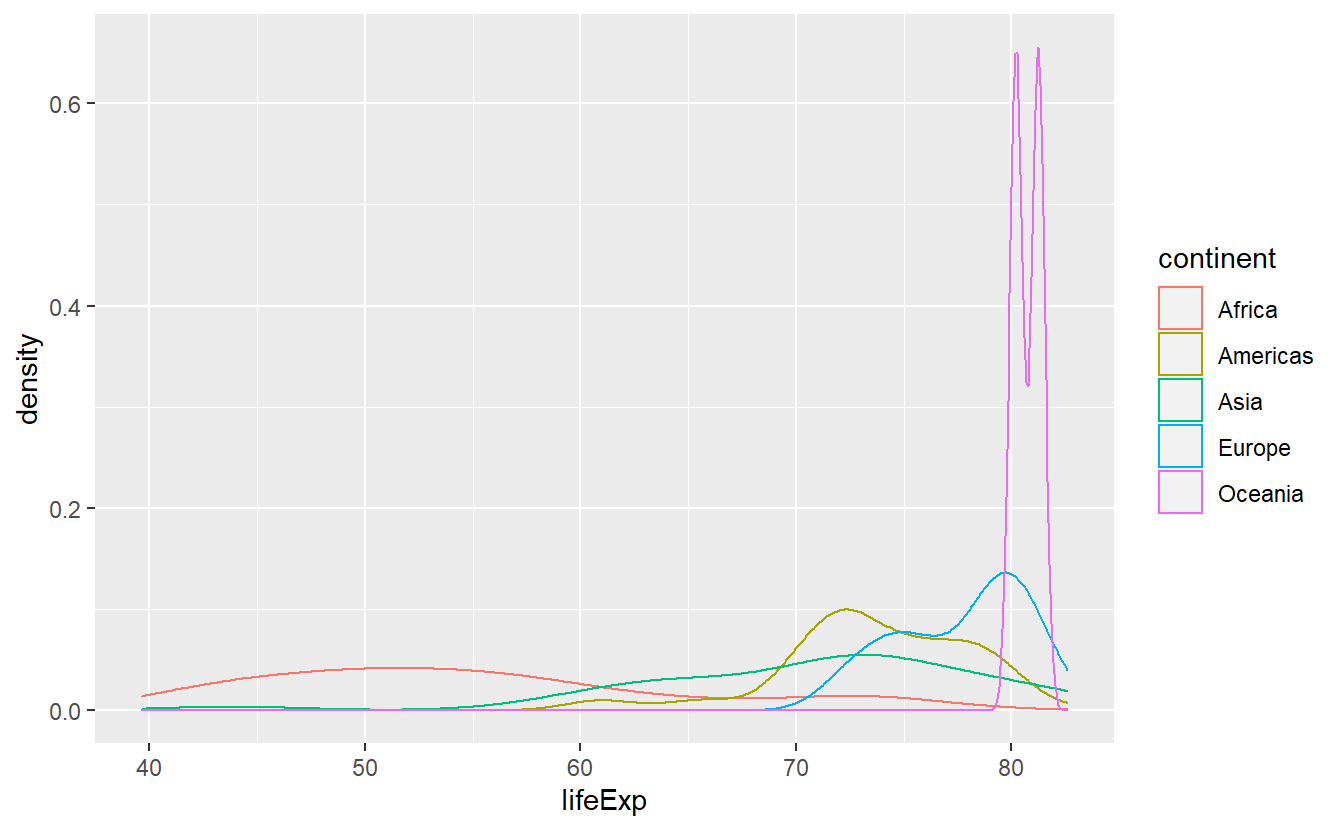
In cases like these, I prefer to use stat_density() as it uses the geom area by default instead of line which leads to the area under the above lines to be filled.
However, stat_density stacks the curves, thus I’d like to adjust the positioning in the same way as I did with histograms.
Also, to relieve the effect of overplotting I make the areas somewhat transparent by decreasing their alpha value which ranges from 0 (invisible) to 1 (not transparent).
ggplot(data = tib_2007, mapping = aes(x = lifeExp)) +
  stat_density(
    mapping = aes(fill = continent),
    position = "identity",
    alpha = 0.4
) 
Notice that in the two previous plots we switched back and forth between using the fill and color aesthetic.
Actually, both plots use both of these aesthetics.
Here and with histograms as well, fill relates to the area of the bar/under the curve and color relates to the boundary of the bars/area.
If we wish, we can always manually specify both.
ggplot(data = tib_2007, mapping = aes(x = lifeExp)) +
  stat_density(
    mapping = aes(fill = continent),
    color = "black",
    position = "identity",
    alpha = 0.4
) 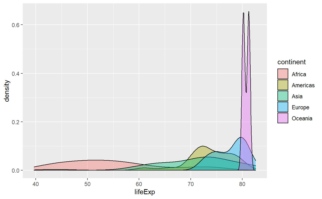
This actually helps us to differentiate the densities where there is much overlap of the areas and we see that Africa has a pretty wide range of life expectancies. Though, it is still hard to discern how large the range of Africa’s life expectancies are. Maybe, stacking the densities could have helped or maybe we try to got at it using other statistical transformations.
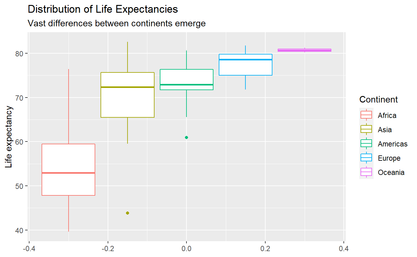
2.2.2 Boxplots
Boxplots are a great way to compress a lot of information of a variable’s distribution into a single picture. For instance, let’s see what we can find about the distribution of the life expectancy throughout the world (again in 2007).
ggplot(data = tib_2007, mapping = aes(y = lifeExp)) +
  geom_boxplot()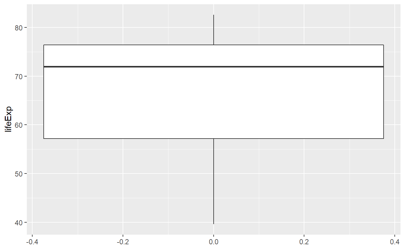
This figure tells us about the range of life expectancies indicated by the lines at the top/bottom of the box. Also, the lowest life expectancy is around 40 years and the highest life expectancy is around 83 years. Further, the lines at the top and bottom of the box tell us about the range of the highest/lowest 25% of observed life expectancies, i.e. the 0.25-quantile and the 0.75-quantile of this variable, respectively.
For instance, the top 25% of observed life expectancies are greater than approximately 76 years. Similarly the bottom 25% of observed life expectancies are smaller than approximately 56 years. Consequently, the middle 50% of the life expectancies range from 56 to 76 years (which is what the box tells us).
In addition, the bold black line in the middle of the box tells us that the median of the observed life expectancies is close to 72 years, i.e. 50% of the life expectancies are below 72 years and the other 50% are above that. Also, from the position of the bold line within the box, we can infer that this is a skewed distribution. Finally, note here that the width of the box has no interpretation.
In summary, a box plot gives us a nice visualization of a distributions quartiles. In the next chapter, we will learn to compute these and other quantiles in general so that we do not have to guess from the figure but still, even without the exact values this figure gives us a pretty good summary of the life expectancy’s distribution.
As with densities and histograms, we can use another aesthetic to condition on the continents.
ggplot(
  data = tib_2007,
  mapping = aes(y = lifeExp, color = continent)
) +
  geom_boxplot()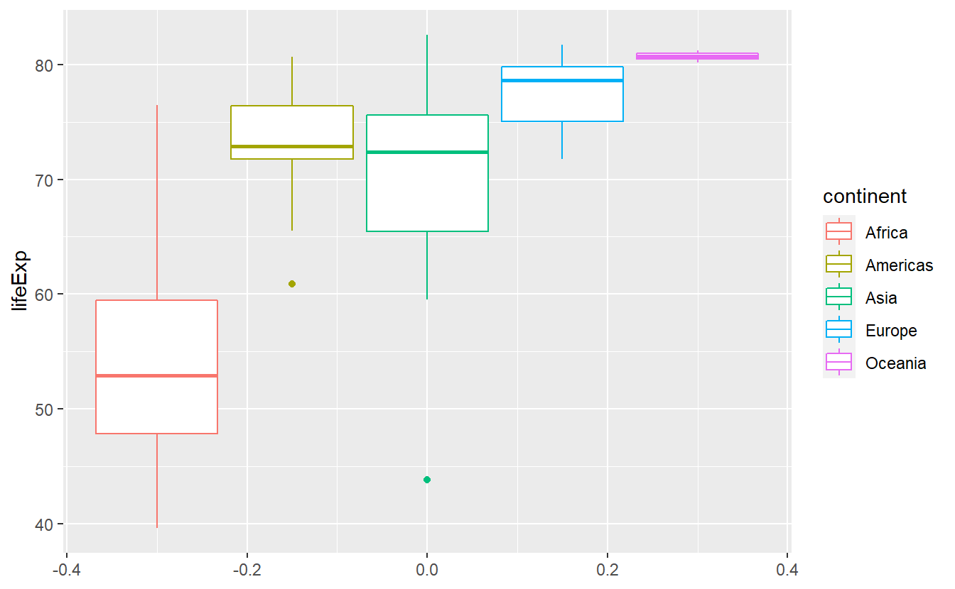
Notice here that there are two “outliers”, i.e. unusally large or small values, within the life expectancies of Asia and the Americas. That’s interesting, I’m wondering what two countries these are. We will find out how to extract these two using R commands in the next chapter. If you’re curious and can’t wait until then, feel free to scroll through the data set manually.
As we just witnessed, box plots are especially useful to visualize multiple distributions as we do here.
With histograms and densities we always had the problem of having to rearrange parts of our diagram so that it remains easily readable.
Box plots compress some of the distributions’ key quantities into a simple picture so that it is easy to simply plot the boxes next to each other. When doing so, it can be of advantage to sort them such that for instance the medians are in ascending order w.r.t. to the y-aesthetic.
The function fct_reorder() does that for us.
ggplot(
data = tib_2007,
mapping = aes(
y = lifeExp,
color = fct_reorder(continent, lifeExp)
)
) +
geom_boxplot()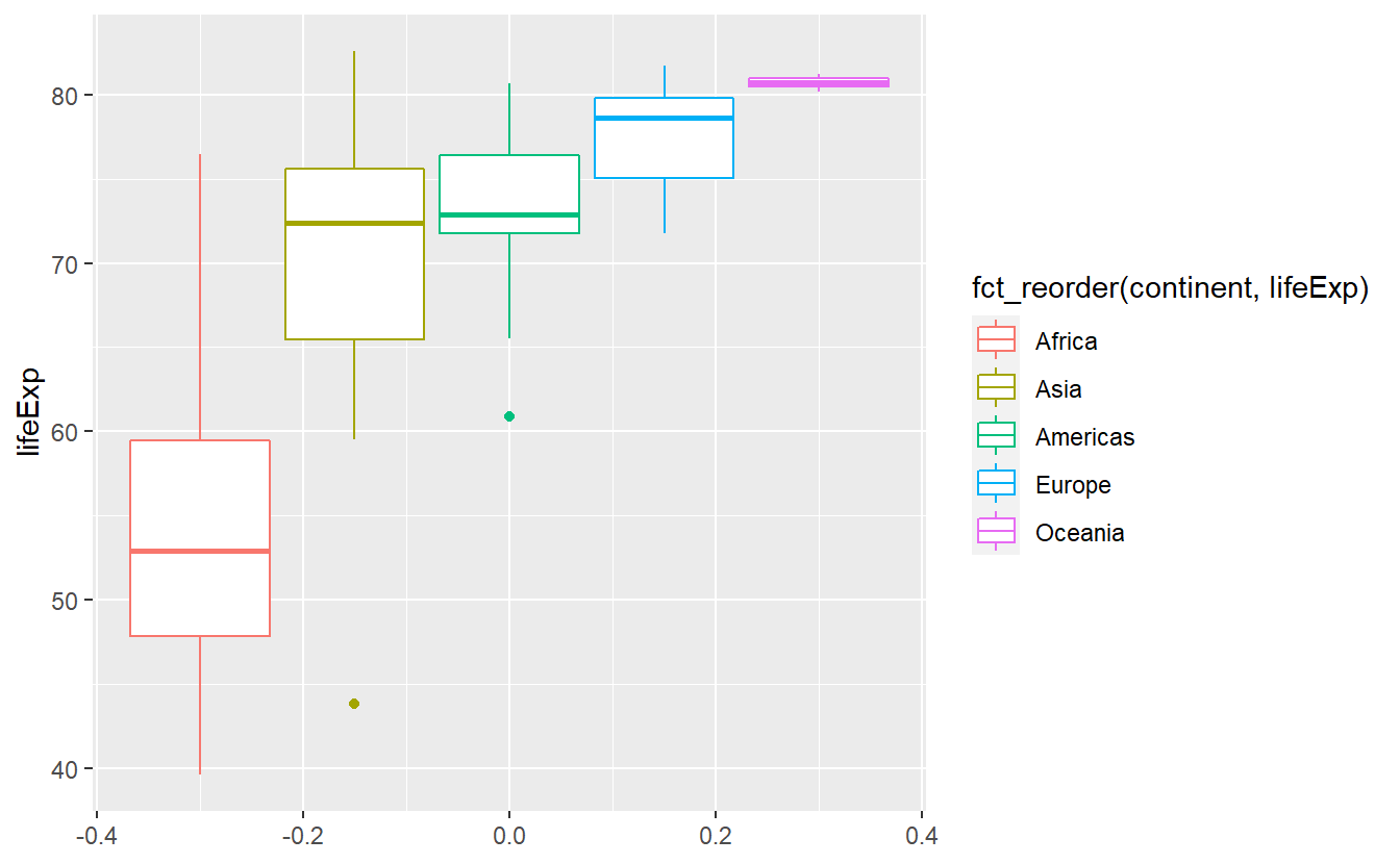 Here, the
 fct_reorder() function took the vector of continents and computed the median value for each distinct continent.
These median values are then used to sort the levels of the categorical vector.
As a result, the label of the legend became annoyingly long.
We can easily revert that manually and we will do that towards the end of this chapter.
2.3 Facets and Coordinate Systems
As we saw with histograms, it is not always easy or useful to plot everything into one window.
An easy way to circumvent this is faceting by adding facet_wrap() or facet_grid() to our original plot.
Basically, what this does is splitting the data by the variables you use within the faceting layer and generating one plot for each splitted group.
Say we want to take our previous histogram plot
ggplot(data = tib_2007, mapping = aes(x = lifeExp)) +
  geom_histogram()
#> `stat_bin()` using `bins = 30`. Pick better value with `binwidth`.
and split this by
 continent.
We will add a facet_wrap() layer and tell it to split the data according to continent by using the vars() function which is basically the analogue of aes() for faceting.
ggplot(data = tib_2007, mapping = aes(x = lifeExp)) +
  geom_histogram() +
  facet_wrap(vars(continent))
#> `stat_bin()` using `bins = 30`. Pick better value with `binwidth`.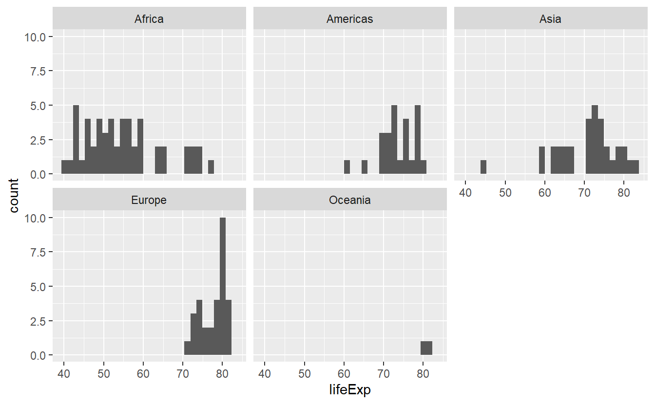
Now, the histograms look more orderly and we can make out differences better. Nevertheless, we might want to use a different color for each histogram and the faceting does not stop us to do so.
ggplot(
  data = tib_2007,
  mapping = aes(x = lifeExp, fill = continent)
) +
  geom_histogram() +
  facet_wrap(vars(continent))
#> `stat_bin()` using `bins = 30`. Pick better value with `binwidth`.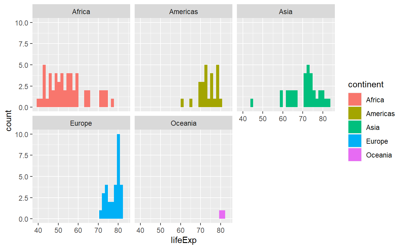
Now, the legend is a bit redundant because the facets are already labeled but do not worry.
We will get rid of the legend in due time.
If we have only one faceting variable facet_wrap() is exactly what we need as it creates a 1D sequence of panels and wraps it into 2D.
We could even specify how many rows and columns we want it wrapped in by specifying nrow and ncol.
Let’s asssume that we want to compare the life expectancy data from two distinct years and we want to facet according to year and continent.
Then, we should stick to facet_grid() which assigns variables (through vars()) to either rows or columns.
# Creating the tibble I was speaking about
tib_1952_2007 <- tib %>%
  filter(year %in% c(1952, 2007))

ggplot(
  data = tib_1952_2007,
  mapping = aes(x = lifeExp, fill = continent)
) +
  geom_histogram() +
  facet_grid(cols = vars(year), rows = vars(continent))
#> `stat_bin()` using `bins = 30`. Pick better value with `binwidth`.
For now, this is pretty much everything you need to know about faceting in this course, so let us move on to briefly talk about coordinate systems.
By default, ggplot will use the coord_cartesian() layer and plot everything in a Cartesian grid.
Though, sometimes you will want to zoom into a specific part of the plot and this is where coord_cartesian() is used most often as it allows to specify the x- and y-axes range by xlim resp. ylim.
Imagine that we only want to look at life expectancies between 60 and 75 years in the following plot because there is a lot of overlap and we want to see what is going on in that area more clearly.
ggplot(data = tib_2007, mapping = aes(x = lifeExp)) +
  stat_density(
    mapping = aes(fill = continent),
    color = "black",
    position = "identity",
    alpha = 0.4
) 
Then, we just set xlim = c(60, 75) within a coord_cartesian() layer.
However, this will only zoom on the x-axis and for the picture to become clearer, we will also need to zoom on the y-axis.
Thus, we set ylim = c(0, 0.125) as well.
ggplot(data = tib_2007, mapping = aes(x = lifeExp)) +
  stat_density(
    mapping = aes(fill = continent),
    color = "black",
    position = "identity",
    alpha = 0.4
  )  +
  coord_cartesian(xlim = c(60, 75), ylim = c(0, 0.125))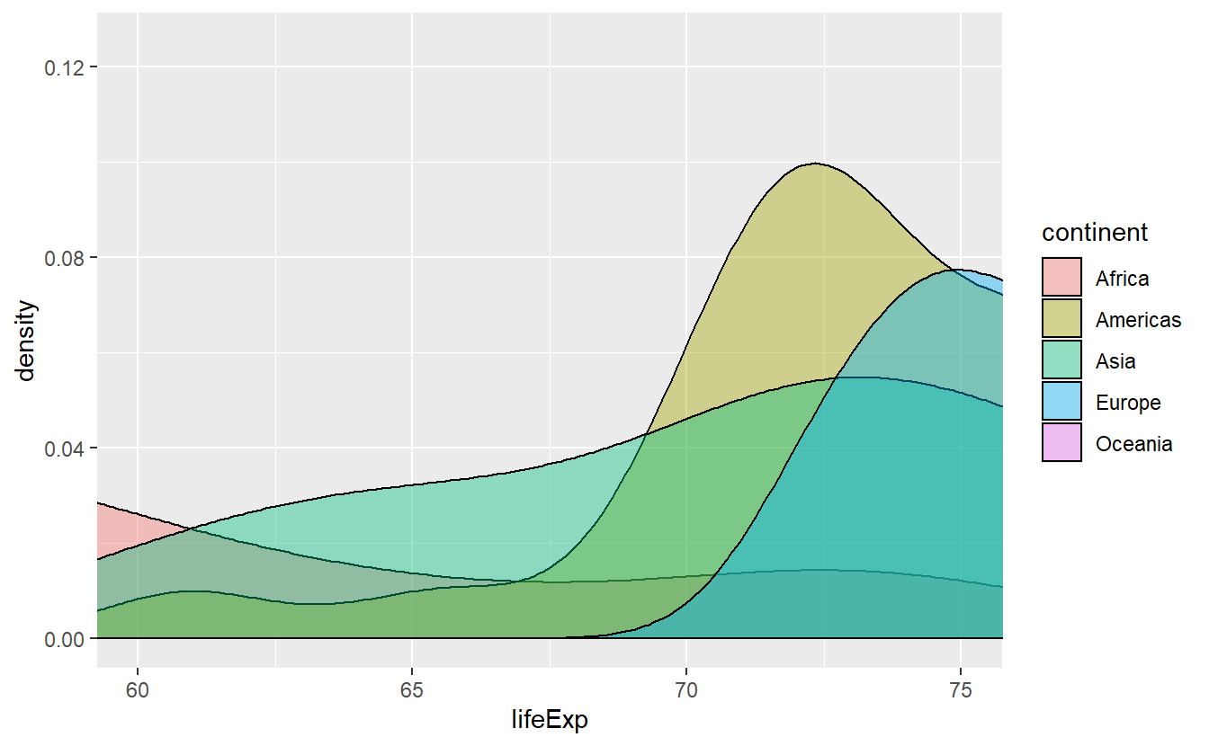
This accomplished pretty much what we wanted to do but beware of other possibilities for zooming into a plot.
Clearly, we could filter all life expectancies before we even start plotting but this also changes the computed density which is not necessarily what we want.
This is pretty obvious, I guess.
However, the xlim and ylim layers are often used for zooming, too, and they pretty much do the same thing as filtering.
Thus, when you are dealing with statistical transformations you have to be careful as the following plot shows.
ggplot(data = tib_2007, mapping = aes(x = lifeExp)) +
  stat_density(
    mapping = aes(fill = continent),
    color = "black",
    position = "identity",
    alpha = 0.4
  )  +
  xlim(60, 75)
#> Warning: Removed 87 rows containing non-finite values (stat_density).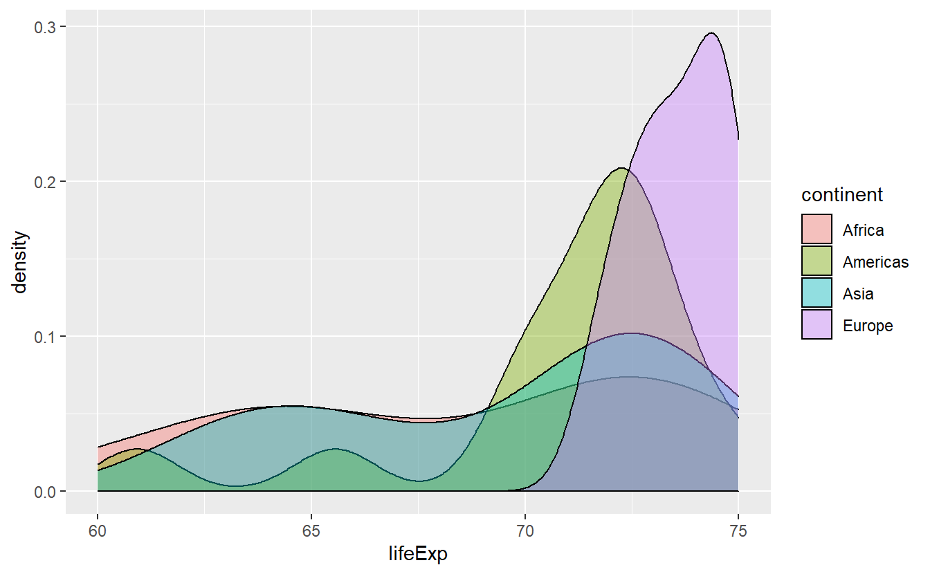
This is clearly not the same picture as we plotted before.
At least, ggplot() will throw a warning and you might want to take it seriously.
2.4 Plot Customization
So far, we have seen that there a lot of defaults implemented in ggplot and many things (such as assigning a color) work automatically. For those of you who have their own will and are not satisfied with the defaults, this is the right section for you. We will learn how to adjust the automatic appearance of aesthetics, change the theme of the plots altogether and rewrite labels.
However, this will become somewhat technical and in case you want to become active yourself, you may skip this section on customization first and work on a couple of exercises at the end of this chapter. When you feel that you are ready for customizations, you can come back here.
2.4.1 Labels
Let us start with labels and titles which is pretty straightforward and controlled through the labs() function.
Earlier, we created the following plot.
ggplot(
  data = tib_2007,
  mapping = aes(
      y = lifeExp,
      color = fct_reorder(continent, lifeExp)
    )
  ) +
  geom_boxplot()
As promised, let us change the labels and while we’re at it, let us generate titles too.
ggplot(
  data = tib_2007,
  mapping = aes(
      y = lifeExp,
      color = fct_reorder(continent, lifeExp)
    )
  ) +
  geom_boxplot() +
  # Set aesthetic to new label through '='
  labs(
    y = "Life expectancy",
    color = "Continent",
    title = "Distribution of Life Expectancies",
    subtitle = "Vast differences between continents emerge"
  )
A different plot we created earlier was this
# Save the plot into a variable to avoid rewriting it later
p <- ggplot(
  data = tib_1952_2007,
  mapping = aes(x = lifeExp, fill = continent)
) +
  geom_histogram() +
  facet_grid(cols = vars(year), rows = vars(continent))
p
#> `stat_bin()` using `bins = 30`. Pick better value with `binwidth`.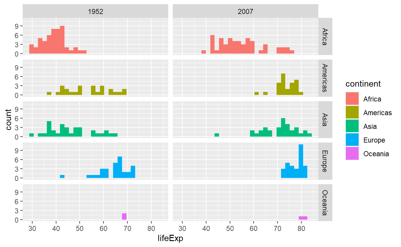
This includes the redundant legend that was automatically generated.
We can move legends or get rid of it altogether by theme(legend.position = *) depending on what position * we choose (possible option are “none”, “left”, “right”, “bottom”, “top” or two-element numeric vector).
p +
  theme(legend.position = "none")
#> `stat_bin()` using `bins = 30`. Pick better value with `binwidth`.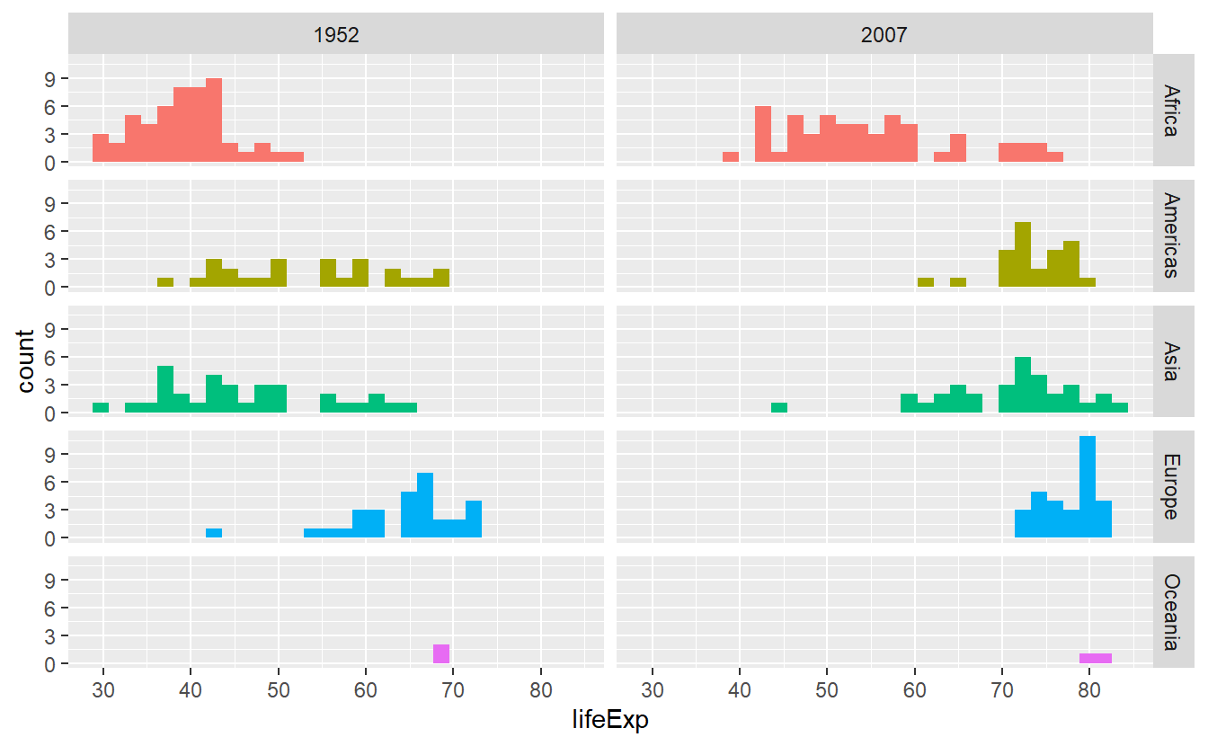
p +
  theme(legend.position = "bottom")
#> `stat_bin()` using `bins = 30`. Pick better value with `binwidth`.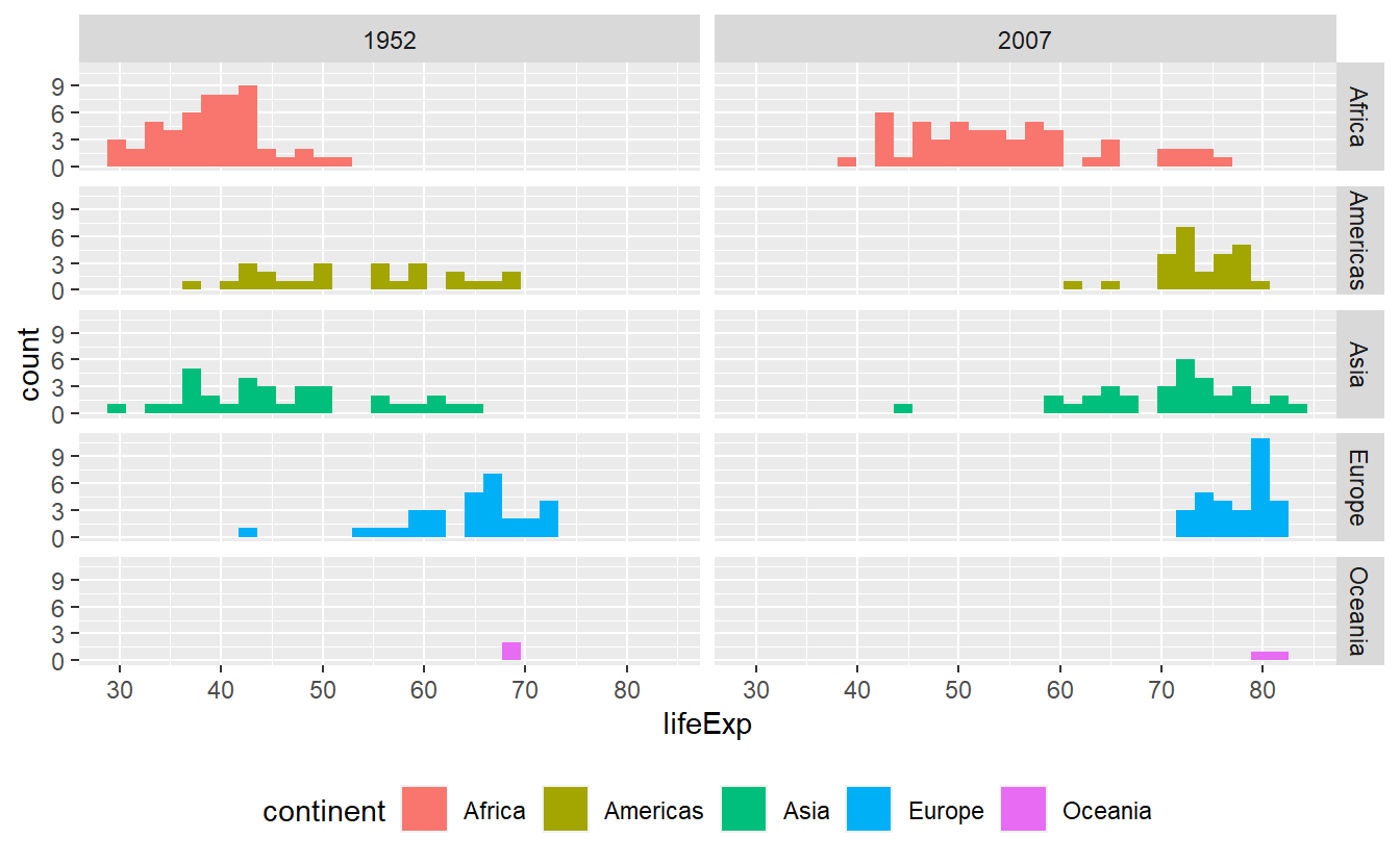
Alternatively, we could use guides() which works well when we used multiple aesthetics and want to get rid of the legend for only one of them.
For instance, this plot right here uses both size and color.
p <- ggplot(data = tib_2007) +
  geom_point(
    mapping = aes(
      x = gdpPercap,
      y = lifeExp,
      color = continent,
      size = pop
    )
  )
p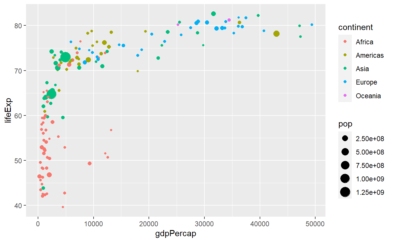
We can keep the color legend and still remove the size legend by
p +
  guides(size = "none")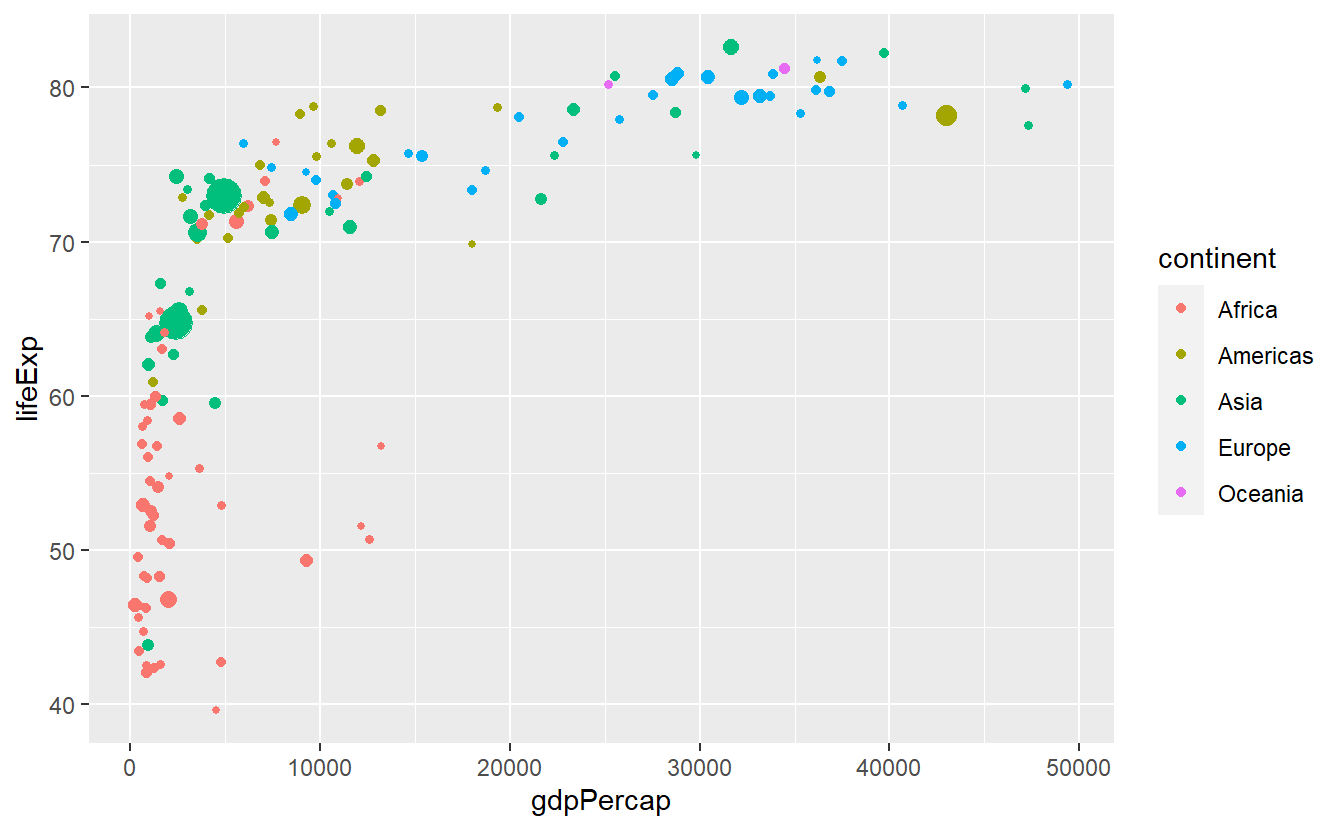
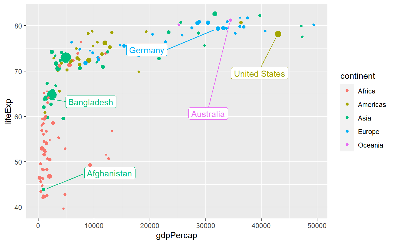
Let us take this chance to combine a few tricks we have learned so far.
p +
  labs(
    x = "GDP per Capita",
    y = "Life expectancy",
    color = "Continent",
    title = "GDP per Capita vs. Life Expectancy in 2007",
    subtitle = "The size of the bubbles relates to a country's population size"
  ) +
  guides(size = "none") +
  theme(legend.position = "bottom")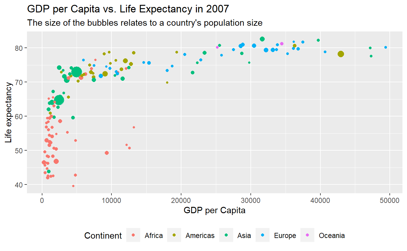
Sometimes, you may want to label specific data points (e.g. specific countries).
For these kind of situations ggplot2 equips us with geom_text() and geom_label() which basically work like geom_point(), i.e. with x- and y-coordinates, and combines this with a label aesthetic.
Let’s try these geoms to highlight a couple of countries.
To do so, we will need to get a selection of countries we want to label first.
This is a perfect example for when it might be beneficial to classify the data input of an individual layer manually instead of inheriting it from the initial layer (otherwise we would label each and every point).
Here, we can use the tibble selectedCountries which we created back when we wanted to draw individual lines for a couple of selected countries.
# Filter for countries in 2007
selectedCountries_2007 <- selectedCountries %>%
  filter(year == 2007)

ggplot(
  data = tib_2007,
  mapping = aes(
    x = gdpPercap,
    y = lifeExp,
    color = continent
  )
) +
  geom_point(mapping = aes(size = pop)) +
  guides(size = "none") +
  geom_text(
    data = selectedCountries_2007,
    mapping = aes(label = country)
  )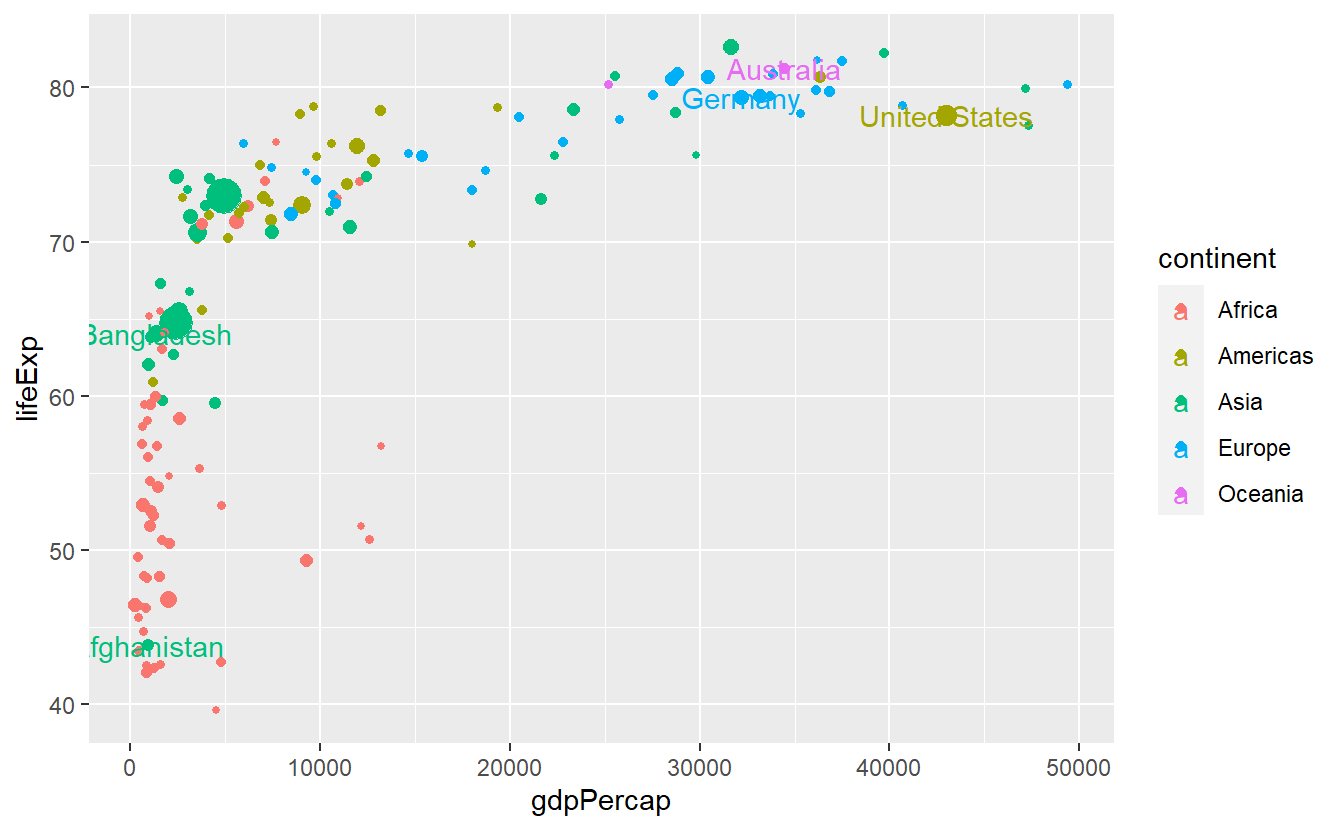
Notice that we put the size aesthetic into the individual layer of geom_point.
Otherwise the text labels would differ in size which we do not really want.
All in all, this plot is still a bit suboptimal as the labels are not really legible.
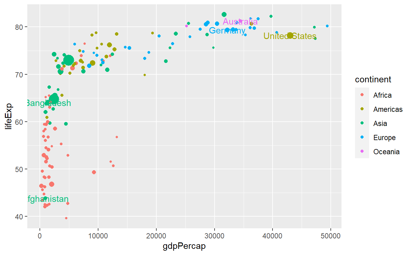
Also, the legend displays both a point (from geom_point()) and “a” from geom_text.
We can get rid of the latter via show.legend = FALSE.
ggplot(
  data = tib_2007,
  mapping = aes(
    x = gdpPercap,
    y = lifeExp,
    color = continent
  )
) +
  geom_point(mapping = aes(size = pop)) +
  guides(size = "none") +
  geom_text(
    data = selectedCountries_2007,
    mapping = aes(label = country),
    show.legend = FALSE
  )
We could try to make the labels more legible by using geom_label instead.
ggplot(
  data = tib_2007,
  mapping = aes(
    x = gdpPercap,
    y = lifeExp,
    color = continent
  )
) +
  geom_point(mapping = aes(size = pop)) +
  guides(size = "none") +
  geom_label(
    data = selectedCountries_2007,
    mapping = aes(label = country),
    show.legend = FALSE
  )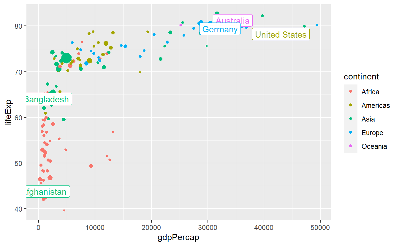
This helped some but is still not really what we’re going for.
We could try to move the labels manually by nudge_x and nudge_y but here it is probably better to deploy geom_repel() from the ggrepel package.
ggplot(
  data = tib_2007,
  mapping = aes(
    x = gdpPercap,
    y = lifeExp,
    color = continent
  )
) +
  geom_point(mapping = aes(size = pop)) +
  guides(size = "none") +
  ggrepel::geom_label_repel(
    data = selectedCountries_2007,
    mapping = aes(label = country),
    show.legend = F
  )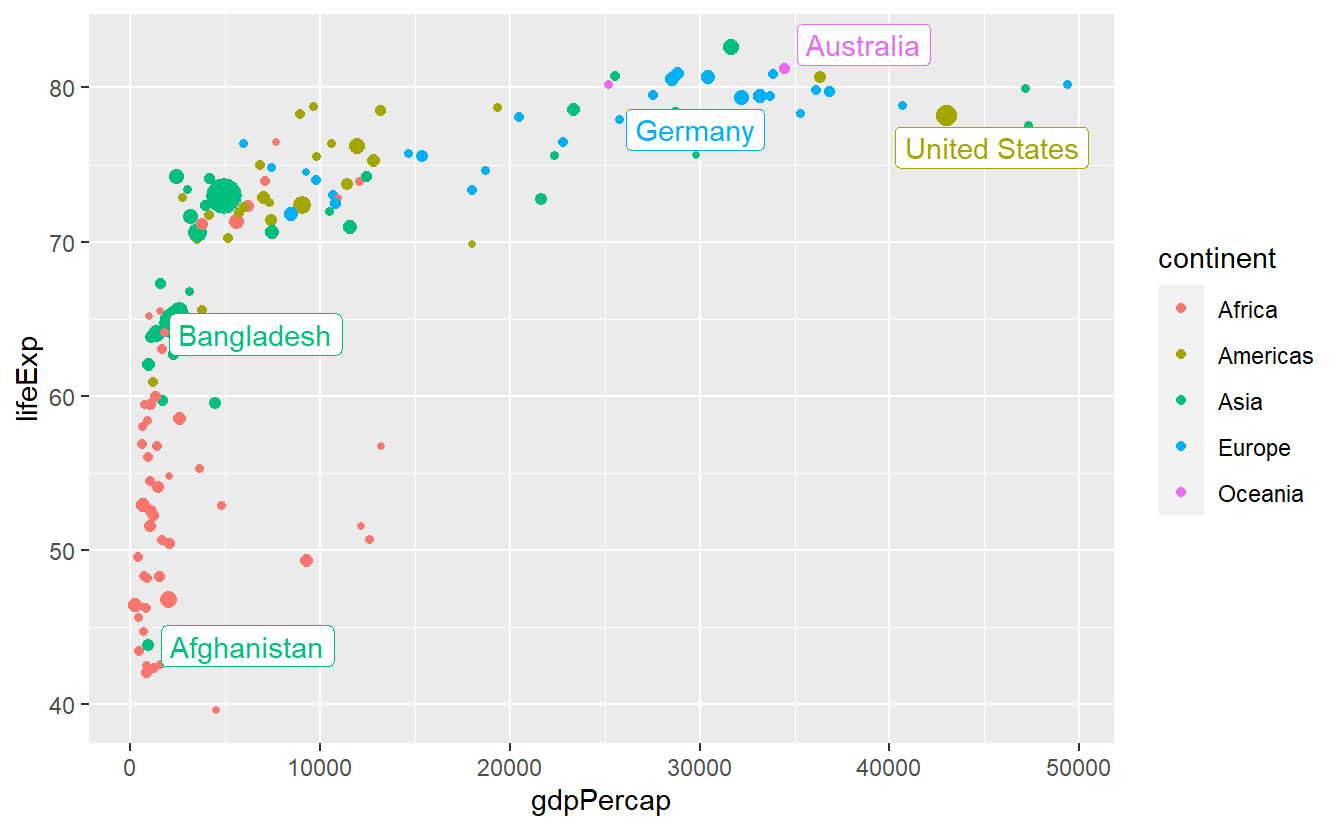
This is better but we can try to avoid some overplotting of points via labels adjusting box.padding and point.padding which you will get to know in more detail in the exercises.
ggplot(
  data = tib_2007,
  mapping = aes(
    x = gdpPercap,
    y = lifeExp,
    color = continent
  )
) +
  geom_point(mapping = aes(size = pop)) +
  guides(size = "none") +
  ggrepel::geom_label_repel(
    data = selectedCountries_2007,
    mapping = aes(label = country),
    box.padding = 3.5,
    point.padding = 0.5,
    show.legend = F
  )
2.4.2 Themes
One simple way to change the appearance of your plot is to adjust the non-data related parts of you plot like background, line colors and so on through themes.
All you need to do is to add a specific theme layer like theme_bw() to the plot.
ggplot(data = tib_2007,
       mapping = aes(x = gdpPercap,
                     y = lifeExp,
                     color = continent)) +
  geom_point() +
  theme_bw()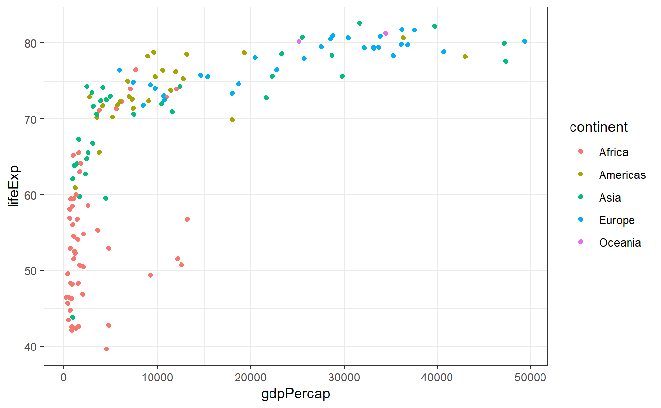
Of course, there are other pre-installed themes you could use.
You can find all of them in the documentation of theme_bw().
And if those are not enough for you, then you can look into the ggthemes package to find even more themes.
If you want to change a single aspect of the theme you are currently working with you can add a theme() layer to your plot and use the generic syntax theme(element.name = element_function()) where you will have to adjust element.name and element_function() to whatever you want to change, e.g.
ggplot(
  data = tib_2007,
  mapping = aes(
    x = gdpPercap,
    y = lifeExp,
    color = continent
  )
) +
  geom_point() +
  theme_bw() +
  # change text settings of axis labels
  theme(axis.title = element_text(size = 14, face = "bold")) +
  # change panel background color to
  theme(panel.background = element_rect(fill = "pink"))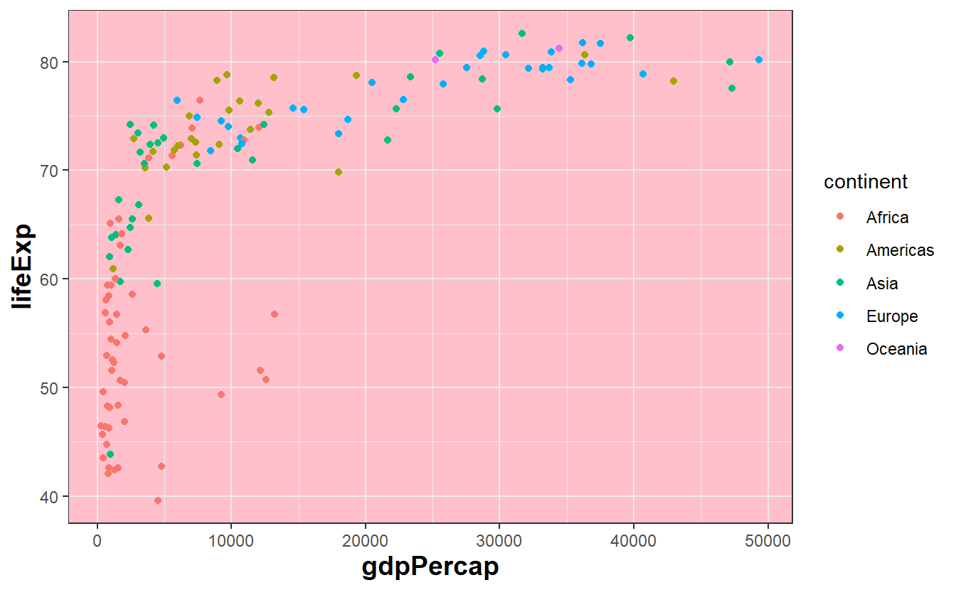
At first, this might feel intimidating as it is hard to know what keywords are available and to which visual property they relate to.
A pretty neat source for keywords and corresponding examples is Chapter 18.3 and 18.4 from the ggplot2 book by Hadley Wickham, Danielle Navarro and Thomas Lin Pedersen.
Though it is probably not terribly useful to read all of it in one session, you might want to pick out a few options and try them out yourself.
Of course, you also always look into the documentation of theme() for a long list of keywords.
Naturally, you can also try to use your favorite search engine to scour the internet for solutions on how to change whatever it is you want to change. Thankfully, there are honorable souls out there answering questions on stackoverflow or similar websites and chances are pretty high that you can find a related question including an answer to your problem.
In any case, the exercises will give you the chance to generate and customize a plot such that it becomes the ugliest plot you can think of. More on that later.
2.4.3 Scales
So far, we have learned that a mapping links data to visual properties of a plot. Actually, it is scales which specify how the mapping does its job and learning to control scales gives us even more power over our plots.
First, let us notice that scales have been secretly at work all along. When we plotted something like
ggplot(
  data = tib_2007,
  mapping = aes(
    x = gdpPercap,
    y = lifeExp,
    color = continent)
) +
  geom_point(mapping = aes(size = pop))
we have really been plotting
ggplot(
  data = tib_2007,
  mapping = aes(
    x = gdpPercap,
    y = lifeExp,
    color = continent)
) +
  geom_point(mapping = aes(size = pop)) +
  scale_x_continuous() +
  scale_y_continuous() +
  scale_color_discrete() +
  scale_size_continuous()
Basically, for every aesthetic we use in our mapping, another layer scale_<aesthetic>_<type> is added to the plot, where <type> depends on the nature of the variables we use.
Deviating from these standard layers is what allows us to customize the output.
For instance, here we might want to plot the data of our x aesthetic on a log-scale.
To make that work, we only have to tell scale_x_continuous that we want to use a non-identity transformation
ggplot(
  data = tib_2007,
  mapping = aes(
    x = gdpPercap,
    y = lifeExp,
    color = continent)
) +
  geom_point(mapping = aes(size = pop)) +
  scale_x_continuous(trans = "log10") +
  guides(size = "none")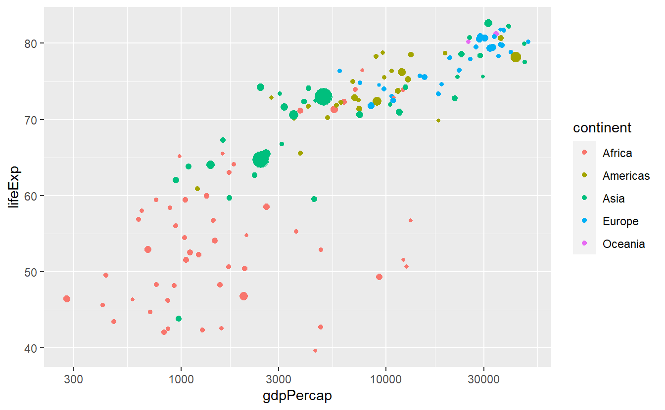
This works with all kinds of transformations
ggplot(
  data = tib_2007,
  mapping = aes(
    x = gdpPercap,
    y = lifeExp,
    color = continent)
) +
  geom_point(mapping = aes(size = pop)) +
  scale_x_continuous(trans = "sqrt") +
  guides(size = "none")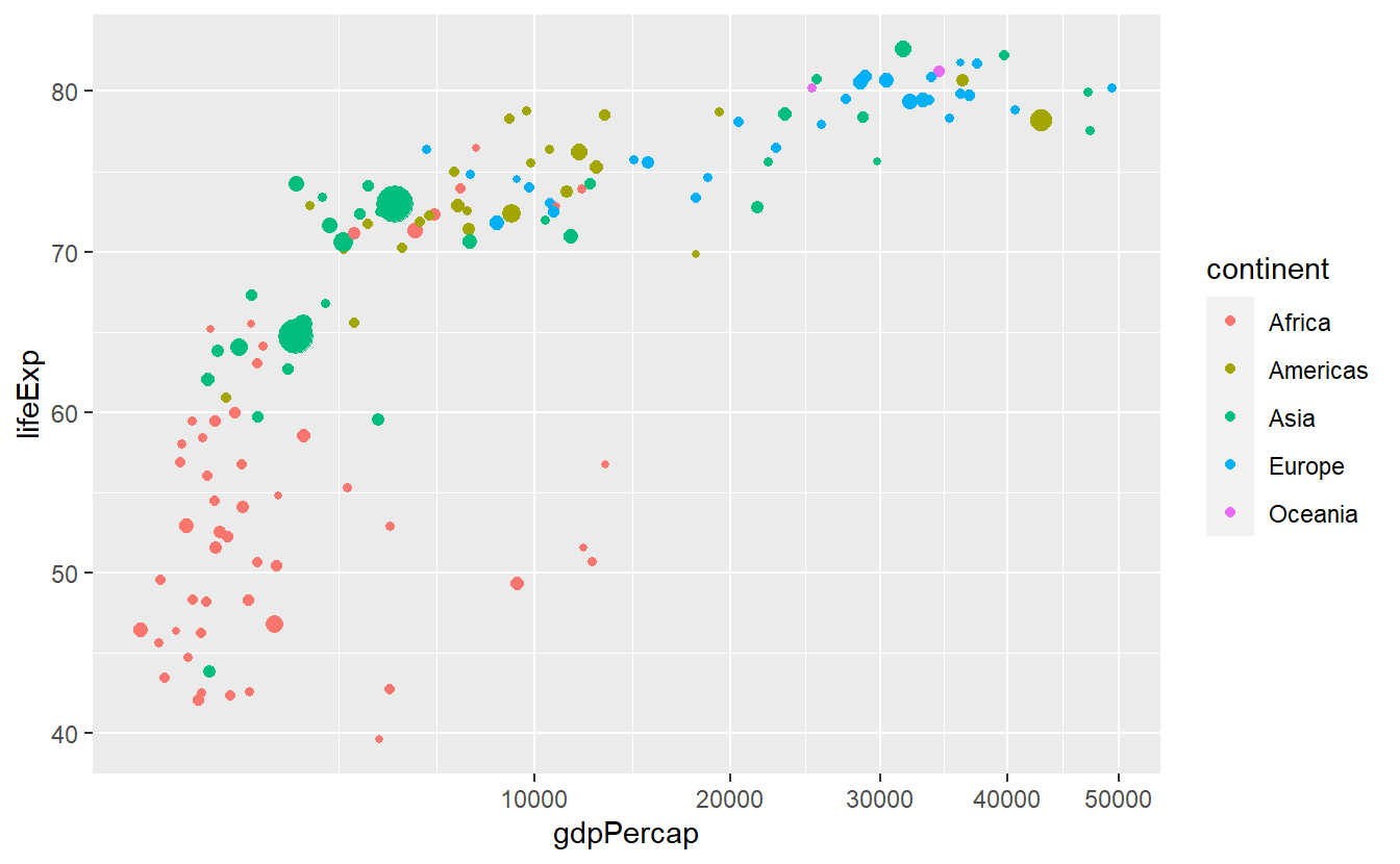
In this plot we might be dissatisfied with the way the x-axis is split after the transformation.
We can easily adjust the breaks manually.
ggplot(
  data = tib_2007,
  mapping = aes(
    x = gdpPercap,
    y = lifeExp,
    color = continent)
) +
  geom_point(mapping = aes(size = pop)) +
  scale_x_continuous(
    trans = "sqrt",
    breaks = c(2500, 5000, 10000)
  ) +
  guides(size = "none")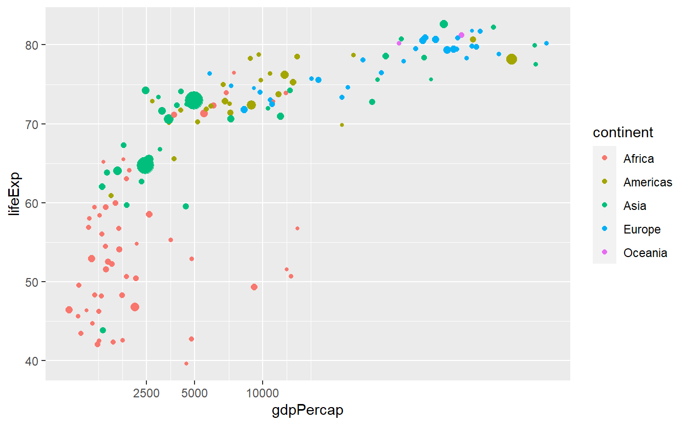
Also, we can adjust the break labels manually through setting the labels option.
This can come in handy when we for instance want to display the values in percent which is completely useless here but for instructive purpose we will do that anyway.
ggplot(
  data = tib_2007,
  mapping = aes(
    x = gdpPercap,
    y = lifeExp,
    color = continent)
) +
  geom_point(mapping = aes(size = pop)) +
  scale_x_continuous(
    trans = "sqrt",
    breaks = c(2500, 5000, 10000)
  ) +
  scale_y_continuous(labels = scales::percent) +
  guides(size = "none")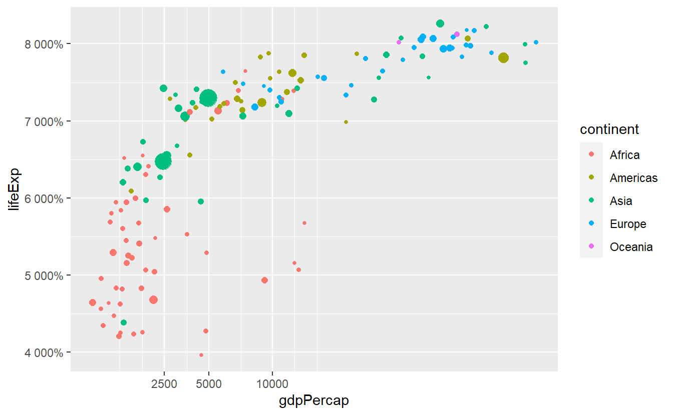
Notice that we defined labels through a function from the scales package27, i.e. we submitted the percent function and not the function’s output which would look like scales::percent().
This can be confusing at first, especially since RStudio always wants to auto-complete the ().
We have to do that because the labels option expects either NULL (for no labels), a character vector specifying all labels or a function that takes the current breaks and returns alternative labels.
Now, let’s talk about how to change the colors.
This is highly important because after a while you will get really sick of the default colors.
Though, you do not have to come up with a pretty color arrangement yourself.
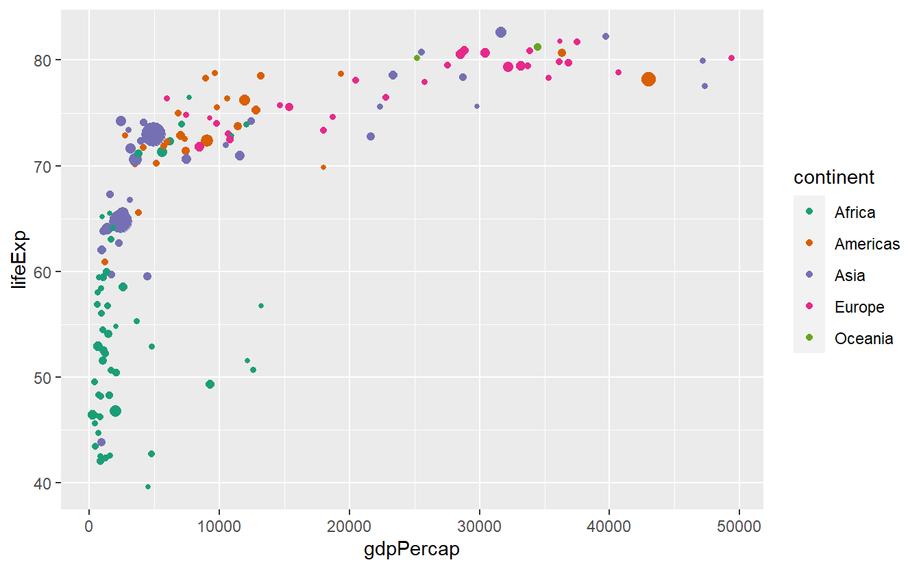
We can still let R do the heavy-lifting and the easiest way to change the colors is to add a scale_color_brewer() layer.
ggplot(
  data = tib_2007,
  mapping = aes(
    x = gdpPercap,
    y = lifeExp,
    color = continent)
) +
  geom_point(mapping = aes(size = pop)) +
  guides(size = "none") +
  scale_color_brewer()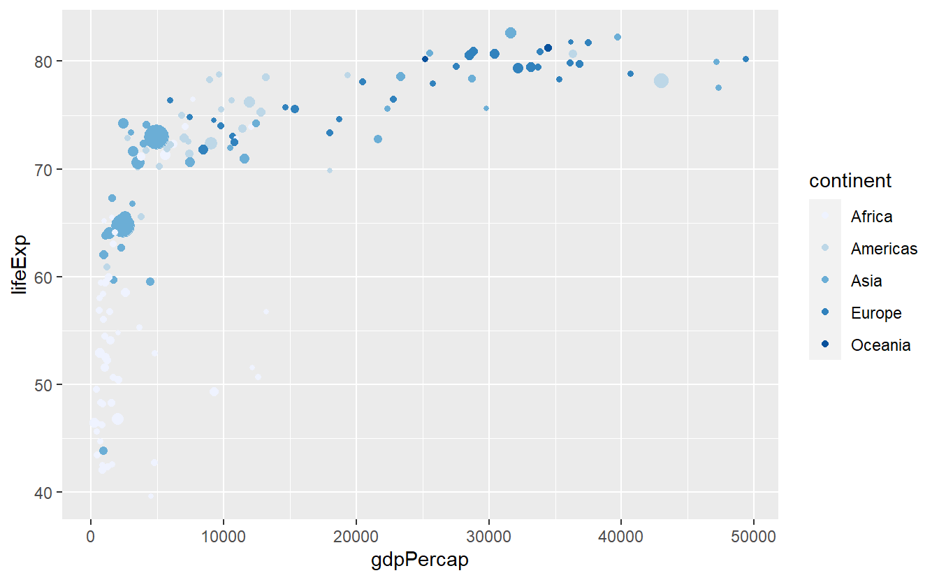
Personally, I would like to use a different palette on this plot, e.g.
p <- ggplot(
  data = tib_2007,
  mapping = aes(
    x = gdpPercap,
    y = lifeExp,
    color = continent)
) +
  geom_point(mapping = aes(size = pop)) +
  guides(size = "none")

p + scale_color_brewer(palette = "Set1")

p + scale_color_brewer(palette = "Dark2")

p + scale_color_brewer(palette = "Paired")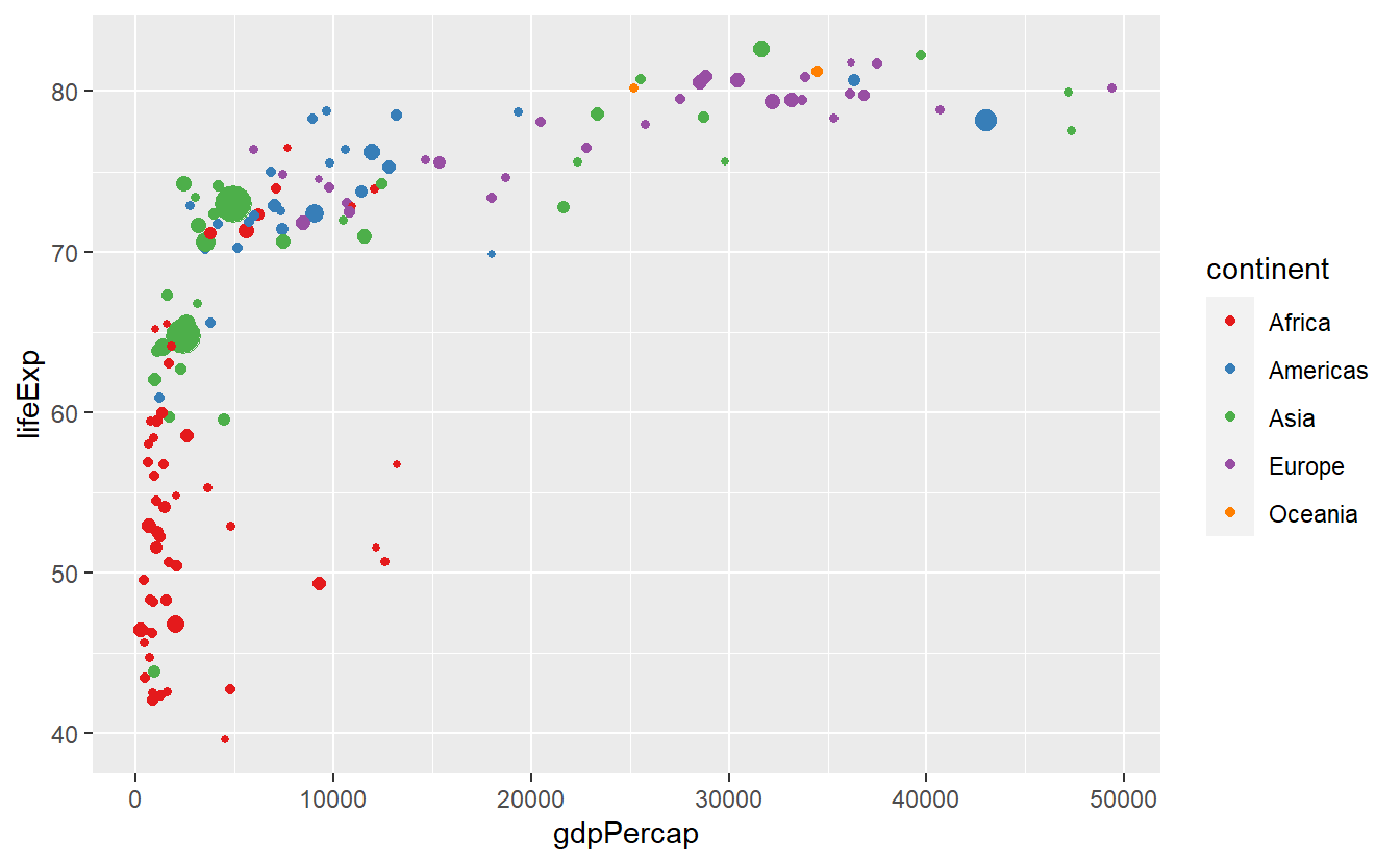
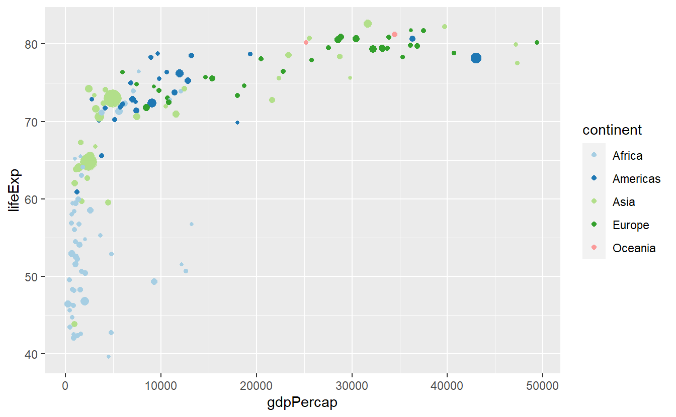
You can find more palettes through running RColorBrewer::display.brewer.all().
Finally, as we have already seen, it is also possible to assign colors according to a continuous numeric variable, e.g.
ggplot(
  data = tib_2007,
  mapping = aes(
    x = gdpPercap,
    y = lifeExp,
    color = lifeExp)
) +
geom_point() 
We can customize this colorbar via a gradient. Using something stereotypical we could associate low life expectancies with red (wrong) and high life expectancies with green (right).
ggplot(
  data = tib_2007,
  mapping = aes(
    x = gdpPercap,
    y = lifeExp,
    color = lifeExp)
) +
  geom_point() +
  scale_color_gradient(low = "orangered2", high = "seagreen3")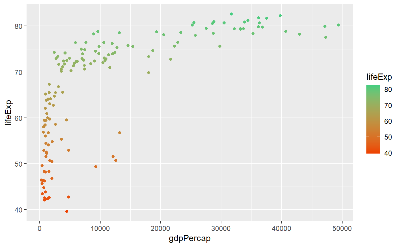
For now this is all we want to cover w.r.t. plot customization. Though, it is worth noting that we have barely scratched the surface here since there are a thousand more options you could tweak and there is very little you cannot adjust manually. Feel free to dive into those options if you are curious. In case you want to get the real deep dive into how ggplots work at their most basic level, you might want to take a look at the ggplot2 Book by Hadley Wickham, Danielle Navarro and Thomas Lin Pedersen.
2.5 Exercises
2.5.1 Jittered Points
Use the mpg dataset from the ggplot2 package and geom_point() to create the following plot.
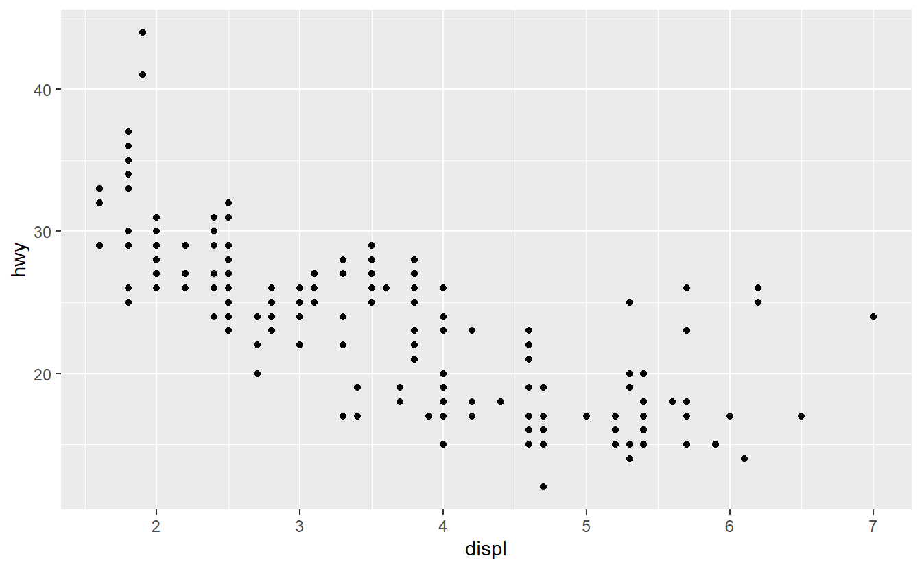
What does the plot describe?
Afterwards, use geom_jitter() instead of geom_point().
Explain the changes.
2.5.3 Positioning
Take a look at the following histogram we created earlier.
ggplot(
  data = tib_2007,
  mapping = aes(x = lifeExp, fill = continent)
) +
  geom_histogram()
#> `stat_bin()` using `bins = 30`. Pick better value with `binwidth`.
Try out all possible values for the
 position argument of geom_histogram() and describe how each argument changes the plot.
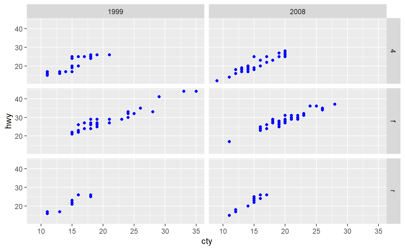
2.5.4 Debugging with Categorical Variables
If you want to use the mpg dataset from the ggplot2 package to summarize the distribution of the highway miles per gallon of both 1999 and 2008, you may want to create a plot like this.
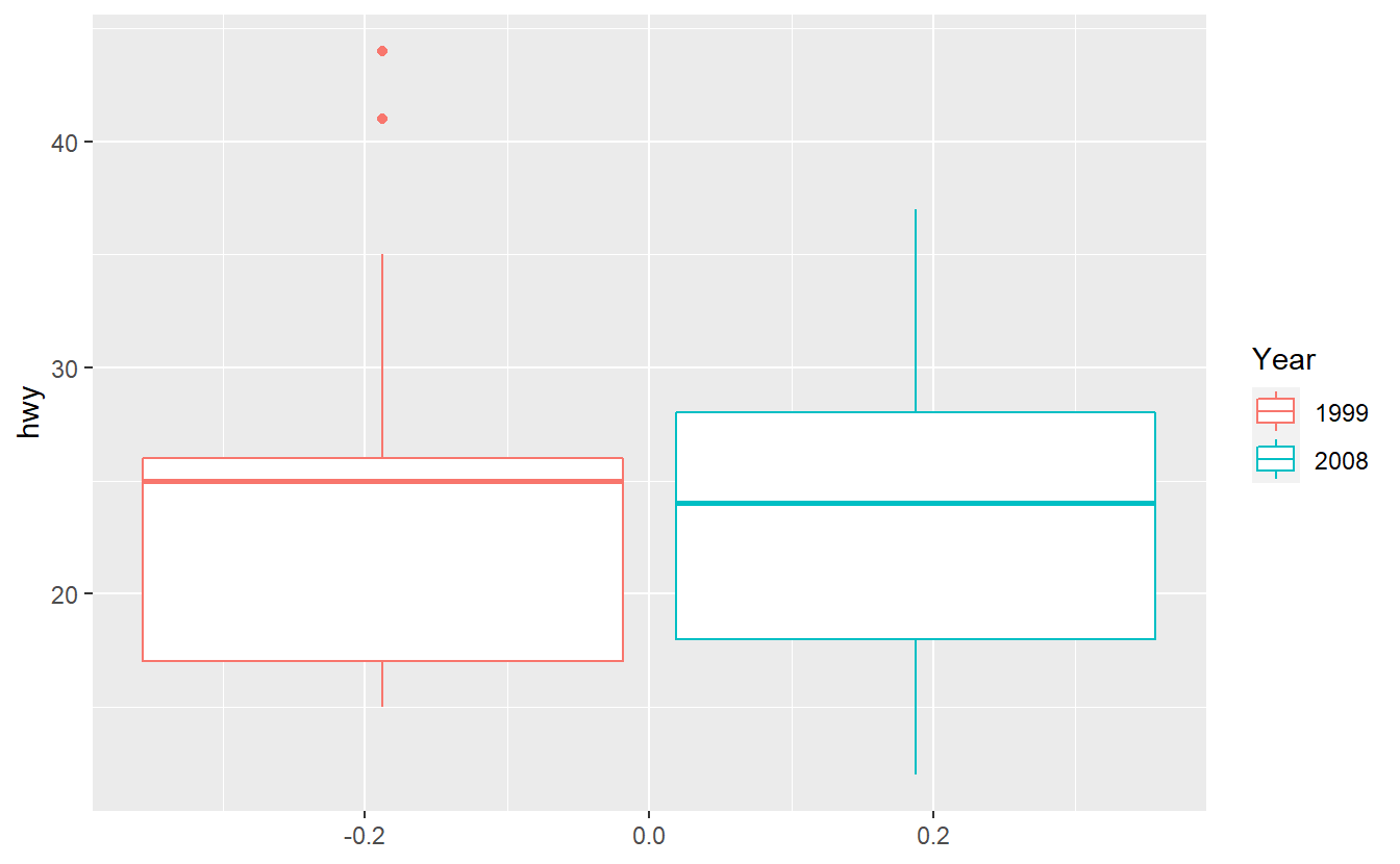
Unfortunately, the following code does not deliver the result you expect it to.
ggplot(data = mpg, aes(y = hwy, col = year)) +
  geom_boxplot()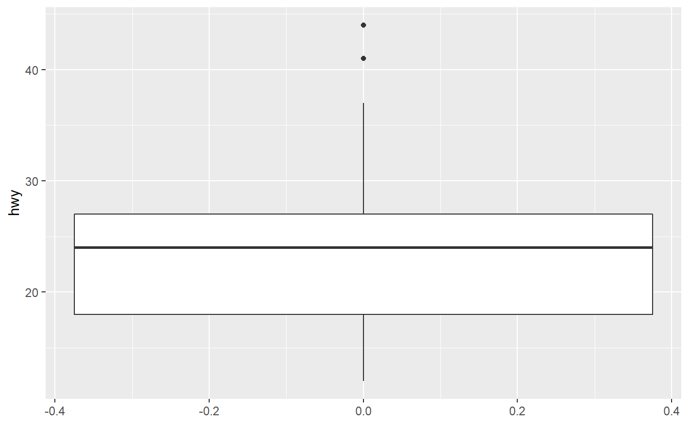
Try to figure out why ggplot was not able to understand that we want to split the data into two categories 1999 and 2008 here.
Maybe the function factor() can help you fix the problem.
2.5.5 Reorder Boxplots
Use the mpg dataset from the ggplot2 package to create the following plot.
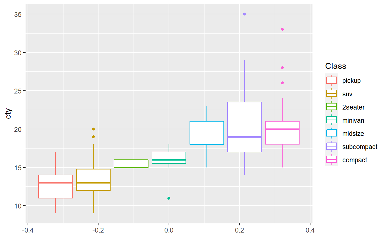
The plots shows that in this data set cars of the “compact” class have the highest median city miles per gallon. Do you think the same class will have also have the highest median highway miles per gallon in this data set? Test your hypothesis by creating the corresponding boxplots.
2.5.6 Creative Exercise
Get creative and make the following plot as ugly as possible.
ggplot(
  data = tib_2007,
  mapping = aes(
    x = gdpPercap,
    y = lifeExp,
    color = continent
  )
) +
  geom_point(mapping = aes(size = pop)) +
  guides(size = "none") +
  ggrepel::geom_label_repel(
    data = selectedCountries_2007,
    mapping = aes(label = country),
    box.padding = 3.5,
    point.padding = 0.5,
    show.legend = F
  )
Change labels, padding values, scales, colors, backgrounds, grids and and whatever else you can come up with to create the absolutely worst plot you can think of. The idea of this exercise is for you to try to change as many visual properties of a plot manually while avoiding the stress of having to make it “look good”28.