6 Hypothesis Testing
\(\def\1{\unicode{x1D7D9}}\)
In Chapter 4 we often wanted to simulate realizations from some distribution which we then learned to do. However, at the end of each simulation we always plotted the simulated realizations only to conclude that it to “sort of, kinda, somewhat” looks like what we would expect the plot to look like. Thus, we can assume that our simulation worked.
Of course, this sounds pretty arbitrary doesn’t it? What if someone else looked at the same picture we just looked at and said “Mmh, I am not so sure about this. It could have been just dumb luck that the plot you just created looks somewhat similar to what it needs to look like if the realizations are indeed drawn from the correct distribution”? As the geniuses that we are50 , we might tell that person to better provide strong evidence that we are in fact wrong. And if he cannot do so, we will just assume that our current assumption (that we are, of course, right) is true.
This is exactly where hypothesis tests come into play. Basically, they provide a framework to quantify and formalize our previous approach. Because as simple as it sounds, assuming something (in this case that our simulation worked) and comparing it to what it should look like if our assumption is true is not so arbitrary after all. It is just that if we do that comparison only visually, human inertia may kick in and make us see what we want to see. More crucially, we may also ignore that our success51 may have been pure chance.
And in all fairness, there is simply no way of knowing if we do not quantify the chances. And, again, this is where hypothesis tests may help us. Therefore, this chapter is dedicated to making our conclusions from data more rigorous using hypothesis tests.
6.1 The Fundamental Principles of Hypothesis Testing
Let us begin our journey into hypothesis testing with a toy example. Assume that we have a sample of realizations from a normal distribution with unknown mean \(\mu\) and known standard deviation \(\sigma = 2\).
Let us assume that this sample represents an anonymous survey of the weekly amount of hours students spent working on the content from the course I taught last semester.
Also, assuming that whoever implemented rnorm() did this correctly, that sample may look like this.
set.seed(123)
sigma <- 1
n <- 100
sample <- rnorm(n, unknown_mu, sd = sigma)
str(sample) # Compact display of vector
#>  num [1:100] 9.16 9.49 11.28 9.79 9.85 ...
The students claim that on average each one of them spent ten hours each week on course-related activities.
Same as before we may look at a histogram of our sample to gain some insights into whether this claim is actually true.
ggplot() +
  geom_histogram(aes(sample), binwidth = 0.25)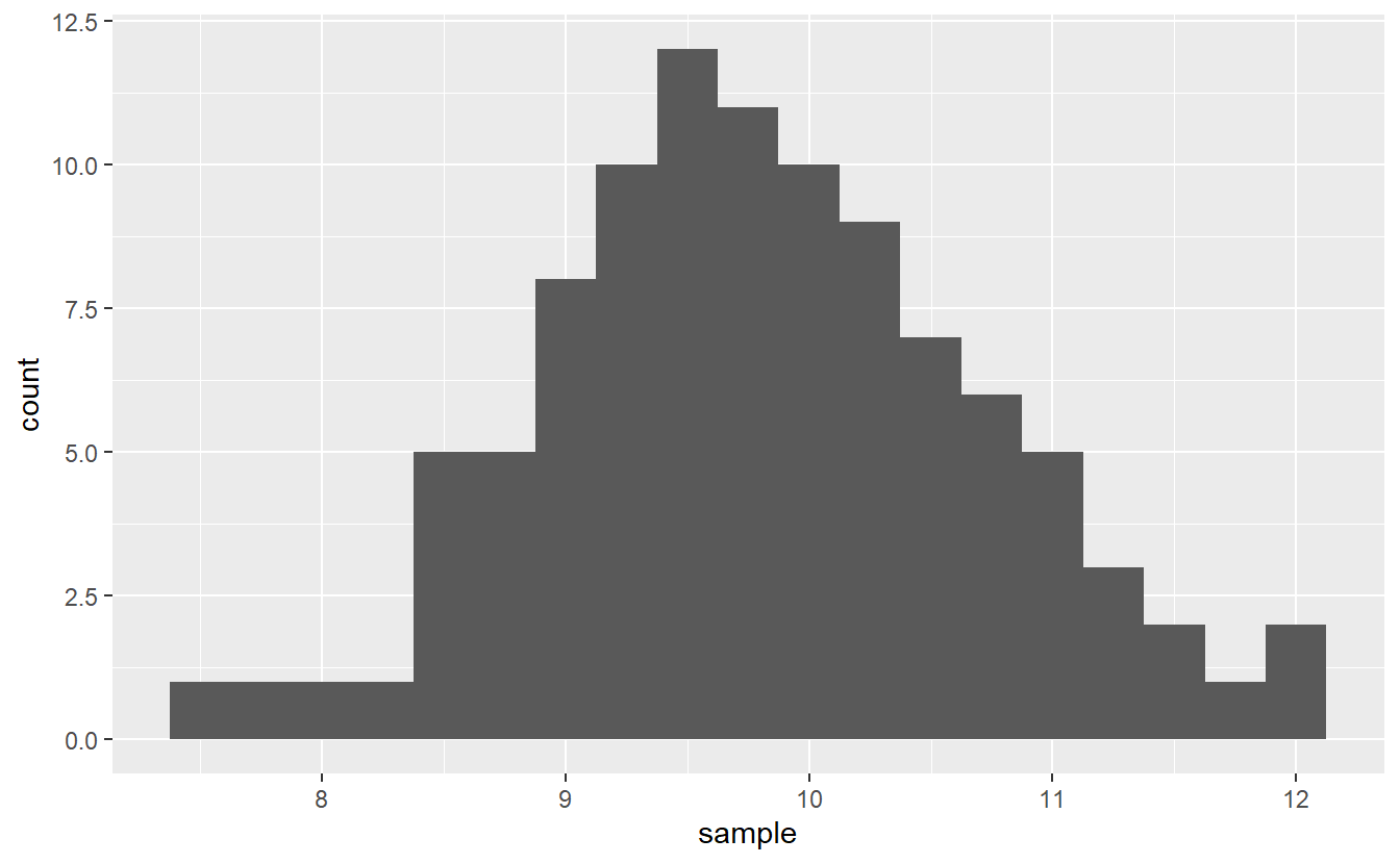
In theory, if the claim were true, this means that \(\mu\) should be equal to ten and one may expect the histogram to peak there. However, by chance alone this picture can get somewhat distorted. Consequently, looking at this histogram alone, it is hard to tell if the claim is true or not.
So, let’s test the so-called null hypothesis \(H_0: \mu = 10\) against the alternative hypothesis \(H_1: \mu \neq 10\). This is usually done through the lens of a so-called test statistic. Its main objective is to summarize the sample into a single quantity whose distribution we know if the null hypothesis were actually true. This known distribution is also called null distribution.
In this case, what might be a reasonable test statistic? Well, probability theory tells us that if \(X_k \sim \mathcal{N}(\mu, \sigma^2)\), \(k \in \mathbb{N}\), are iid. random variables, then \[\begin{align*} T = \sqrt{n} \frac{\overline{X}_n - \mu}{\sigma} \sim \mathcal{N}(0, 1) \end{align*}\] where \(\overline{X}_n\) denotes the sample mean.
This means that if the null hypothesis is actually true52, then for independent samples the test statistic distribution may look similar to this
set.seed(123)
N <- 10000
Ts <- numeric(N)
for (i in seq_along(Ts)) {
  samp <- rnorm(n, mean = 10, sd = sigma)
  Ts[i] <- sqrt(n) * (mean(samp) - 10) / sigma
}

x <- seq(-3, 3, 0.01)
standard_normal_density <- dnorm(x)
ggplot() +
  geom_histogram(aes(x = Ts, y = ..density..)) +
  geom_line(aes(x, standard_normal_density), col = "red", size = 1)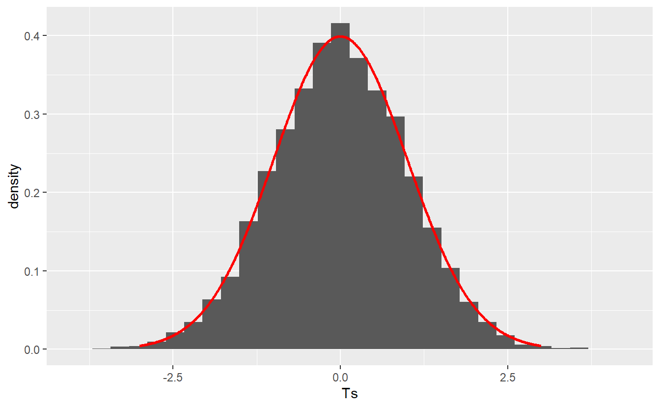
Therefore, the null distribution puts the observed value of our test statistic into perspective. This means that if our null hypothesis is actually true, then even though the test statistic’s value may vary due to randomness, it is highly unlikely that the test statistic’s value w.r.t. our initial sample is located on the far right of this picture, say 4. Consequently, if this happens you could reject the null hypothesis.
On the other hand, if you observe that the sample’s test statistic value is located somewhere near the origin of the above picture, then you would have to conclude that the test statistic is within the reasonable variation we should expect. It is important to stress that this is absolutely not the same as to say that the null hypothesis is true.
Think about it: What if the true mean \(\mu\) is equal to 10.005? Then saying that \(\mu = 10\) is plain wrong. But a hypothesis test may not detect this small deviation as it might be disguised within the “reasonable variation” we expect anyway. Thus, a hypothesis test can be used to give evidence that a hypothesis is wrong and needs to be rejected but it may never proof that a hypothesis is true.
Of course, this begs the question what constitutes “strong” evidence against our null hypothesis? As we said earlier, a far out value of the test statistic may be such strong evidence but what is actually “far out”? This, again, is where null distribution offers perspective.
Since the null distribution is known in this case, we can use its quantiles to find a threshold for where we want to draw the line w.r.t. what values of the test statistic are deemed too unlikely. This is controlled by what is usually refered to as the significance level \(\alpha \in (0, 1)\).
Fundamentally, this significance level is an upper bound for the probability that our null hypothesis is rejected, i.e. \(\mathbb{P}(T \in K) \leq \alpha\) where \(K\) is the set of too unlikely test statistic values also known as the rejection area. Of course, the rejection area depends on the null distribution and the significance level \(\alpha\).
In this example where our test statistic follows a standard normal distribution, the rejection area may look like \(\{x \in \mathbb{R} : \vert x \vert > z_{1 - \alpha/2} \}\) where \(z_\alpha\) denotes the \(\alpha\)-quantile of the standard normal distribution.
Note that elementary probability theory shows that for our current test statistic \(T\) it holds that \(\mathbb{P}(\vert T \vert > z_{1-\alpha/2}) = \alpha\). Thus, this rejection area corresponds to a hypothesis test of significance level \(\alpha\).
This means that if the test statistic of our sample is - depending on your choice of \(\alpha\) - in one the following shaded regions, we reject the null hypothesis.
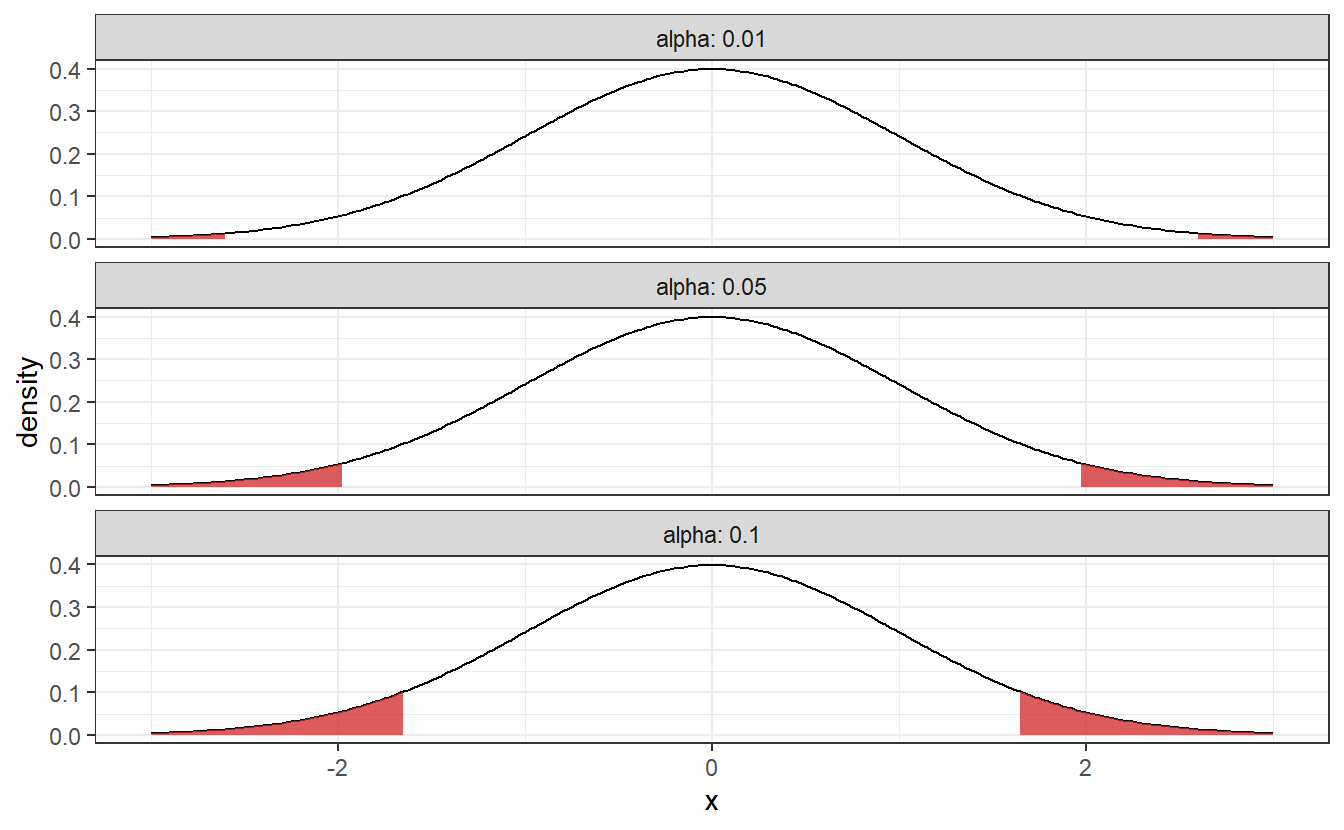
As you can see these rejection area are getting larger as \(\alpha\) increases. This corresponds to how willing we are to a reject our null hypothesis, i.e. if \(\alpha\) is small, then we will need pretty strong evidence to reject the null hypothesis. To avoid fiddling with the results, \(\alpha\) should be chosen before you implement the hypothesis test. Common choices for \(\alpha\) include 1%, 5% and 10%.
Coming back to the student’s amount of hours spent working, choosing \(\alpha = 0.05\), we now understand what it takes to test the students’ claim that their average amount of weekly hours is \(\mu = 10\). Let’s see where the sample’s test static lies in our above plot.
alpha <- 0.05
n <- length(sample)
sigma <- 1 # was previously given
statistic <- sqrt(n) * (mean(sample) - 10) / sigma

x <- seq(-3, 3, 0.025)
y <- dnorm(x)

tib_norm <- tibble(
  x = x,
  density = y,
  alpha = alpha,
  quantile = qnorm(1 - alpha / 2)
)

tib_norm <- tib_norm %>%
  mutate(rejected = abs(x) > quantile)

tib_rejected <- tib_norm %>% filter(rejected)
tib_lower <- tib_rejected %>% filter(x < 0)
tib_upper <- tib_rejected %>% filter(x > 0)

ggplot(data = tib_norm, aes(x, density)) +
  geom_line() +
  geom_area(data = tib_lower, alpha = 0.75, fill = "firebrick3") +
  geom_area(data = tib_upper, alpha = 0.75, fill = "firebrick3") +
  geom_vline(xintercept = statistic, col = "Firebrick4", size = 1)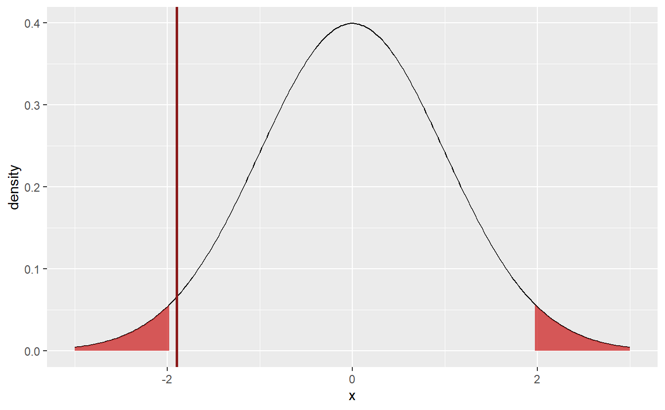
Here, the test statistic (indicated by the red line) does not fall within the rejection area. Thus, I cannot reject the null hypothesis \(\mu = 10\). Though, If I had chosen \(\alpha = 0.1\) instead, it looks like the hypothesis would have been rejected, since the test statistic is already close to the current rejection area. But since I decided in advance on the significance level, there is no going back.
Nevertheless, I still did not put all my assumptions into the design of the test yet, so let us remedy that. You may have already noticed that the rejection areas are symmetric in the sense that they will penalize too large and too small values. This corresponds to a two-sided test.
Since I am wary of my student exaggerating their amount of work rather than understating it, it would not be appropriate for me to test \(H_0: \mu = 10\) vs. \(H_1: \mu \neq 10\). Rather I should use a one-sided test \(H_0: \mu \geq 10\) vs. \(H_1: \mu < 10\). Notice here that \(H_0\) does not correspond to my believe but rather the opposite of it. This is because a test can only be rejected. Thus, if I want to gather evidence for my theory, I need to debunk the opposite.
In effect, the rejection area of the test needs to be adjusted to the new null hypothesis, i.e. I will only reject if the test statistic becomes too small. For the current test statistic this corresponds to the rejection area \(\{x \in \mathbb{R} : x \leq z_\alpha\}\). The fact that under the null hypothesis, i.e. if \(\mu \geq \mu_0 = 10\), this rejection area corresponds to a significance level of \(\alpha\) can be seen as follows \[\begin{align*} \mathbb{P}\bigg(\sqrt{n} \frac{\overline{X}_n - \mu_0}{\sigma} \leq z_\alpha\bigg) &= \mathbb{P}\bigg(\sqrt{n} \frac{\overline{X}_n - \mu}{\sigma} \leq z_\alpha - \sqrt{n} \frac{\mu - \mu_0}{\sigma}\bigg) \\ &\leq \mathbb{P}\bigg(\sqrt{n} \frac{\overline{X}_n - \mu}{\sigma} \leq z_\alpha\bigg) = \alpha \end{align*}\]
Therefore, let’s see how the sample fares with this new test.
tib_norm <- tibble(
  x = x,
  density = y,
  alpha = alpha,
  quantile = qnorm(alpha)
)

tib_norm <- tib_norm %>%
  mutate(rejected = x <= quantile)

tib_rejected <- tib_norm %>% filter(rejected)
tib_lower <- tib_rejected %>% filter(x < 0)

ggplot(data = tib_norm, aes(x, density)) +
  geom_line() +
  geom_area(data = tib_lower, alpha = 0.75, fill = "firebrick3") +
  geom_vline(xintercept = statistic, col = "Firebrick4", size = 1)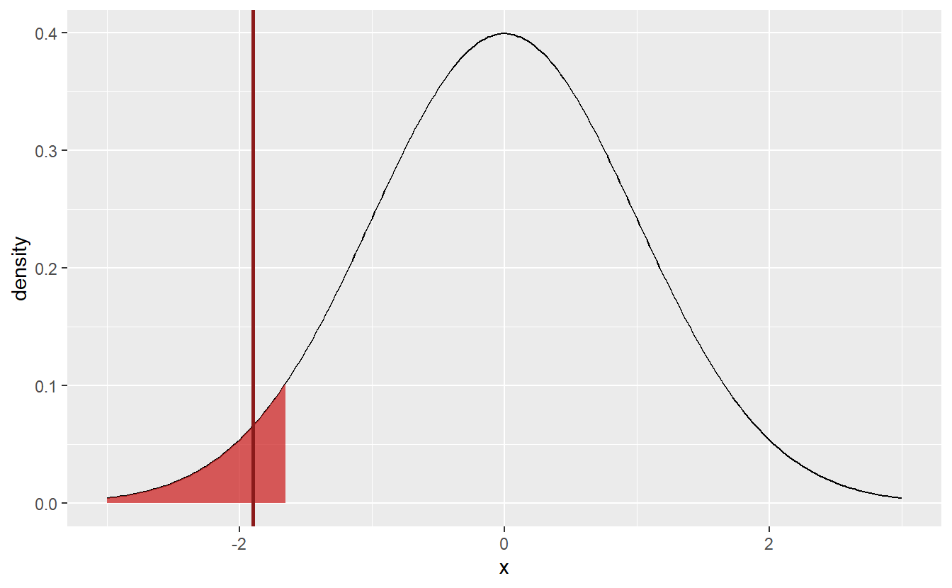
Consequently, this new hypothesis test would reject the hypothesis that \(\mu \geq 10\) and I would have some evidence that, in fact, the students were (not necessarily consciously) misjudging their average amount of working hours.
To conclude this section, notice that we adjusted the test after the fact. This is not a good practice but was done here anyway to demonstrate the difference between one-sided and two-sided tests. What’s more, in general you have to be careful when running multiple tests (which can be justified in some instances). That is because if you run enough tests, then some of your tests may be rejected by chance alone. This is known in the literature as multiple testing problem which is outside the scope of this text but was mentioned here for your awareness.
6.2 p-Values
In the last section we implemented a so-called Z-test as it relies on the statistic \[\begin{align*} T = \sqrt{n}\frac{\overline{X}_n - \mu_0}{\sigma} \end{align*}\] which is sometimes referred to as Z-statistic. Later, we will get to know more tests such as t-tests and F-tests which use statistics whose null distribution follows a t- resp. F-distribution. In its principles, all these tests follow the same approach as the previous Z-test, i.e. they
- Find a suitable statistic \(T\) whose null distribution is known
- Use the quantiles of said null distribuion to construst a proper rejection area depending on whether the test is one- or two-sided
- Check whether the specific sample yields that the statistic lies within the rejection area.
As such, I believe it is more instructive to talk about some more general concepts first before we look at different tests. One notorious term which is bound to come up when you are talking about hypothesis tests is p-values. Before we talk about what makes this concept so notorious, let us define it first.
Let \(T\) be a statistic which follows some unknown distribution, \(t\) the value of said statistic for an observed sample and \(H_0\) a null hypothesis. Then, the p-value \(p\) is given by
- \(p = \mathbb{P}(T \leq t \vert H_0)\) for a one-sided left-tail test, i.e. a test whose rejection area is on the left-tail of the null distribution, e.g. such as the test we conducted at the end of the last section
- \(p = \mathbb{P}(T \geq t \vert H_0)\) for a one-sided right-tail test
- \(p = 2\min \big\{ \mathbb{P}(T \geq t \vert H_0), \mathbb{P}(T \leq t \vert H_0) \big\}\) for two-sided tests.
Informally, the \(p\)-value puts the “extremeness” of the observed sample into context via the probability that the statistic \(T\) is more extreme than the observed value \(t\) given that the null hypothesis is true. In hypothesis testing, this translates to us being able to reject the null hypothesis if this probability \(p\) is small. More specifically, we may reject the null hypothesis if \(p \leq \alpha\).
In the left-tail test we conducted before, the p-value is bounded from above by
pnorm(statistic)
#> [1] 0.02898393
which is another justification to reject the null hypothesis.
Ok, so we have got that covered. What is so notorious now? As with all statistics, the problem with this p-value arises when one puts too much faith into one single quantity and reduces data analysis to just that. Apparently, this has led to people simply looking for instances where \(p < 0.05\) and claiming this proves what they wanted to proof. This behavior became known as “p-hacking”.
Apparently, this became such a problem that in 2015 some scientific journals decided to ban the use of p-values and null hypothesis significance testing53.
Then, in 2016, the American Statistical Association (ASA) released a statement on p-values summarizing the “problems”54 regarding p-values that occured in the past and offering a profound perspective on the whole discussion.
I highly recommend that you read the statement in full but just in case, here are two quotes that you should definitely take with you:
- “P-values can indicate how incompatible the data are with a specified statistical model. […] This incompatibility can be interpreted as casting doubt on or providing evidence against the null hypothesis or the underlying assumptions.”
- “Scientific conclusions and business or policy decisions should not be based only on whether a p-value passes a specific threshold.”
6.3 Confidence intervals
Another important concept is that of confidence intervals which can be thought of as complementary to hypothesis tests.
Recall that the significance level \(\alpha\) of a hypothesis test means that the probability that the test is rejected under the null hypothesis is at most \(\alpha\). Using the z-statistic \(T\) as above with rejection area \(K = \{x \in \mathbb{R} : \vert x \vert > z_{1 - \alpha/2} \}\) we know that \(\mathbb{P}(T \in K) \leq \alpha\) and consequently \(\mathbb{P}(T \notin K) \geq \alpha\). Notice that the latter can be rewritten as follows \[\begin{align*} 1 - \alpha &\leq \mathbb{P}\bigg( \bigg\vert \sqrt{n}\frac{\overline{X}_n - \mu}{\sigma}\bigg\vert \leq z_{1-\alpha/2} \bigg) \\ &= \mathbb{P}\bigg( \overline{X}_n - \frac{\sigma z_{1-\alpha/2}}{\sqrt{n}} \leq \mu \leq \overline{X}_n + \frac{\sigma z_{1-\alpha/2}}{\sqrt{n}} \bigg). \end{align*}\]
Therefore, we know that with probability of at least \(1 - \alpha\) the random interval \(I = [\overline{X}_n - \sqrt{n}\sigma z_{1-\alpha/2}, \overline{X}_n + \sqrt{n}\sigma z_{1-\alpha/2}]\) contains the real unknown parameter \(\mu\). This is why \(I\) is called a \((1-\alpha)-\text{confidence interval}\).
Let us visualize this with a small example using realizations from a normal distribution.
set.seed(123)
# Arbitrary parameters
unknown_mu <- 3
sigma <- 2
alpha <- 0.05

# Compute intervals for random samples
q <- qnorm(1 - alpha / 2)
n <- 100   # sample length
N <- 50    # amount of random intervals
lower_bound <- numeric(N)
upper_bound <- numeric(N)
for (i in seq_along(lower_bound)) {
  sample <- rnorm(n, mean = unknown_mu, sd = sigma)
  lower_bound[i] <- mean(sample) - sigma * q / sqrt(n)
  upper_bound[i] <- mean(sample) + sigma * q / sqrt(n)
}

# Visualize intervals and check how often mu is included
tibble(
  i = seq_along(lower_bound),
  lower_bound = lower_bound,
  upper_bound = upper_bound
) %>%
  ggplot() +
  geom_errorbar(aes(y = i, xmin = lower_bound, xmax = upper_bound)) +
  geom_vline(xintercept = unknown_mu, col = "Firebrick4", size = 1)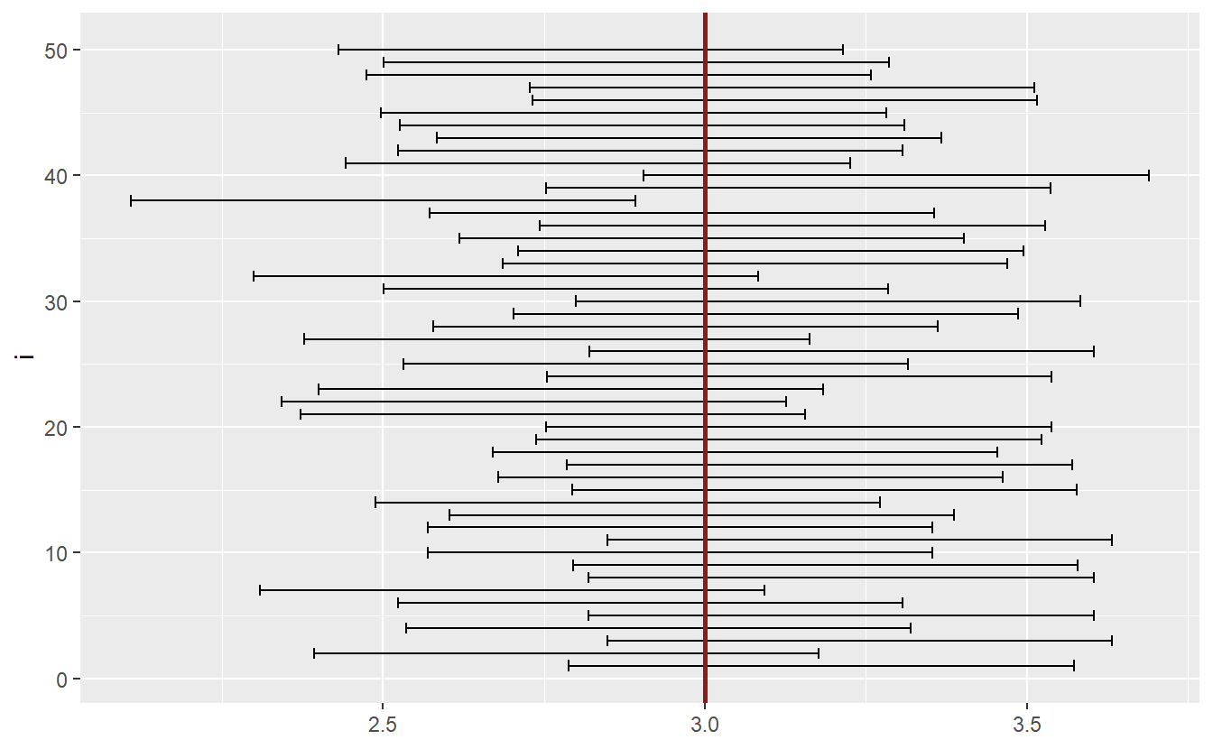
As you can see, most intervals include the unknown parameter \(\mu\). If we were to simulate enough intervals, then the percentage of intervals not containing \(\mu\) would correspond to \(\alpha\).
Given a sample, confidence intervals are an easy way to check whether a null hypothesis in the form of \(H_0: \mu = \mu_0\) will be rejected. Since a rejection of the test means that the test statistic lies within the rejection area, we could also check whether the value \(\mu_0\) lies within the confidence interval. If it does not, then the test will be rejected.
6.4 Simulation-based Hypothesis Testing
So far, we have only looked at the Z-statistic \(T = \sqrt{n}(\overline{X}_n - \mu) / \sigma\) and samples drawn from a normal distribution. This allowed us to cover the basics of hypothesis testing without having to worry much about complicated looking test statistics and, more importantly, their null distribution. But what happens if our sample for instance is not drawn from a normal distribution? Does \(T \sim \mathcal{N}(0, 1)\) still hold then?
Of course, this is not strictly true but the central limit theorem will tell us that, in a lot of cases, this assertion is at least approximately true if the sample size is large enough. Fine, we dodged a bullet there but what happens if the parameter \(\sigma\) is unknown too and we have to estimate it as the square root of the sample variance \(s^2_n\)? What distribution can we expect for the new statistic \(\tilde{T} = \sqrt{n}(\overline{X}_n - \mu) / s_n\)?
The statistical standard theory states that the new statistic follows a t-distribution with \(n-1\) degrees of freedom if the observations are drawn from a normal distribution. This is also why this new statistic is often called t-statistic and the corresponding test is called t-test. In this case, it would be easy to construct a hypothesis test using the quantiles of the t-distribution. However, if the normality assumption is not fulfilled, it is not immediately clear what null distribution we can expect.
To circumvent this issue there are two simulation-based approaches we can use. The first one is pretty straight-forward: Simply simulate enough random variables from your null distribution and approximate the test statistic’s distribution Monte-Carlo style and check how well your initial observation fits into this distribution.
However, this approach relies on the fact that you need to assume the distribution of your observations and can simulate said distribution. Consequently, you will need to have a reasonable guess what distribution might be appropriate. As we will see, the second approach known as bootstrapping is not subject to this problem.
6.4.1 Simulating new observations from a well-known distribution
Since this idea is pretty straight-forward, let us simply look at a specific example. We will assume that our sample is drawn from an exponential distribution and we will test the null hypothesis \(H_0: \mu = 5\) vs. \(H_1: \mu \neq 5\) where \(\mu\) corresponds to the mean of the underlying distribution.
Thus, let us artificially generate an original sample with mean \(\mu = 7\) (i.e. the null hypothesis is wrong)
set.seed(123)
n <- 40 # sample size
real_mu <- 7
sample <- rexp(n, rate = 1 / real_mu)
str(sample)
#>  num [1:40] 5.904 4.036 9.303 0.221 0.393 ...
Now, we may compute the sample’s t-statistic w.r.t. to our null hypothesis
Alright, this is the value we will need to compare to the statistic’s distribution under the null hypothesis. Therefore, let us generate samples of the same length as the original sample drawn from an exponential distribution with mean \(\mu_0 = 5\).
set.seed(12345)
N <- 100000 # Monte-carlo samples
tStats <- numeric(N)
for (i in seq_along(tStats)) {
  simu_sample <- rexp(n, rate = 1 / mu_0)
  tStats[i] <- sqrt(n) * (mean(simu_sample) - mu_0) / sd(simu_sample)
}

# Compare distribution to original observed statistic
alpha <- 0.05
left_quantile <- quantile(tStats, alpha / 2)
right_quantile <- quantile(tStats, 1 - alpha / 2)
ggplot() +
  geom_histogram(aes(x = tStats)) +
  geom_vline(xintercept = tStat, size = 1, col = "red") +
  geom_vline(xintercept = left_quantile, size = 1, col = "green") +
  geom_vline(xintercept = right_quantile, size = 1, col = "green")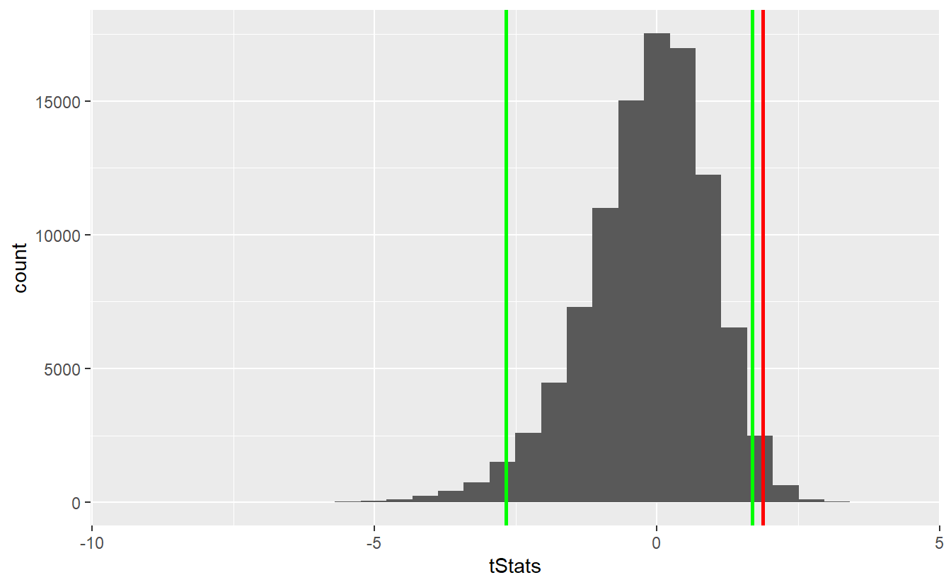
As we can see, the observed statistic lies within the rejection area (outside the area between the two green lines). Consequently, we can reject the null hypothesis. For comparison, let’s check how the t-distribution had fared here.
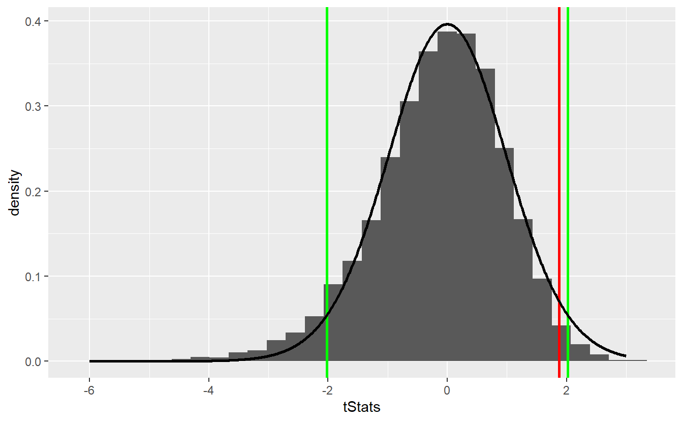
tib_t <- tibble(
  x = seq(-6, 3, 0.01),
  density = dt(x, df = n - 1)
)

left_t_quantile <- qt(alpha / 2, df = n - 1)
right_t_quantile <- qt(1 - alpha / 2, df = n - 1)

ggplot() +
  geom_histogram(aes(x = tStats, y = ..density..)) +
  geom_vline(xintercept = tStat, size = 1, col = "red") +
  geom_vline(xintercept = left_t_quantile, size = 1, col = "green") +
  geom_vline(xintercept = right_t_quantile, size = 1, col = "green") +
  geom_line(data = tib_t, aes(x, density), size = 1)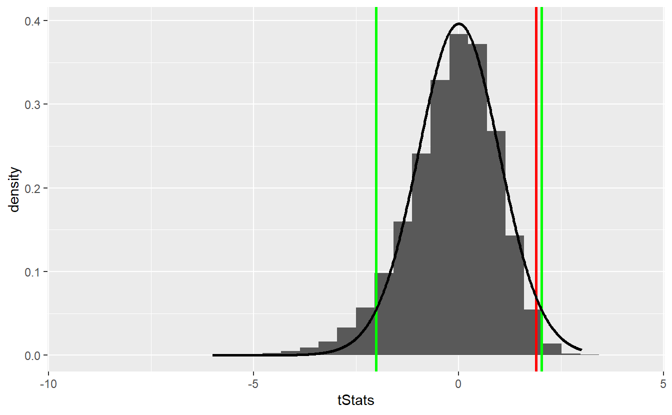
In this scenario, we would not have been able to reject the null hypothesis even though the approximation via the t-distribution does not look too shabby55.
6.4.2 Bootstrap
In the previous example, we had to assume that we knew or at least reasonably guessed that the original observations are drawn from an exponential distribution. Of course, we might be wrong about our assumption which could introduce an error we aim to avoid.
Luckily, there is a (frankly magical56) statistical technique called bootstrapping which makes our lifes much easier in this regard. The idea behind bootstrapping is to treat our original sample as representative of the whole population. If this is indeed the case, we might as well use the original sample as though it were the whole population to generate more samples from it by drawing from the original sample with replacement57.
This way, we can generate a lot more samples that we can use similarly to how we used the simulated samples in the previous section. However, we will have to transform our original observations before sampling from it such that we are in fact sampling from the null distribution we want to test.
For instance, imagine that we want to test \(H_0: \mu = 5\) vs. \(H_1: \mu \neq 5\) like in the previous section. Then, we will have to make sure that we sample from a distribution that has mean \(\mu_0 = 5\). We can artificially make our sample fulfill this by subtracting the sample’s mean and adding \(\mu_0 = 5\) to it. Of course, if the null hypothesis is true, this will not change much and that is exactly the point.
Now, we will implement the bootstrap test.
To do so, we will use the package infer for its rep_sample_n() function which generates the samples for us and does so quite fast.
library(infer)
N <- 10000 # amount of bootstrap samples
tib_original <- tibble(
  # transformed original
  original = sample - mean(sample) + mu_0
)
set.seed(123)
samples <- rep_sample_n(
  tib_original,
  size = n,
  replace = TRUE,
  reps = N
)
The tibble samples now contains two columns replicate and original containing numbers 1 to N and the drawn samples respectively, i.e. it looks like this
samples
#> # A tibble: 400,000 x 2
#> # Groups:   replicate [10,000]
#>   replicate original
#>       <int>    <dbl>
#> 1         1   13.4
#> 2         1   -0.418
#> 3         1    0.904
#> 4         1    7.57
#> 5         1    2.67
#> 6         1    0.904
#> # ... with 399,994 more rows
For each sample, we can now easily compute our test statistic.
tStats <- samples %>%
  group_by(replicate) %>%
  summarise(stat = sqrt(n) * (mean(original) - mu_0) / sd(original)) %>%
  pull(stat)

left_quantile <- quantile(tStats, alpha / 2)
right_quantile <- quantile(tStats, 1 - alpha / 2)
ggplot() +
  geom_histogram(aes(x = tStats)) +
  geom_vline(xintercept = tStat, size = 1, col = "red") +
  geom_vline(xintercept = left_quantile, size = 1, col = "green") +
  geom_vline(xintercept = right_quantile, size = 1, col = "green")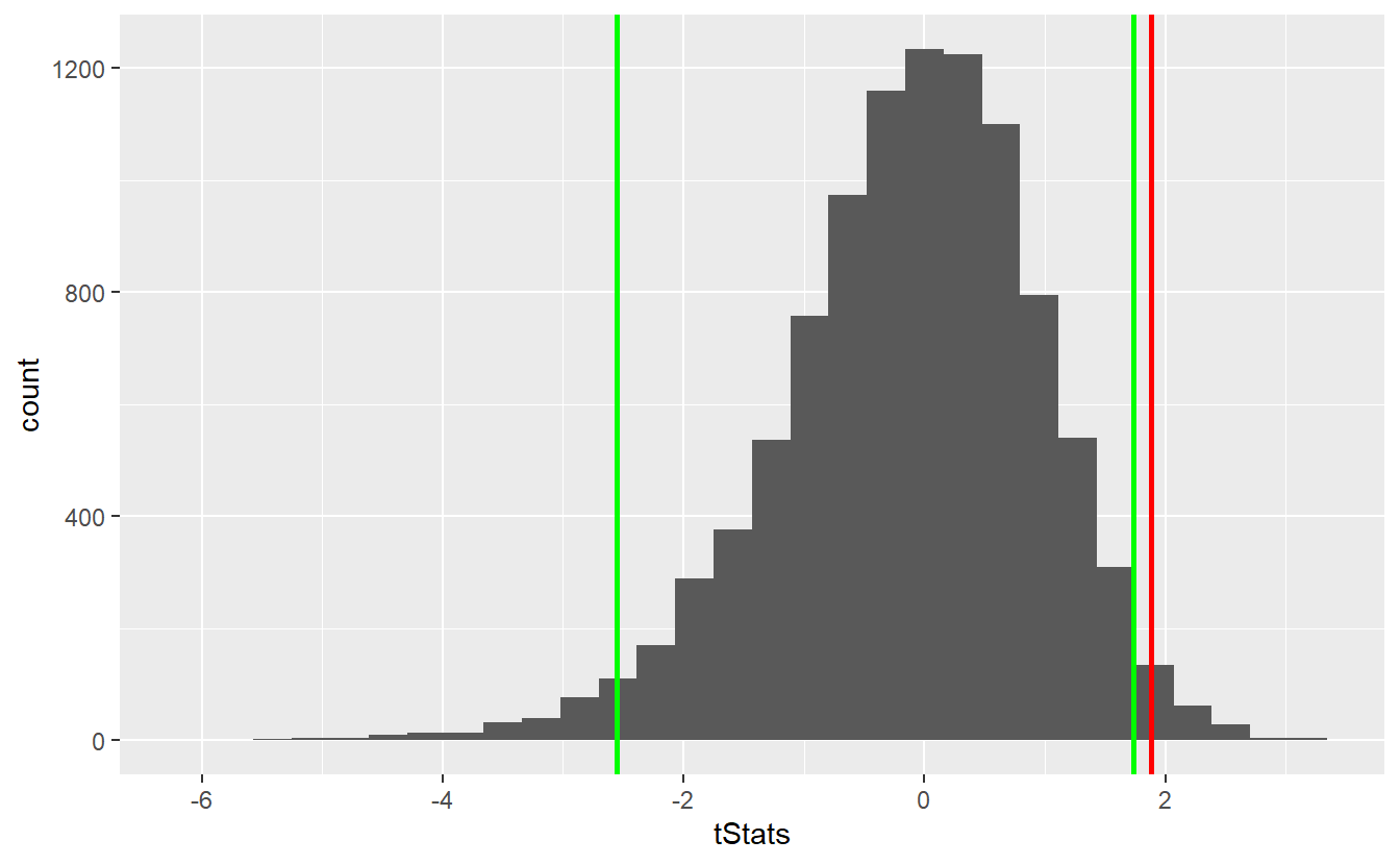
As you can see, the bootstrap delivers quite similar results to our first simulation-based hypothesis test and the test decision remain unchanged. Similarly, the comparison with the theoretical t-test looks similar
Though bootstrapping is a really neat technique it may be wise to end this section on a word of caution. With bootstrapping, in our subsequent samples we cannot observe any other values that were not present in the original sample. In fact, this is the key point why we need to assume that our original sample is representative of our whole distribution.
In a lot of cases, this assumption can be made somewhat easily. However, there are instances when this is not quite true. For example, imagine that an insurer wants to model the financial impact of natural catastrophes like floods, storms etc. Naturally that insurer will observe a lot of small claims resulting from rather weak storms but what is driving the total amount of claims will be the rare but highly forceful ones. This kind of behavior can be replicated by distributions with an infinite variance which is why they are popular among insurers.
By definition, in a reasonably sized sample these rare but forceful events won’t occur frequently. Consequently, resampling from such a sample may underestimate the impact of these rare events which is why bootstrapping may yield erroneous results.
By now, there are methods that can to a degree cope with that but this is not within the scope of these lecture notes. So, just remember that even though bootstrapping is neat, it is not a cure-all.
6.5 The infer Package
We have already used the infer package to implement the resampling task as part of the previous bootstrap test.
Of course, this package offers way more than simple resampling.
In fact, infer is the main package for statistical inference within the tidymodels framework which you think of as the tidyverse tailored to common modeling and machine learning tasks.
Later in this course, we will learn more about the other packages within tidymodels.
Right now, though, is the time for only infer to shine.
As we have seen in Chapter 3, packages within the tidyverse like to develop their functionality around a couple of key functions (also known as verbs within the tidyverse) such as mutate() and summarise().
The same thing happens within the infer package.
Here, the key verbs are
In short, these four verbs correspond to what we have done before:
- We specify what variable(s) we want to consider.
In our previous examples, this was always some vector
samplebut, of course, when we work with a tibble with multiple columns we will have to determine which column contains our data of interest. - We hypothesize what may or may not be true, i.e. we create the null hypothesis.
- We generate realizations from our null hypothesis. Naturally, this step is necessary if we work with a simulation-based test.
- We calculate an appropriate test statistic (for each sample)
For the t-test we performed earlier, this may look like this:
# Our sample from that example
str(sample)
#>  num [1:40] 5.904 4.036 9.303 0.221 0.393 ...

# Infer works with tibbles
tibble(
  orig = sample
) %>%
  specify(response = orig)
#> Response: orig (numeric)
#> # A tibble: 40 x 1
#>    orig
#>   <dbl>
#> 1 5.90
#> 2 4.04
#> 3 9.30
#> 4 0.221
#> 5 0.393
#> 6 2.22
#> # ... with 34 more rows
This may look like a regular tibble now, but in fact this tibble now “knows” the variable of interest, i.e. the response variable.
Next, we declare the null hypothesis.
Here, our options are point which corresponds to the type of null hypotheses we have been looking at all along, e.g. hypotheses of the form \(H_0: \mu = \mu_0\), or independence which does not really make sense with one sample, so we ignore that here.
tibble(
  orig = sample
) %>%
  specify(response = orig) %>%
  hypothesise(null = "point", mu = mu_0)
#> Response: orig (numeric)
#> Null Hypothesis: point
#> # A tibble: 40 x 1
#>    orig
#>   <dbl>
#> 1 5.90
#> 2 4.04
#> 3 9.30
#> 4 0.221
#> 5 0.393
#> 6 2.22
#> # ... with 34 more rows
Again, this may look like a regular tibble but it “knows” the response variable and null hypothesis now.
For a theoretical test, we can now compute the statistic of our choice with calculate:
obs_stat <- tibble(
  orig = sample
) %>%
  specify(response = orig) %>%
  hypothesise(null = "point", mu = mu_0) %>%
  calculate(stat = "t")
obs_stat
#> # A tibble: 1 x 1
#>    stat
#>   <dbl>
#> 1  1.88
Alternatively, we may run a bootstrap test using the generate() step before calculate().
This will then generate bootstrap samples such that calculate() can compute the statistic for each sample.
null_dist <- tibble(
  orig = sample
) %>%
  specify(response = orig) %>%
  hypothesise(null = "point", mu = mu_0) %>%
  generate(reps = N, type = "bootstrap") %>%
  calculate(stat = "t")
null_dist
#> # A tibble: 10,000 x 2
#>   replicate    stat
#>       <int>   <dbl>
#> 1         1 -0.0511
#> 2         2  2.15
#> 3         3 -1.82
#> 4         4 -1.44
#> 5         5  1.14
#> 6         6 -1.81
#> # ... with 9,994 more rows
Now, infer will also help us to visualize the null distribution and comparing it to the observed statistic via visualize() + shade_p_value().
null_dist %>%
  visualize() +
  shade_p_value(obs_stat, direction = "two-sided")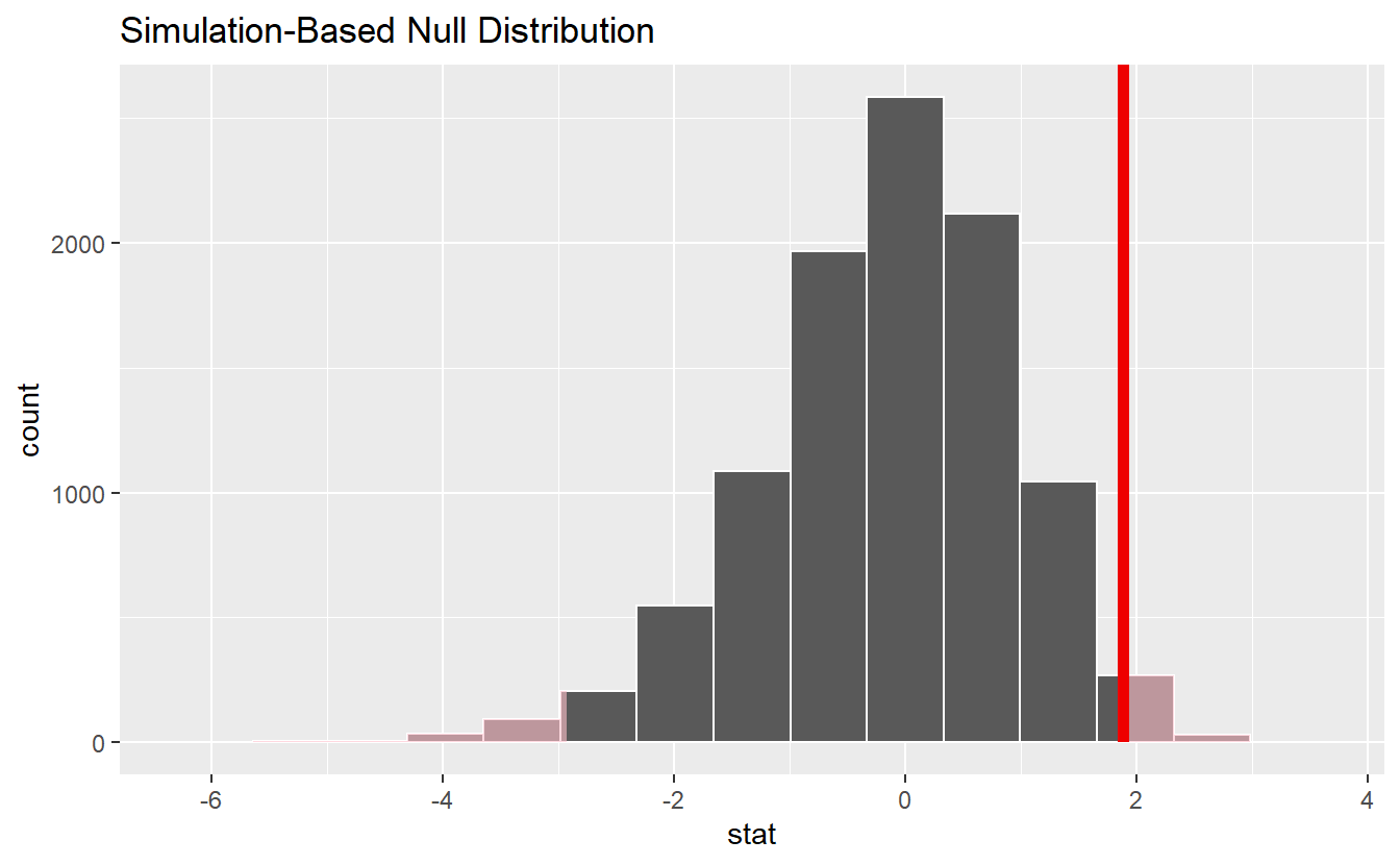
Finally, the corresponding p-value can be computed by
null_dist %>%
  get_p_value(obs_stat, direction = "two-sided")
#> # A tibble: 1 x 1
#>   p_value
#>     <dbl>
#> 1  0.0308
Thus, as in our previous bootstrap test we would have rejected the null hypothesis w.r.t. to a significance level of \(\alpha = 0.05\).
Armed with the infer package, it becomes time to use it to learn some new statistical tests.
This means that we will focus on the workflow so that we can test what we want to test.
Unfortunately, this won’t give us much time to cover the underlying assumptions and machinery of the tests.
Nevertheless, I will try to summarize some key aspects of each test so that you are not blindly applying them. Though it is stressed that we cover only the bare minimum of what one can know about each test.
6.5.1 Difference of Means Test
We have already covered the common t-test to test for the mean of a given sample using the statistic \[\begin{align*} T = \sqrt{n}\frac{\overline{X}_n - \mu_0}{s_X}, \end{align*}\] where \(\overline{X}_n\) is the sample mean and \(s^2_X\) is the sample variance. This worked under the assumption that the realizations are independent and normally distributed.
Now, given two such independent samples \(X\) and \(Y\) from two different populations one may ask whether the populations’ means are identical. For instance, imagine that \(X\) consists of body heights of only men and \(Y\) consists of body heights of only women58. Even if we suspect that each observation is drawn from a normal distribution, we may suspect that the distribution’s parameter may vary depending on whether we look at the group of men or women.
In its simplest form, the two-sample t-test assumes that at least the populations’ variances agree and that both samples are of the same length \(n\). If so, then the statistic \[\begin{align*} T = \frac{ \overline{X}_n - \overline{Y}_n }{ \sqrt{\frac{s^2_X + s^2_Y}{n}} } \end{align*}\] follows a t-distribution with \(2n-2\) degrees of freedom.
Let us see this test in action on an artificial example. Again, we will work with the example of body heights (in cm) and will test \(H_0: \mu_\text{men} - \mu_\text{women} = 0\) vs. \(H_1: \mu_\text{men} \neq \mu_\text{women}\).
set.seed(123)
# Totally made up numbers
mu_m <- 180
mu_w <- 160
sigma <- 20
n <- 35

heights <- tibble(
  men = rnorm(n, mean = mu_m, sd = sigma),
  women = rnorm(n, mean = mu_w, sd = sigma)
) %>%
  pivot_longer(
    cols = everything(),
    names_to = "gender",
    values_to = "height"
  )

heights %>%
  ggplot() +
  geom_boxplot(aes(x = gender, y = height))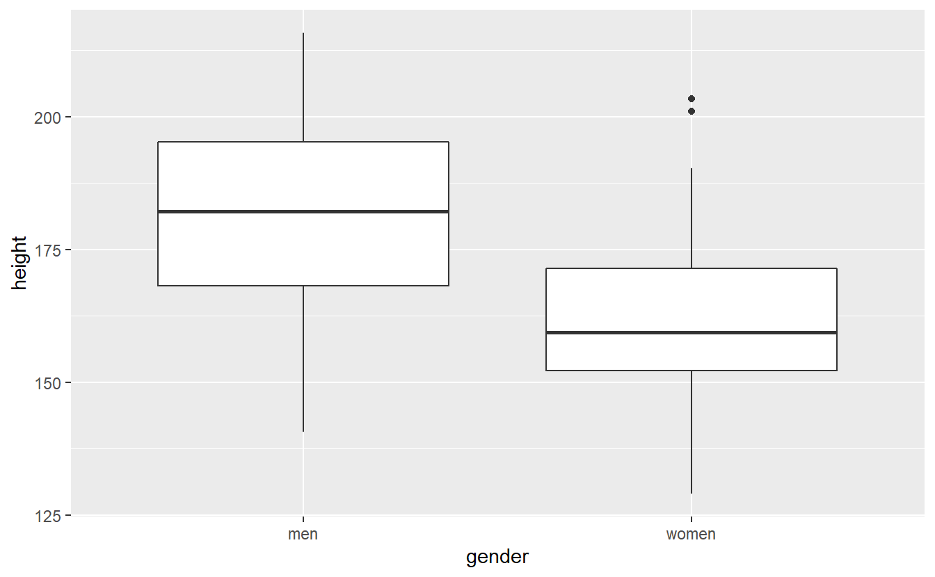
As per our simulation and the visual impression from the boxplot, there is a difference in means between the two populations. Nevertheless, let us run the test anyway.
In this case we will need to specify() that our response variable is height and our explanatory variable is gender.
This can be easily done using a formula response ~ explanatory.
Also for interpretations, when we calculate the statistic it is important to fix whether we consider \(\mu_\text{men} - \mu_\text{women}\) or \(\mu_\text{women} - \mu_\text{men}\).
This can be done via the order argument.
Finally, we observe the following statistic in this case.
obs_stat <- heights %>%
  specify(height ~ gender) %>%
  calculate(stat = "t", order = c("men", "women"))
obs_stat
#> # A tibble: 1 x 1
#>    stat
#>   <dbl>
#> 1  4.25
Comparing this to the appropriate quantile delivers
alpha <- 0.05
if (abs(obs_stat) > qt(1 - alpha / 2, df = 2 * n - 2)) {
  print("Hypothesis rejected")
} else {
  print("Not rejected")
}
#> [1] "Hypothesis rejected"
Alternatively, we could use generate() to find the simulation-based null distribution.
null_dist <-
  heights %>%
  specify(height ~ gender) %>%
  hypothesise(null = "independence") %>%
  generate(reps = 1000, type = "permute") %>%
  calculate(stat = "t", order = c("men", "women"))
Notice that we used independence as null hypothesis here.
This is because under the null hypothesis the samples from both populations are independent (which is an assumption of the t-test anyway) and follow the same distribution.
Consequently, under this hypothesis the test statistic should be similar when you randomly jumble around the population labels.
This is exactly what happens in the generate() step due to type = "permute", i.e. we draw different heights without replacement and assign them to either men or women such that the group sizes are the same.
Alternatively, you may think of this as creating one large sample from the group’s individual samples and drawing without replacement randomly new samples for each group. Under the null hypothesis, the new group samples should be similar to the original group samples. Finally, we can compare our observed statistic to the null distribution. Here, this shows that we would reject the null hypothesis.
null_dist %>%
  visualize() +
  shade_p_value(obs_stat, direction = "both")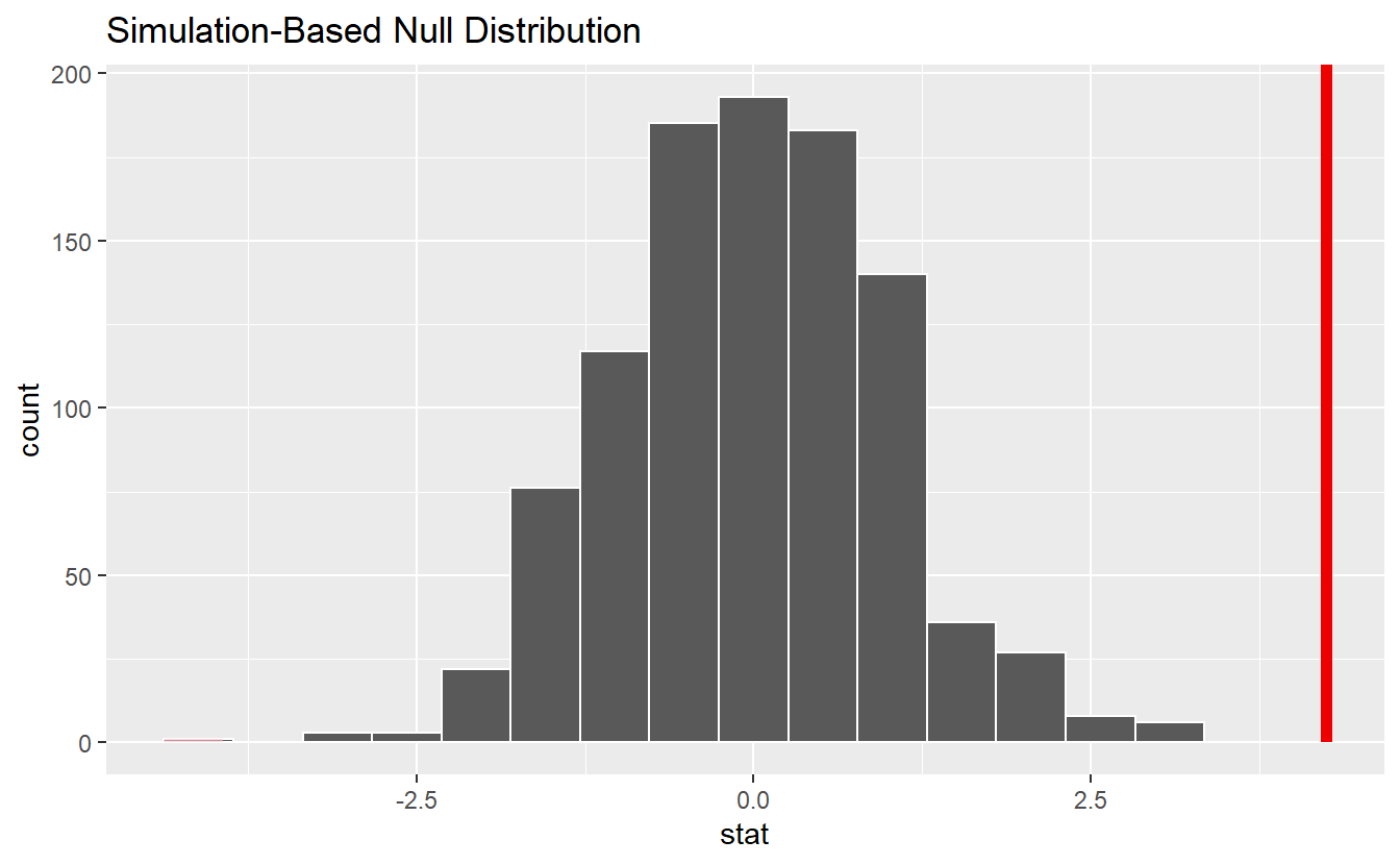
6.5.2 Independence Test
Given two samples \(X\) and \(Y\), a common test of the null hypothesis \(H_0: \text{The underlying distributions of } X \text{ and } Y \text{ are independent}\) is the so-called Pearson’s \(\chi^2\)-test. As indicated by the name, the test uses a statistic which is \(\chi^2\)-distributed under the null hypothesis.
This test basically assigns each observed value in a sample into one of \(r\) resp. \(m\) categories (amount of categories may differ for each sample).
This way, we can count how many observed pairs \((X_i, Y_i)\) fall into one category.
Repeating this for each of the \(m \cdot r\) possible categories a pair can fall in to, will deliver a so-called contingency table.
Basically this resembles tables describing the joint distribution of a discrete random vector which you probably have already seen in previous courses and look similar to this table
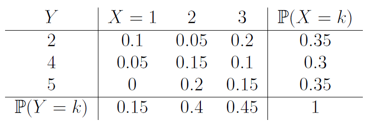
but instead of probabilities we have the amount of observed pairs in each field of the table.
If the null hypothesis is true, i.e. if \(X\) and \(Y\) are independent, we know that the joint probability of observing a pair of \((X, Y)\) needs to be equal to the product of the probabilities w.r.t. \(X\) and \(Y\). Consequently, the test computes the respective relative frequencies from the contingency tables of observed values to compute the test statistic \[\begin{align*} T = N \sum_{i, j} p_{i\cdot} p_{\cdot j} \bigg( \frac{ p_{ij} - p_{i\cdot} p_{\cdot j} }{p_{i\cdot} p_{\cdot j}} \bigg)^2 \end{align*}\] where \(p_{ij}\) is the relative frequency of pairs of \((X, Y)\) falling into the \(i\)-th row and the \(j\)-th column of the contingency table. Further, \(p_{i\cdot}\) resp. \(p_{\cdot j}\) is the relative frequency of \(X\) resp. \(Y\) falling into the \(i\)-th row resp. to the \(j\)-th column of the contingency table.
Now, under the null hypothesis, this statistic follows a \(\chi^2\)-distribution with \((m - 1)(r - 1)\) degrees of freedom.
Let’s see how this works within an infer pipeline.
To do so, let us simulate two different samples where the second sample is simply a transformed version of the first sample and see whether the test will be able to reject the null hypothesis.
Here, we will work solely with categorical samples, so that the test applies as described.
In practice, with continuous data often a binning procedure is applied in advance.
However, one has to make sure that the bins will not become too small.
A rule of thumb is that each bin should contain at least 5 observations under the null hypothesis.
We avoid this issue by simulating a rather large sample.
Also, since we are working with categorical data, at the moment of writing infer makes us convert the data to factors59.
set.seed(123)
n <- 100
m <- 3
data <- tibble(
  first = rbinom(n, size = m, prob = 1 / 2),
  second = first^2
) %>%
  mutate(across(.fns = as.factor)) %>%
  pivot_longer(
    cols = everything(),
    names_to = "sample",
    values_to = "value"
  )
The rest of the test then works analogously to the two-sample t test. Though notice that the \(\chi^2\)-distribution has only one tail, which is why the \(\chi^2\)-test is typically run only one-sided.
obs_stat <- data %>%
  specify(value ~ sample) %>%
  calculate(stat = "Chisq")
obs_stat
#> # A tibble: 1 x 1
#>    stat
#>   <dbl>
#> 1    94

alpha <- 0.05
upper_bound <- qchisq(1 - alpha , df = (m - 1) * (2 - 1))


if (abs(obs_stat) > upper_bound) {
  print("Hypothesis rejected")
} else {
  print("Not rejected")
}
#> [1] "Hypothesis rejected"
Again, we could also test this via permutation to eliminate all associations in the two different samples and compare the resulting null distribution to our observed distribution.
null_dist <- data %>%
  specify(sample ~ value) %>%
  hypothesise(null = "independence") %>%
  generate(reps = 1000, type = "permute") %>%
  calculate(stat = "Chisq")

null_dist %>%
  visualize() +
  shade_p_value(obs_stat = obs_stat, direction = "right")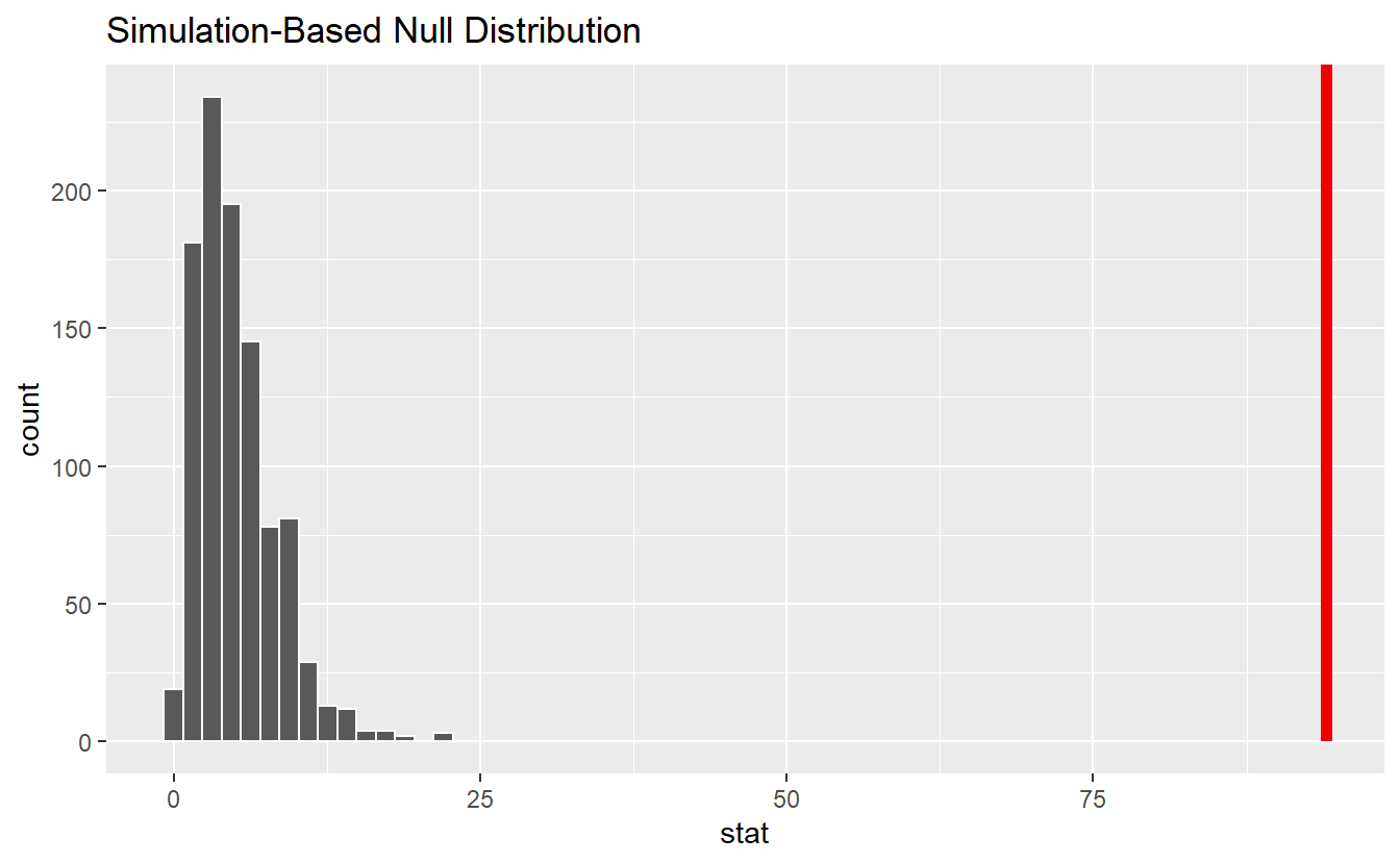
This reveals that our observed value is not in alignment with the null distribution. Consequently, we can reject the null hypothesis.
6.5.3 ANOVA
Another popular test is known under the name analysis of variance, or short ANOVA. In its simplest form, you can think of ANOVA as an extension of the above t-test, i.e. while the above t-test investigates the difference in means between two groups, ANOVA considers the difference among multiple groups.
This may be formalized like so: Assume that the \(j\)-th observed value \(Y_{ij}\) from the \(i\)-th group, \(i = 1, \ldots, k\), can be rewritten as \[\begin{align*} Y_{ij} = \mu_i + \varepsilon_{ij}, \end{align*}\] where \(\mu_i\) describes the \(i\)-th group mean and \(\varepsilon_{ij}\) describes the natural random fluctuation of the \(j\)-th observation within the \(i\)-th group. Thus, we want to test \(H_0: \mu_1 = \ldots = \mu_k\) vs. \(H_1: \exists i \neq j: \mu_i \neq \mu_j\).
The ANOVA test does this by comparing the variance of the data within groups to the variance among groups. This is done by decomposing the total sum of squares \[\begin{align*} \text{TSS} = \sum_{i = 1}^{k} \sum_{j = 1}^{n_i} (y_{ij} - \overline{y}_{\cdot \cdot})^2, \end{align*}\] where \(\overline{y}_{\cdot \cdot}\) describes the overall mean, into the group sum of squares \[\begin{align*} \text{GSS} = \sum_{i = 1}^{k} n_i (\overline{y}_{i\cdot} - \overline{y}_{\cdot\cdot})^2, \end{align*}\] where \(\overline{y}_{i\cdot}\) is group mean and \(n_i\) the sample size of the \(i\)-th group, and the residual sum of squares \[\begin{align*} \text{RSS} = \sum_{i = 1}^{k} \sum_{j = 1}^{n_i} (y_{ij} - \overline{y}_{i\cdot})^2. \end{align*}\]
This may seem frighteningly complicated. Luckily, for our purposes it suffices to know that through some statistical magic it is possible to show that under the null hypothesis the statistic \[\begin{align*} T = \frac{GSS / (k - 1)}{RSS / (N - k)} \end{align*}\] follows an F-distribution with \(k - 1\) and \(N - k\) degrees of freedom. Therefore, ANOVA is an example of an F-test.
Let us construct an example with four different groups and check whether an ANOVA test can detect whether their means are unequal. To do so, we will simulate realizations from 4 normal distributions that differ in mean but not in their variance. The assumption of all random variables having the same variance is known as homoscedasticity and an assumption of ANOVA.
set.seed(123)
n <- 30
sigma <- 1.5
data <- tibble(
  `1` = rnorm(n, 3.0, sigma),
  `2` = rnorm(n, 3.7, sigma),
  `3` = rnorm(n, 3.9, sigma),
  `4` = rnorm(n, 4.0, sigma)
) %>%
  pivot_longer(
    cols = everything(),
    names_to = "group",
    values_to = "value"
  ) %>%
  mutate(group = as.factor(group))

data %>%
  ggplot() +
  geom_boxplot(aes(x = group, y = value))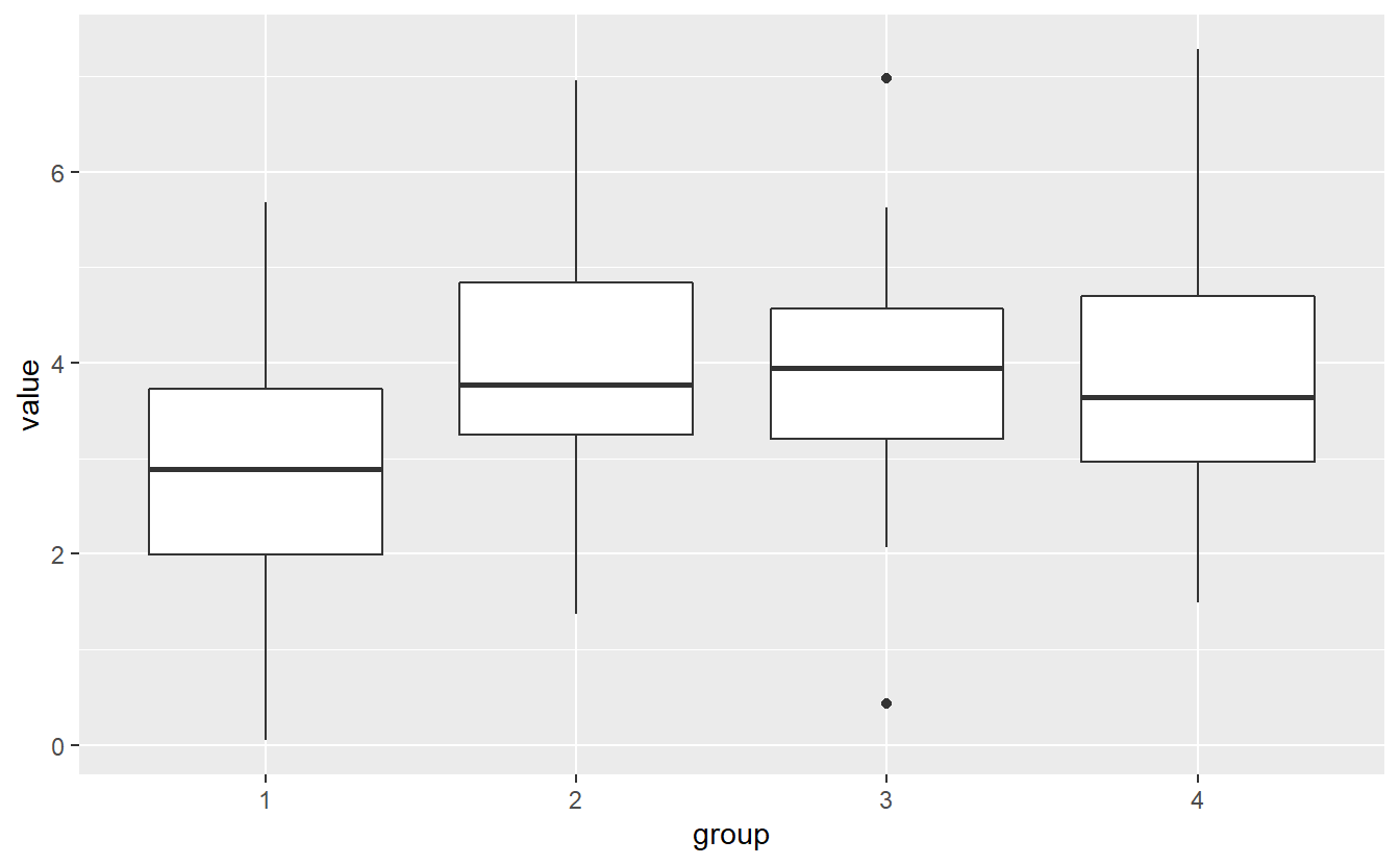
There is a lot of overlap in the boxplots, so we should be cautious about whether we could argue that the group means actually differ. Let’s see what ANOVA gives us. Though, notice that - same as the \(\chi^2\)-distribution - the F-distribution has only one tail as well. Thus, ANOVA is only run one-sidedly.
obs_stat <- data %>%
  specify(value ~ group) %>%
  calculate(stat = "F")
obs_stat$stat
#> [1] 4.08334

k <- 4
N <- k * n
alpha <- 0.05
upper_bound <- qf(1 - alpha, df1 = k - 1, df2 = N - k)

if (abs(obs_stat) > upper_bound) {
  print("Hypothesis rejected")
} else {
  print("Not rejected")
}
#> [1] "Hypothesis rejected"
The corresponding infer pipeline would look like this.
data %>%
  specify(value ~ group) %>%
  hypothesise(null = "independence") %>%
  generate(reps = 1000, type = "permute") %>%
  calculate(stat = "F") %>%
  get_p_value(obs_stat = obs_stat, direction = "right")
#> # A tibble: 1 x 1
#>   p_value
#>     <dbl>
#> 1   0.008
6.5.4 Kolmogorow-Smirnow Test
Finally, let us conclude this chapter with a so-called goodness of fit test. A highly popular test in that area is the Kolmogorow-Smirnow test which tests \(H_0: F_X(x) = F_0(x)\) vs. \(H_1: F_X(x) \neq F_0(x)\) where \(F_X\) denotes the distribution function of the underlying distribution of a given sample \(X\) and \(F_0\) represents the distribution function whose appropriateness to the sample shall be tested.
The idea of the test is pretty simple.
From each sample \(X = (X_1, \ldots, X_n)\) it is easy to generate the corresponding empirical distribution function
\[\begin{align*}
F_n(x) = \frac{1}{n} \sum_{k = 1}^{n} \1 \{X_k \leq x\}.
\end{align*}\]
Therefore, if \(X\) is really a sample from an underlying distribution \(F_0\), then the empirical distribution function \(F_n\) should not deviate too much from \(F_0\).
Using the command ecdf(), this can be visualized like so:
set.seed(123)
n <- 30
sample <- rexp(40)
F_n <- ecdf(sample)

tib <- tibble(
  x = seq(-2, max(sample), 0.025),
  theo = pexp(x),
  emp = F_n(x)
) %>%
  pivot_longer(
    cols = 2:3,
    names_to = "CDF",
    values_to = "F"
  )

tib %>%
  ggplot() +
  geom_line(aes(x = x, y = F, col = CDF))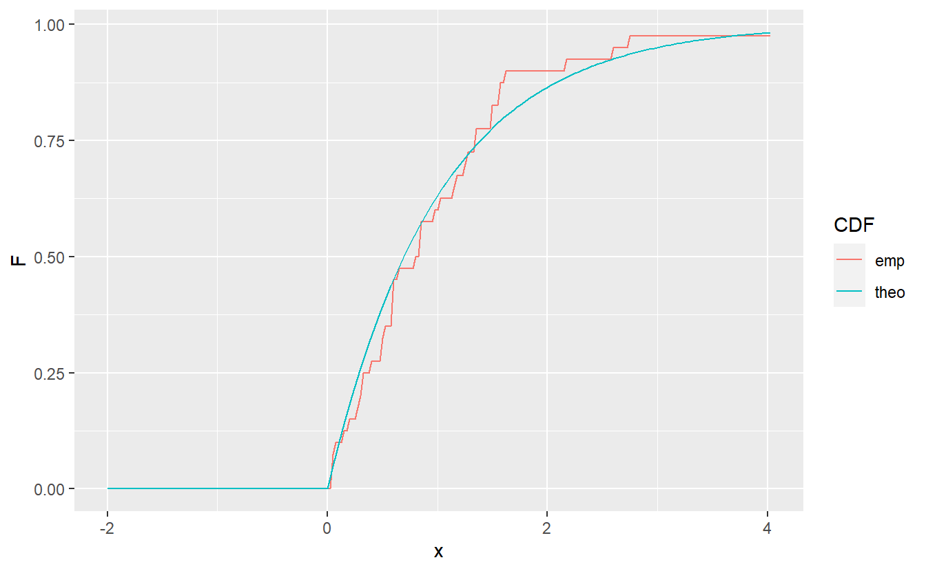
As test statistic the Kolmogorow-Smirnow test uses \[\begin{align*} T = \sup_x \vert F_n(x) - F_0(x) \vert. \end{align*}\] This is motivated by the fact that under the null hypothesis \(T\) converges to zero as the sample size \(n\) increases due to the Glivenko-Cantelli theorem. Therefore, if \(T\) is too large, then we will reject the null hypothesis.
The threshold value for when \(T\) is considered too large, can be approximated by the formula \[\begin{align*} T_\alpha = \sqrt{\frac{-0.5\log(\alpha/2)}{n}}, \end{align*}\] where \(\alpha\), as usual, corresponds to the test’s significance level.
A related two-sample version of the Kolmogorow-Smirnow test investigates \(H_0: F_X(x) = F_Y(x)\) vs. \(H_1: F_X(x) \neq F_Y(x)\), i.e. it tests whether two samples come from the same distribution.
In its test statistic, instead of \(F_0\) it then uses the empirical distribution function of the second sample \(Y\) and a slightly different threshold formula.
For our purposes, this does not matter too much.
We can use both versions of the test via ks.test():
set.seed(123)
n <- 40
sample1 <- rgamma(n, shape = 4, rate = 1 / 3)

# one-sample test
ks.test(sample1, "pexp", rate = 1 / 3)
#>
#>  One-sample Kolmogorov-Smirnov test
#>
#> data:  sample1
#> D = 0.7092, p-value < 2.2e-16
#> alternative hypothesis: two-sided

# one-sample test
ks.test(sample1, "pgamma", shape = 3.5, rate = 1 / 3)
#>
#>  One-sample Kolmogorov-Smirnov test
#>
#> data:  sample1
#> D = 0.097354, p-value = 0.8077
#> alternative hypothesis: two-sided
Thus, judging from the p-values (and assuming a significance level of \(0.05\)) we would reject the hypothesis that sample1 is drawn from an exponential distribution with parameter \(1/3\) but won’t reject that sample1 is drawn from a gamma distribution with shape \(3.5\) and rate \(1 / 3\).
Finally, a two-sample test works by supplying a second sample to ks.test() instead of a character string defining the theoretical cdf.
sample2 <- rgamma(n, shape = 10, rate = 1 / 3)
ks.test(sample1, sample2)
#>
#>  Two-sample Kolmogorov-Smirnov test
#>
#> data:  sample1 and sample2
#> D = 0.9, p-value = 8.882e-16
#> alternative hypothesis: two-sided
Again, we can reject the null hypothesis that sample1 and sample2 stem from the same distribution.
6.6 Exercises
6.6.1 Milage of Cars
Take a look at the mpg data set.
A quick exploratory data analysis reveals the following plot
dat <- mpg %>%
  filter(class %in% c("compact", "midsize", "subcompact"))

dat %>%
  ggplot(aes(y = cty, col = class)) +
  geom_boxplot()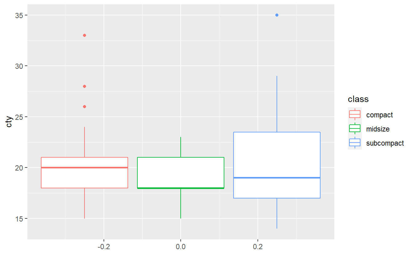
Test whether the three classes have the same mean city milage with an ANOVA test. Do you think all assumptions of ANOVA are satisfied here? Use a Levene test60 to check whether the homoscedasticity assumption is fullfilled. Run all of these tests at a significance level of \(\alpha = 0.1\).
6.6.2 p-Value Computation
Recall our example from earlier where we tested \(H_0: \mu_\text{men} - \mu_\text{women} = 0\) vs. \(H_1: \mu_\text{men} \neq \mu_\text{women}\). Here, I adjusted the true mean of the women so that it becomes more interesting, because the difference between men and women is smaller.
set.seed(123)
# Totally made up numbers
mu_m <- 180
mu_w <- 170
sigma <- 20
n <- 35

heights <- tibble(
  men = rnorm(n, mean = mu_m, sd = sigma),
  women = rnorm(n, mean = mu_w, sd = sigma)
) %>%
  pivot_longer(
    cols = everything(),
    names_to = "gender",
    values_to = "height"
  )

heights %>%
  ggplot() +
  geom_boxplot(aes(x = gender, y = height))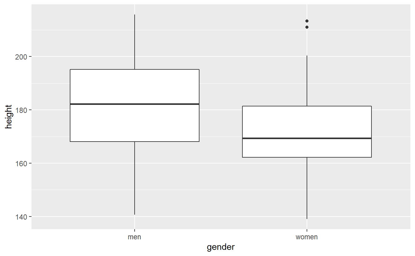
Estimate the p-value of the corresponding test via a bootstrap procedure based on 10000 bootstrap samples.
Compute this “by hand”, i.e. do not use specify(), hypothesise(), generate(), calculate(), get_p_value().
6.6.3 Kolmogorow-Smirnow Test
Implement without using ks.test() a function my_ks_test(sample1, sample2, alpha) that implements a two-sample Kolmogorow-Smirnow test testing the null hypothesis that the underlying CDF of the sample sample1 is equal to the underlying CDF of sample sample2 at a given significance level alpha.
The alternative hypothesis should be that the underlying CDF of sample1 is not equal to the CDF of sample2.
You can use the following threshold value61 for the test
\[\begin{align*}
D_{n,m} = \sqrt{- \log\bigg( \frac{\alpha}{2} \bigg) \cdot \frac{1 + (m / n)}{2m}},
\end{align*}\]
where \(n\) resp. \(m\) is the length of the first resp. second sample.
The function should return either Null hypothesis rejected or Null hypothesis not rejected.
Test whether your functions delivers the same result as ks.test() on the basis of 100 simulated normally distributed samples of length 50 with common variance \(\sigma^2 = 1\) and individual means \(\mu_1, \mu_2 \in \{0, 1, 2\}\) of samples for \(\alpha \in \{ 0.025, 0.05, 0.1\}\).
Your tests should be collected in a tibble like this
tests
#> # A tibble: 2,700 x 6
#>     mu1   mu2 alpha  simu my_ks                       ks
#>   <dbl> <dbl> <dbl> <int> <chr>                       <chr>
#> 1     0     0 0.025     1 Null hypothesis not reject~ Null hypothesis not rejec~
#> 2     0     0 0.025     2 Null hypothesis not reject~ Null hypothesis not rejec~
#> 3     0     0 0.025     3 Null hypothesis not reject~ Null hypothesis not rejec~
#> 4     0     0 0.025     4 Null hypothesis not reject~ Null hypothesis not rejec~
#> 5     0     0 0.025     5 Null hypothesis not reject~ Null hypothesis not rejec~
#> 6     0     0 0.025     6 Null hypothesis not reject~ Null hypothesis not rejec~
#> # ... with 2,694 more rows
such that one can easily check whether there are discrepancies between my_ks_test() and ks_test() like that:
tests %>%
  summarise(different_results = sum(ks != my_ks))
#> # A tibble: 1 x 1
#>   different_results
#>               <int>
#> 1                 0
Also, when creating the tibble, try to avoid nested for-loops.
Instead, a function like expand_grid() may be helpful.