3 Wrangling Data
Data comes not always in a neat format that allows us to easily generate ggplots. Actually, this is a common theme in working with data: Before we can do what we really want to do, we need to handle the data “appropriately”29 so that it is in a form we can (or want) to work with. This whole process is known as data wrangling and is the focus of this chapter.
3.1 Tidy data
Let us start by looking at the publicly availablenon_net_users_prc.csv file from Gapminder.org which is licensed under CC-BY 4.0 and contains the “proportion of people who did not use the internet in the last 3 months from any location, calculated as a percentage of a country’s total population”.
Opening the .csv-file with a text editor of your choice will reveal that it looks like this:
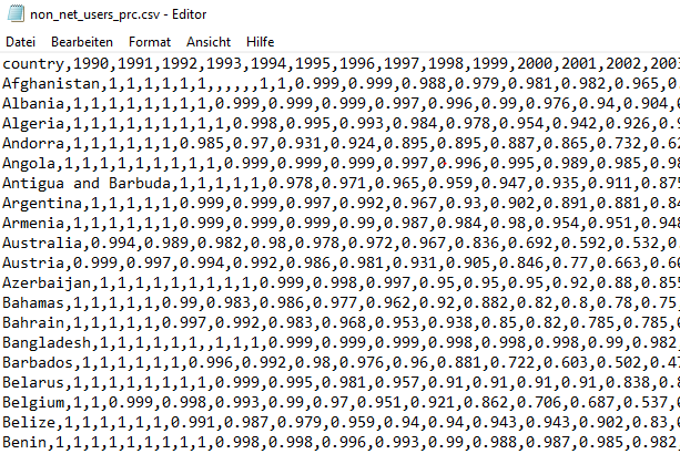
Figure 3.1: Excerpt of the non_net_users_prc.csv file
This indicates that .csv-files contain nothing more than comma-separated values.30
Obviously, we don’t want to work with the messy output of our editor, so let’s load the file into R and save it into a variable tib.
We achieve this by using the read_csv() function31 from the readr package (which is part of the tidyverse package) together with the file’s location (relative to where the file we are working from is).
# I store the file in another directory `data` within the current directory
tib <- read_csv("data/non_net_users_prc.csv")
#>
#> -- Column specification --------------------------------------------------------
#> cols(
#>   .default = col_double(),
#>   country = col_character()
#> )
#> i Use `spec()` for the full column specifications.
Apparently, this worked and read_csv() was kind enough to provide us with information on how R interprets the data.
The first couple of lines of the tibble look like this:
head(tib)
#> # A tibble: 6 x 31
#>   country  `1990` `1991` `1992` `1993` `1994` `1995` `1996` `1997` `1998` `1999`
#>   <chr>     <dbl>  <dbl>  <dbl>  <dbl>  <dbl>  <dbl>  <dbl>  <dbl>  <dbl>  <dbl>
#> 1 Afghani~      1      1      1      1      1  1     NA     NA     NA     NA
#> 2 Albania       1      1      1      1      1  1      1      1      0.999  0.999
#> 3 Algeria       1      1      1      1      1  1      1      1      1      0.998
#> 4 Andorra       1      1      1      1      1  1      0.985  0.97   0.931  0.924
#> 5 Angola        1      1      1      1      1  1      1      1      1      0.999
#> 6 Antigua~      1      1      1      1      1  0.978  0.971  0.965  0.959  0.947
#> # ... with 20 more variables: 2000 <dbl>, 2001 <dbl>, 2002 <dbl>, 2003 <dbl>,
#> #   2004 <dbl>, 2005 <dbl>, 2006 <dbl>, 2007 <dbl>, 2008 <dbl>, 2009 <dbl>,
#> #   2010 <dbl>, 2011 <dbl>, 2012 <dbl>, 2013 <dbl>, 2014 <dbl>, 2015 <dbl>,
#> #   2016 <dbl>, 2017 <dbl>, 2018 <dbl>, 2019 <dbl>
Let us select only a few countries we want to look at.
country_filter <- c(
  "Germany",
  "Australia",
  "United States",
  "Russia",
  "Afghanistan"
)

# Filter using the previously created vector
(tib_filtered <- tib %>%
  filter(country %in% country_filter))
#> # A tibble: 5 x 31
#>   country  `1990` `1991` `1992` `1993` `1994` `1995` `1996` `1997` `1998` `1999`
#>   <chr>     <dbl>  <dbl>  <dbl>  <dbl>  <dbl>  <dbl>  <dbl>  <dbl>  <dbl>  <dbl>
#> 1 Afghani~  1      1      1      1      1      1     NA     NA     NA     NA
#> 2 Austral~  0.994  0.989  0.982  0.98   0.978  0.972  0.967  0.836  0.692  0.592
#> 3 Germany   0.999  0.998  0.996  0.995  0.991  0.982  0.97   0.933  0.901  0.792
#> 4 Russia    1      1      1      1      1      0.998  0.997  0.995  0.992  0.99
#> 5 United ~  0.992  0.988  0.983  0.977  0.951  0.908  0.836  0.784  0.699  0.642
#> # ... with 20 more variables: 2000 <dbl>, 2001 <dbl>, 2002 <dbl>, 2003 <dbl>,
#> #   2004 <dbl>, 2005 <dbl>, 2006 <dbl>, 2007 <dbl>, 2008 <dbl>, 2009 <dbl>,
#> #   2010 <dbl>, 2011 <dbl>, 2012 <dbl>, 2013 <dbl>, 2014 <dbl>, 2015 <dbl>,
#> #   2016 <dbl>, 2017 <dbl>, 2018 <dbl>, 2019 <dbl>
Our goal now is to show the evolution of the internet usage quota over the years by one differently colored line for each country. If the data were in a neat format, we could easily do that as we learned how to do so previously. However, this might be the point where you realize that something is not quite right here.
Our tibble tib_filtered contains 31 columns none of which contain only years (x-axis) or percentages (y-axis).
However, the columns for the x- and y-axis can be easily created by rearranging the information from tib_filtered.
Here, do not worry about the code that does the rearranging for us.
All will be explained in due time.
tib_filtered_rearranged <- tib_filtered %>%
  pivot_longer(
    cols = -country,
    names_to = "year",
    values_to = "percentage"
  ) %>%
  mutate(year = as.numeric(year))
tib_filtered_rearranged
#> # A tibble: 150 x 3
#>   country      year percentage
#>   <chr>       <dbl>      <dbl>
#> 1 Afghanistan  1990          1
#> 2 Afghanistan  1991          1
#> 3 Afghanistan  1992          1
#> 4 Afghanistan  1993          1
#> 5 Afghanistan  1994          1
#> 6 Afghanistan  1995          1
#> # ... with 144 more rows
Finally, this is something we can work with. Using our skills from the previous chapter we can create the desired plot from this transformed data.
tib_filtered_rearranged %>%
  ggplot(aes(year, percentage, col = country)) +
  geom_point() +
  geom_line() +
  coord_cartesian(ylim = c(0, 1))
#> Warning: Removed 5 rows containing missing values (geom_point).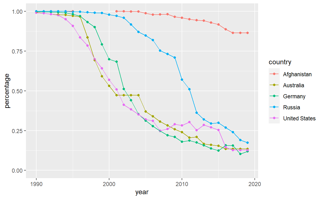
First of all, notice that we are being warned that there are 5 missing values. It can be easily seen that the missing values are related to Afghanistan. A quick internet search reveals that according to Wikipedia and the referenced sources therein32, the internet was “banned prior to 2002 because the previous Taliban government believed that it broadcasts obscene, immoral, and anti-Islamic material, and because the few internet users at the time could not be easily monitored as they obtained their telephone lines from neighboring Pakistan”. That might explain the missing values.
Interestingly, Afghanistan appears to lack a lot of possibilities to access the internet as the usage is low even today. Also, it looks like Russia has been a bit behind the curve w.r.t. to internet access in the early 2000s but managed to catch up to Germany, Australia and the United States.
More importantly, after some rearrangement of the data it was quite easy to generate the plot we wanted to look at.
This is because we have made sure that the data is tidy which is the exact format ggplot2 and a lot of other packages from the tidyverse are designed to work with.
Tidy data’s fundamental principles can be expressed by three simple axioms.
- Each variable has its own column.
- Each observation has its own row.
- Each value has its own cells.
At first, it might be confusing to think about what constitutes a “variable” and an “observation”.
Simply put, you can think of a variable as what you would want to use to define an aesthetic of a ggplot.
Notice that if you find yourself trying to manually draw two differently colored lines for e.g. two distinct years, then chances are pretty high that you might want to rearrange your data such that you have a column/variable year.
In the previous example, tidy data means that we have one column for our variables year, percentage and color, i.e. the year 2002 is an observation of our variable year.
Similarly, something like 0.994 is an observation of our variable percentage.
This also means that our original representation of the data set had way too many columns.
Thus, we need to make the table narrower, i.e. reduce the amount of columns, which leads to the table becoming longer.
This can be achieved (as we did earlier) through so-called pivoting with pivot_longer().
However, for this to work we need to indicate what variable the column names and cell values belong to and which columns actually need to be pivoted.
For instance, the column country does not need to be altered.
Therefore, it is only columns 2 and onward that need to be rearranged.
Clearly, the column names are observations of a variable we want to call year and the cell values are observations of a variable we will name percentage.
This leads to
tib_filtered %>%
  pivot_longer(
    cols = -country,          # columns to pivot
    names_to = "year",        # column names belong to "year"
    values_to = "percentage"  # cell values belong to "percentage"
  )
#> # A tibble: 150 x 3
#>   country     year  percentage
#>   <chr>       <chr>      <dbl>
#> 1 Afghanistan 1990           1
#> 2 Afghanistan 1991           1
#> 3 Afghanistan 1992           1
#> 4 Afghanistan 1993           1
#> 5 Afghanistan 1994           1
#> 6 Afghanistan 1995           1
#> # ... with 144 more rows
Notice that the first argument of the function pivot_longer() is a tibble which we have moved outside the function call through a pipe.
Also, we specified which columns to pivot through cols.
Here, this meant all columns except for country (indicated by - in front of country).
Finally, the mutate() step we did earlier makes the year column use doubles instead of character values so that ggplot can interpret the values appropriately. The mutate() function will be covered in more details later.
Conversely, sometimes it is necessary to make a table wider to make it tidy.
Naturally, there is an antagonist to pivot_longer() named pivot_wider() which does exactly what the name implies.
Here, let us use it to revert our data back into its original state to indicate how it works in principle.
tib_filtered_rearranged %>%
  pivot_wider(
    names_from = "year",
    values_from = "percentage"
  )
#> # A tibble: 5 x 31
#>   country  `1990` `1991` `1992` `1993` `1994` `1995` `1996` `1997` `1998` `1999`
#>   <chr>     <dbl>  <dbl>  <dbl>  <dbl>  <dbl>  <dbl>  <dbl>  <dbl>  <dbl>  <dbl>
#> 1 Afghani~  1      1      1      1      1      1     NA     NA     NA     NA
#> 2 Austral~  0.994  0.989  0.982  0.98   0.978  0.972  0.967  0.836  0.692  0.592
#> 3 Germany   0.999  0.998  0.996  0.995  0.991  0.982  0.97   0.933  0.901  0.792
#> 4 Russia    1      1      1      1      1      0.998  0.997  0.995  0.992  0.99
#> 5 United ~  0.992  0.988  0.983  0.977  0.951  0.908  0.836  0.784  0.699  0.642
#> # ... with 20 more variables: 2000 <dbl>, 2001 <dbl>, 2002 <dbl>, 2003 <dbl>,
#> #   2004 <dbl>, 2005 <dbl>, 2006 <dbl>, 2007 <dbl>, 2008 <dbl>, 2009 <dbl>,
#> #   2010 <dbl>, 2011 <dbl>, 2012 <dbl>, 2013 <dbl>, 2014 <dbl>, 2015 <dbl>,
#> #   2016 <dbl>, 2017 <dbl>, 2018 <dbl>, 2019 <dbl>
If you have trouble understanding how pivot_longer() and pivot_wider() work, then a visualization can maybe help.
One such visualisation can be found within the repository gadenbuie/tidyexplain on GitHub.
Notice that the animation uses the functions gather() and spread() which are our pivoting functions’ predecessors.
3.2 Access to Tibbles
Naturally, you may want to extract specific values from a tibble.
As always, there are a couple of ways to do that.
So, let’s create a dummy tibble to practice on through tibble() or tribble().
Whereas tibble() specifies a tibble columnwise like this
dummy <- tibble(
  variable1 = c(100, 200, 300, 500, 234),
  name2 = c(2, 4, 6, 8, 10),
  column3 = c(1, 1, 1, 1, 1)
)
dummy
#> # A tibble: 5 x 3
#>   variable1 name2 column3
#>       <dbl> <dbl>   <dbl>
#> 1       100     2       1
#> 2       200     4       1
#> 3       300     6       1
#> 4       500     8       1
#> 5       234    10       1
tribble() specifies a tibble rowwise like this
dummy <- tribble(
  ~variable1, ~name2, ~column3,
  100, 2,  1,
  200, 4,  1,
  300, 6,  1,
  500, 8,  1,
  234, 10, 1
)
dummy
#> # A tibble: 5 x 3
#>   variable1 name2 column3
#>       <dbl> <dbl>   <dbl>
#> 1       100     2       1
#> 2       200     4       1
#> 3       300     6       1
#> 4       500     8       1
#> 5       234    10       1
Notice that we had to use ~ to specify the column names.
As you can imagine, tibble() is the way to go for creating a tibble in most cases but for small examples tribble()’s syntax can be read more easily.
Naturally, tibble() can be used in conjunction with other functions, e.g. our dummy tibble could be created like this
We have already learned one way to get to specific values in the tibble.
In the last chapter and at the beginning of this one, we have used filter() to access the tibble rowwise through conditions on the values we want to look at.
For instance, if we want to only look at the rows where name2 of dummy is between 5 and 9 we can use filter() in conjunction with between() which is a function that returns TRUE/FALSE values that filter() needs to decide what rows to retain.
dummy %>%
  filter(between(name2, 5, 9))
#> # A tibble: 2 x 3
#>   variable1 name2 column3
#>       <dbl> <dbl>   <dbl>
#> 1       300     6       1
#> 2       500     8       1
Also, filter() is part of the dplyr package which equips us with a lot of convenient functions for the most common data manipulation tasks.
For instance, dplyr also provides the slice functions to access rows.
Most of these functions are self-explanatory, so here are a few examples.
# Rows 2, 4, 5
slice(dummy, c(2, 4, 5))
#> # A tibble: 3 x 3
#>   variable1 name2 column3
#>       <dbl> <dbl>   <dbl>
#> 1       200     4       1
#> 2       500     8       1
#> 3       234    10       1

# First three rows - see also slice_tail()
slice_head(dummy, n = 3)
#> # A tibble: 3 x 3
#>   variable1 name2 column3
#>       <dbl> <dbl>   <dbl>
#> 1       100     2       1
#> 2       200     4       1
#> 3       300     6       1

# Two rows containing the largest values of "Variable1"
# - see also slice_min()
slice_max(dummy, variable1, n = 2)
#> # A tibble: 2 x 3
#>   variable1 name2 column3
#>       <dbl> <dbl>   <dbl>
#> 1       500     8       1
#> 2       300     6       1

# 2 random rows
slice_sample(dummy, n = 2)
#> # A tibble: 2 x 3
#>   variable1 name2 column3
#>       <dbl> <dbl>   <dbl>
#> 1       234    10       1
#> 2       200     4       1
A word of caution: The slice_* functions need n to be specified explicitly.
Consequently, you will always have to write n = 2 (or similar).33
Further, we can access the tibble columnwise through pull() and select().
Whereas the first function is designed to return a vector from a single column, the latter can be used to extract a new tibble consisting only of the specified columns.
Additionally, useful helper functions : (for consecutive columns) and - (for all but the specified columns) can be used with select.
More helper functions can be found in the documentation of tidyselect::language. You you will get to play around with those in the exercises.
# Select() always returns a tibble
select(dummy, variable1)
#> # A tibble: 5 x 1
#>   variable1
#>       <dbl>
#> 1       100
#> 2       200
#> 3       300
#> 4       500
#> 5       234

# Use pull() if you want to get a vector
pull(dummy, variable1)
#> [1] 100 200 300 500 234

# Shortcut for above
dummy$variable1
#> [1] 100 200 300 500 234

# Consecutive columns
select(dummy, variable1:name2)
#> # A tibble: 5 x 2
#>   variable1 name2
#>       <dbl> <dbl>
#> 1       100     2
#> 2       200     4
#> 3       300     6
#> 4       500     8
#> 5       234    10

# Choosing columns manually
select(dummy, variable1, column3)
#> # A tibble: 5 x 2
#>   variable1 column3
#>       <dbl>   <dbl>
#> 1       100       1
#> 2       200       1
#> 3       300       1
#> 4       500       1
#> 5       234       1

# All but one column
select(dummy, -variable1)
#> # A tibble: 5 x 2
#>   name2 column3
#>   <dbl>   <dbl>
#> 1     2       1
#> 2     4       1
#> 3     6       1
#> 4     8       1
#> 5    10       1
We can access both, row and column specific values, by accessing the tibble through the corresponding row and column indices.
This is done via [[...]] or [...] where the difference in both approaches lies in the output’s format.
# Returns a tibble
dummy[1, 2]
#> # A tibble: 1 x 1
#>   name2
#>   <dbl>
#> 1     2

# Returns a vector
dummy[[1, 2]]
#> [1] 2

# Multiple indices
dummy[c(1, 3), 2:3]
#> # A tibble: 2 x 2
#>   name2 column3
#>   <dbl>   <dbl>
#> 1     2       1
#> 2     6       1

# Variable names can be used (with quotation marks)
dummy[c(1, 2), 'name2']
#> # A tibble: 2 x 1
#>   name2
#>   <dbl>
#> 1     2
#> 2     4

# Minus helper function
dummy[-c(1, 2), -3]
#> # A tibble: 3 x 2
#>   variable1 name2
#>       <dbl> <dbl>
#> 1       300     6
#> 2       500     8
#> 3       234    10

# All rows by empty row index
dummy[, 1:2]
#> # A tibble: 5 x 2
#>   variable1 name2
#>       <dbl> <dbl>
#> 1       100     2
#> 2       200     4
#> 3       300     6
#> 4       500     8
#> 5       234    10
Notice that [...] will always return a tibble (even if you extract only a single cell).
This is in contrast to data.frames which you can think of as base R’s version of a tibble, i.e. with data.frames [...] can return vectors and data.frames.
Also, [[...]] can only be used to return a data.frame’s complete column.
# Transform to data.frame
dummy_df <- as.data.frame(dummy)

# Returns vector
dummy_df[2:3, 1]
#> [1] 200 300

# Returns data.frame with row index
dummy_df[2, 1:2]
#>   variable1 name2
#> 2       200     4

# [[...]] can only return whole columns
dummy_df[[2]]
#> [1]  2  4  6  8 10
This last paragraph served only for your awareness of the different behavior you can encounter with data.frames. In this text, we will only work with tibbles.
Finally, you may wonder why we would need functions such as pull() and select() if we can just as easily stick to [[...]] or [...].
In this case, notice that these additional functions are convenient as they avoid having to use quotation marks and work better in a pipe.
Also, without select() and pull(), one needs to use . in the pipe which is not as visually appealing as it conceals the intended operation.
# With select()
dummy %>%
  select(variable1:name2)
#> # A tibble: 5 x 2
#>   variable1 name2
#>       <dbl> <dbl>
#> 1       100     2
#> 2       200     4
#> 3       300     6
#> 4       500     8
#> 5       234    10

# Without select()
dummy %>%
  .[, c("variable1", "name2")]
#> # A tibble: 5 x 2
#>   variable1 name2
#>       <dbl> <dbl>
#> 1       100     2
#> 2       200     4
#> 3       300     6
#> 4       500     8
#> 5       234    10
3.3 Mutate tibbles
Most of the time, quantities we are interested in are not explicitly present in a data set.
Consequently, we will need to compute our desired variables from the existing variables ourselves.
Luckily, the dplyr package brings us the mutate() function which allows us to create new variables in a tibble.
For instance, let us create a fourth column in our dummy tibble which consists of the sum of the first and second column.
The syntax for this is pretty straightforward as it follows the template mutate(data, <variableName> = <Computation>).
mutate(dummy, FourthName = variable1 + name2)
#> # A tibble: 5 x 4
#>   variable1 name2 column3 FourthName
#>       <dbl> <dbl>   <dbl>      <dbl>
#> 1       100     2       1        102
#> 2       200     4       1        204
#> 3       300     6       1        306
#> 4       500     8       1        508
#> 5       234    10       1        244
Notice that mutate() will understand variable1 and name2 in our computation as referring to the corresponding columns within the tibble, i.e. we did not have to use quotation marks.
We can even create multiple columns at once and use newly created variables in later calculations.
dummy <- mutate(
  dummy,
  Fourth = variable1 + name2,
  Fifth = 2 * Fourth
)
dummy
#> # A tibble: 5 x 5
#>   variable1 name2 column3 Fourth Fifth
#>       <dbl> <dbl>   <dbl>  <dbl> <dbl>
#> 1       100     2       1    102   204
#> 2       200     4       1    204   408
#> 3       300     6       1    306   612
#> 4       500     8       1    508  1016
#> 5       234    10       1    244   488
Same as most tidyverse functions, mutate() works pretty well within a pipe, i.e. we might as well write
dummy <- dummy %>%
  mutate(
    Fourth = variable1 + name2,
    Fifth = 2 * Fourth
  )
Further, mutate() has a neat helper across() which allows us to do a single operation on multiple columns at once.
A practical use case for this is to convert multiple columns into the correct format, e.g. by rounding or converting.
For example, let us take a the first three columns of our previous tibble and turn them into factors, which might be necessary when you want to plot data and need to make sure that ggplot() will understand certain columns as categorial variables.
Instead of using applying as.factor() to each column manually, let us use across() within mutate()34.
We can specify which columns should be transformed via the .cols argument and what functions are to be used using the .fns argument.
Notice that is is possible to use multiple functions if you collect the function names within a vector.
dummy %>%
  mutate(across(.cols = variable1:column3, .fns = as.factor))
#> # A tibble: 5 x 5
#>   variable1 name2 column3 Fourth Fifth
#>   <fct>     <fct> <fct>    <dbl> <dbl>
#> 1 100       2     1          102   204
#> 2 200       4     1          204   408
#> 3 300       6     1          306   612
#> 4 500       8     1          508  1016
#> 5 234       10    1          244   488
3.3.1 Vectorized Calculations
Before we make this a bit more interesting with a small but nevertheless real data set, we need to talk about vectorized calculations in R.
You might think that mutate() evaluates our calculations by going through each row sequentially.
However, this is not really true, e.g. take a look at this example
tribble(
  ~a, ~b,
  1, 3,
  2, 4,
  3, 5
) %>%
  mutate(minimum = min(a, b))
#> # A tibble: 3 x 3
#>       a     b minimum
#>   <dbl> <dbl>   <dbl>
#> 1     1     3       1
#> 2     2     4       1
#> 3     3     5       1
If it were actually true that the calculations are done sequentially, then the minimum column should be equal to column a since in each row, the value in column a is smaller than the value in column b.
But what really happens here is that we take the whole columns a and b and stick them both into the min() function.
The min() function, in turn, takes multiple inputs and concatenates the vectors to return the single overall minimum (here 1).
Finally, mutate() expects to get a vector of the same length as a resp. b but only gets a single value which triggers the recycling mechanism35
such that instead we get a vector full of ones.
It is worth pointing out that this situation is not only a result of us using the incorrect min() function for our purposes.
This is also caused by the fact that mutate() will work with the whole column vectors, i.e. mutate() takes a vector and returns a vector of the same length.
In the present case, we should have correctly used the function pmin().
tribble(
  ~a, ~b,
  1, 3,
  2, 4,
  3, 5
) %>%
  mutate(minimum = pmin(a, b))
#> # A tibble: 3 x 3
#>       a     b minimum
#>   <dbl> <dbl>   <dbl>
#> 1     1     3       1
#> 2     2     4       2
#> 3     3     5       3
3.3.2 Small Case Study
Now, let us make this slightly more applied and look at the the data set cars which comes pre-installed with R.
# cars is the data set and we convert it from data.frame to tibble
(tib <- cars %>% as_tibble())
#> # A tibble: 50 x 2
#>   speed  dist
#>   <dbl> <dbl>
#> 1     4     2
#> 2     4    10
#> 3     7     4
#> 4     7    22
#> 5     8    16
#> 6     9    10
#> # ... with 44 more rows
In this data set we can find 50 observations of speed of cars in mph (speed) and the distance it has taken them to stop in feet (dist).
It is worth acknowledging that this data was recorded in the 1920s, so it might be a little bit out-of-date.
However, for our instructional purposes the data set still works well enough.
Let us imagine that we want to compare the dist variable to the physical model we might know from Physics class.
This model is summarized as follows36:
Suppose that \(v\) is the speed (in ft/s),
\(g\) the standard gravity (in ft/s),
\(t_{p-r}\) the perception-reaction time (in s) and
\(\mu\) the friction coefficient.
Then the total distance it takes to stop \(D\) (in ft) is given by37
\[\begin{align*}
D = vt_{p-r} + \frac{v^2}{2\mu g}
\end{align*}\]
Now, we can compute the theoretical distances from our model for each dist observation in our data set and compare the observations and the model visually.
# Define the constants in the formula
t_pr <- 1.5   # seconds
mu <- 0.7
g <- 32.17405 # ft / s^2

# Compute distances from model
model_tib <- tibble(
  ftps = 1:50,
  mph = ftps * 3600 / 5280, # Convert to mph for comparability
  dist_model = ftps * t_pr + ftps^2 / (2 * mu * g)
)

# Compare models and observations visually
ggplot() +
  geom_point(data = tib, aes(speed, dist)) +
  geom_line(data = model_tib, aes(mph, dist_model), col = "Red") +
  labs(
    x = "Speed (in mph)",
    y = "Distance (in ft)",
    title = "Observations vs. Physical Model"
) 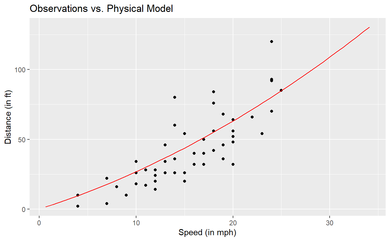
This does not look too bad. So, let us quantify the deviations of our observations from our model. A common approach is to compute the mean squared error (MSE) which - as the name implies - is the average of the squared deviations. Same as with the variance of a random variable, the unit of the MSE is the original unit squared. Thus, often one might want to consider the square root of the MSE (RMSE). Alternatively, instead of squaring the error one could also look at the mean of the absolute errors which gives us the mean absolute error (MAE).
errors <- tib %>%
  mutate(
    speed_ftps = speed * 5280 / 3600,
    dist_model = speed_ftps * t_pr + speed_ftps^2 / (2 * mu * g),
    sq_error = (dist - dist_model)^2,
    abs_error = abs(dist - dist_model)
  )

(MSE <- errors %>% pull(sq_error) %>% mean())
#> [1] 234.175
(RMSE <- sqrt(MSE))
#> [1] 15.30278
(MAE <- errors %>% pull(abs_error) %>% mean())
#> [1] 12.17646
To put these latter two quantities into perspective, one could additionally normalize the quantities by dividing the errors by the mean of the observations.
(NRMSE <- RMSE / mean(errors$dist))
#> [1] 0.3560441
(NMAE <- MAE / mean(errors$dist))
#> [1] 0.2833052
Quantities like these are usually used to compare different models to find out which model fits to the data better. In this case, we do not really have anything to compare these values to so it is hard to make a judgment on whether these numbers constitute a “good” model.
Of course, a low MSE or MAE in itself can never guarantee that a model is appropriate but it is at least a start to judge a model’s quality.
Curiously, on this particular data set we could also fit a straight line through the observations to explain dist via speed (which is definitely wrong for higher velocities not observed in this data set) and get an even lower NRMSE of
# Code is here only for completeness' sake.
# Ignore if currently confusing.
# Will be covered in other chapter.
linmod <- lm(data = errors, dist ~ speed)
RMSE_lm <- mean(linmod$residuals^2) %>% sqrt()
RMSE_lm / mean(errors$dist)
#> [1] 0.3506016
For now, let this serve as a cautionary tale to avoid putting too much faith in a low MSE.
3.4 Summaries
In the last chapter we learned that plots can help us to get an understanding of a data set. In this regard, summaries can help us to quantify some of our understanding from our previous graphical data exploration. Recall that we looked at the following boxplot of life expectancies in 2007 in the last chapter.
tib_2007 <- gapminder::gapminder %>%
  filter(year == 2007)

ggplot(tib_2007, aes(y = lifeExp)) +
  geom_boxplot()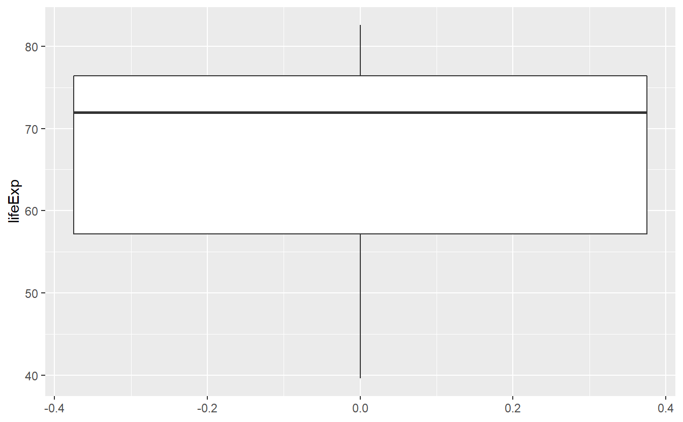
In the description of this plot I mentioned that the solid bold line in the middle of the box corresponds to the median, i.e. the value that separates the lower half of the data from the upper half of the data. From the plot I had to guess that the median is approximately 72. Using the previously learned function I can now compute the median explicitly.
tib_2007 %>% pull(lifeExp) %>% median()
#> [1] 71.9355
Huh, I was actually pretty close with my guess. So I got that goin’ for me, which is nice38. By the same approach, I could compute a lot more statistical quantities like so
# Mean
tib_2007 %>% pull(lifeExp) %>% mean()
#> [1] 67.00742

# Minimum
tib_2007 %>% pull(lifeExp) %>% min()
#> [1] 39.613

# Maximum
tib_2007 %>% pull(lifeExp) %>% max()
#> [1] 82.603
This of course is quite tedious, so base R provides us with a neat summary() function to give us the most common statistical quantities at a glance.
summary(tib_2007)
#>         country       continent       year         lifeExp
#>  Afghanistan:  1   Africa  :52   Min.   :2007   Min.   :39.61
#>  Albania    :  1   Americas:25   1st Qu.:2007   1st Qu.:57.16
#>  Algeria    :  1   Asia    :33   Median :2007   Median :71.94
#>  Angola     :  1   Europe  :30   Mean   :2007   Mean   :67.01
#>  Argentina  :  1   Oceania : 2   3rd Qu.:2007   3rd Qu.:76.41
#>  Australia  :  1                 Max.   :2007   Max.   :82.60
#>  (Other)    :136
#>       pop              gdpPercap
#>  Min.   :1.996e+05   Min.   :  277.6
#>  1st Qu.:4.508e+06   1st Qu.: 1624.8
#>  Median :1.052e+07   Median : 6124.4
#>  Mean   :4.402e+07   Mean   :11680.1
#>  3rd Qu.:3.121e+07   3rd Qu.:18008.8
#>  Max.   :1.319e+09   Max.   :49357.2
#>
From a perspective of quickly getting an overview of the data, this is quite nice.
However, if I want to use these quantities later on, I will again have to compute them manually as the return of summary() is not in a handy format.
For example, saving the summary and calling a specific cell of the corresponding table gives us
tmp <- summary(tib_2007)
tmp[1, 2]
#> [1] "Africa  :52  "
Luckily, dpylr from the tidyverse package provides the summarise() function.
However, summarise() forces us to manually determine which summaries we want to compute.
But this also gives us a lot of flexibility to compute a lot of summaries within a single function call.
Also, summarise() will expect the first argument to be a tibble, so we can use the function easily within a pipe.
tib_2007 %>%
  summarise(
    mean_lifeExp = mean(lifeExp),
    median_lifeExp = median(lifeExp),
    lowerQuartile = quantile(lifeExp, 0.25),
    upperQuartile = quantile(lifeExp, 0.75)
  )
#> # A tibble: 1 x 4
#>   mean_lifeExp median_lifeExp lowerQuartile upperQuartile
#>          <dbl>          <dbl>         <dbl>         <dbl>
#> 1         67.0           71.9          57.2          76.4
Here, the first quartile (25% quantile) and the third quartile (75%quantile), respectively, gives us the range of the box in the previous boxplot.
Also they describe the life expectancy which is larger than exactly 25% and 75% of the present life expectancies, respectively.
If we wanted to apply a summary function, say mean(), to multiple columns we can use across() again.
tib_2007 %>%
  summarise(
    across(.cols = lifeExp:gdpPercap, .fns = mean)
  )
#> # A tibble: 1 x 3
#>   lifeExp       pop gdpPercap
#>     <dbl>     <dbl>     <dbl>
#> 1    67.0 44021220.    11680.
In principle, we can use a vector and extend the .fns argument to cover multiple functions and use pivot_wider() and pivot_longer() to transform the output into a similar appearance as the overview generated by summary().
However, for brevity we will skip this part here.
Summaries in summarise() can become arbitrarily complex which allows for a high degree of customization.
Here, let us look at a fairly simple example.
Let us find out how many percent of the countries have a life expectancy less than say 50 or 60.
This can be achieved through computing a boolean vector lifeExp < 50 of zeroes and ones (1 if a countries life expectancy is less then 50) and a mean() summary of the corresponding vector.
tib_2007 %>%
  summarise(
    percent50 = mean(lifeExp < 50),
    percent60 = mean(lifeExp < 60)
  )
#> # A tibble: 1 x 2
#>   percent50 percent60
#>       <dbl>     <dbl>
#> 1     0.134     0.303
All of our summaries so far have been pretty coarse. In our plots from the last chapter, we have already seen that there are vast differences in life expectancy between continents. So, let us consider these differences in our computations too.
3.4.1 Grouped Summaries
First, let us quantify the different numbers of countries between continents.
To do that, we can use the n() summary function which counts the observations within groups.
Applying this to our current tibble would give us
tib_2007 %>%
  summarise(n = n())
#> # A tibble: 1 x 1
#>       n
#>   <int>
#> 1   142
Well, now we know that we have 142 observations which is not terribly useful.
What we want to do now is to instruct summarise() to count the observations within each continent separately.
This is done by declaring a grouping variable by group_by().
tib_2007 %>%
  group_by(continent) %>%
  summarise(n = n())
#> # A tibble: 5 x 2
#>   continent     n
#>   <fct>     <int>
#> 1 Africa       52
#> 2 Americas     25
#> 3 Asia         33
#> 4 Europe       30
#> 5 Oceania       2
The idea of counting is so common that dplyr implemented a practical helper function.
tib_2007 %>%
  count(continent)
Now, we can look at the life expectancies for each continent separately. Also, with grouped summaries it is a good idea to incorporate the number of observations within each group. This will help to avoid drawing conclusions from small samples.
tib_2007 %>%
  group_by(continent) %>%
  summarise(
    mean = mean(lifeExp),
    lowerQuartile = quantile(lifeExp, 0.25),
    upperQuartile = quantile(lifeExp, 0.75),
    n = n()
  )
#> # A tibble: 5 x 5
#>   continent  mean lowerQuartile upperQuartile     n
#>   <fct>     <dbl>         <dbl>         <dbl> <int>
#> 1 Africa     54.8          47.8          59.4    52
#> 2 Americas   73.6          71.8          76.4    25
#> 3 Asia       70.7          65.5          75.6    33
#> 4 Europe     77.6          75.0          79.8    30
#> 5 Oceania    80.7          80.5          81.0     2
In fact, we can even use multiple groupings to see how the mean and the quartiles evolve for each continent over time.
summary_evolution <- gapminder::gapminder %>%
  group_by(continent, year) %>%
  summarise(
    mean = mean(lifeExp),
    lowerQuartile = quantile(lifeExp, 0.25),
    upperQuartile = quantile(lifeExp, 0.75)
  )
#> `summarise()` has grouped output by 'continent'. You can override using the `.groups` argument.
summary_evolution
#> # A tibble: 60 x 5
#> # Groups:   continent [5]
#>   continent  year  mean lowerQuartile upperQuartile
#>   <fct>     <int> <dbl>         <dbl>         <dbl>
#> 1 Africa     1952  39.1          35.8          42.1
#> 2 Africa     1957  41.3          37.4          44.8
#> 3 Africa     1962  43.3          39.5          47.8
#> 4 Africa     1967  45.3          41.4          49.5
#> 5 Africa     1972  47.5          43.3          51.5
#> 6 Africa     1977  49.6          44.5          53.9
#> # ... with 54 more rows
Notice that R will inform us how the output tibble is grouped.
By default, summarise() will simply peel away the last grouping layer (in this case year) and the output tibble will be grouped according to the remaining groups.
This is why we also did not get any grouping message earlier since peeling of the only grouping layer leaves the output ungrouped.
In most cases, we want to get rid of all groupings, so we can manually determine that summarise() should do just that via .groups = "drop".39.
summary_evolution <- gapminder::gapminder %>%
  group_by(continent, year) %>%
  summarise(
    mean = mean(lifeExp),
    lowerQuartile = quantile(lifeExp, 0.25),
    upperQuartile = quantile(lifeExp, 0.75),
    .groups = "drop"
  )
summary_evolution
With a little bit of work we can plot this nicely.
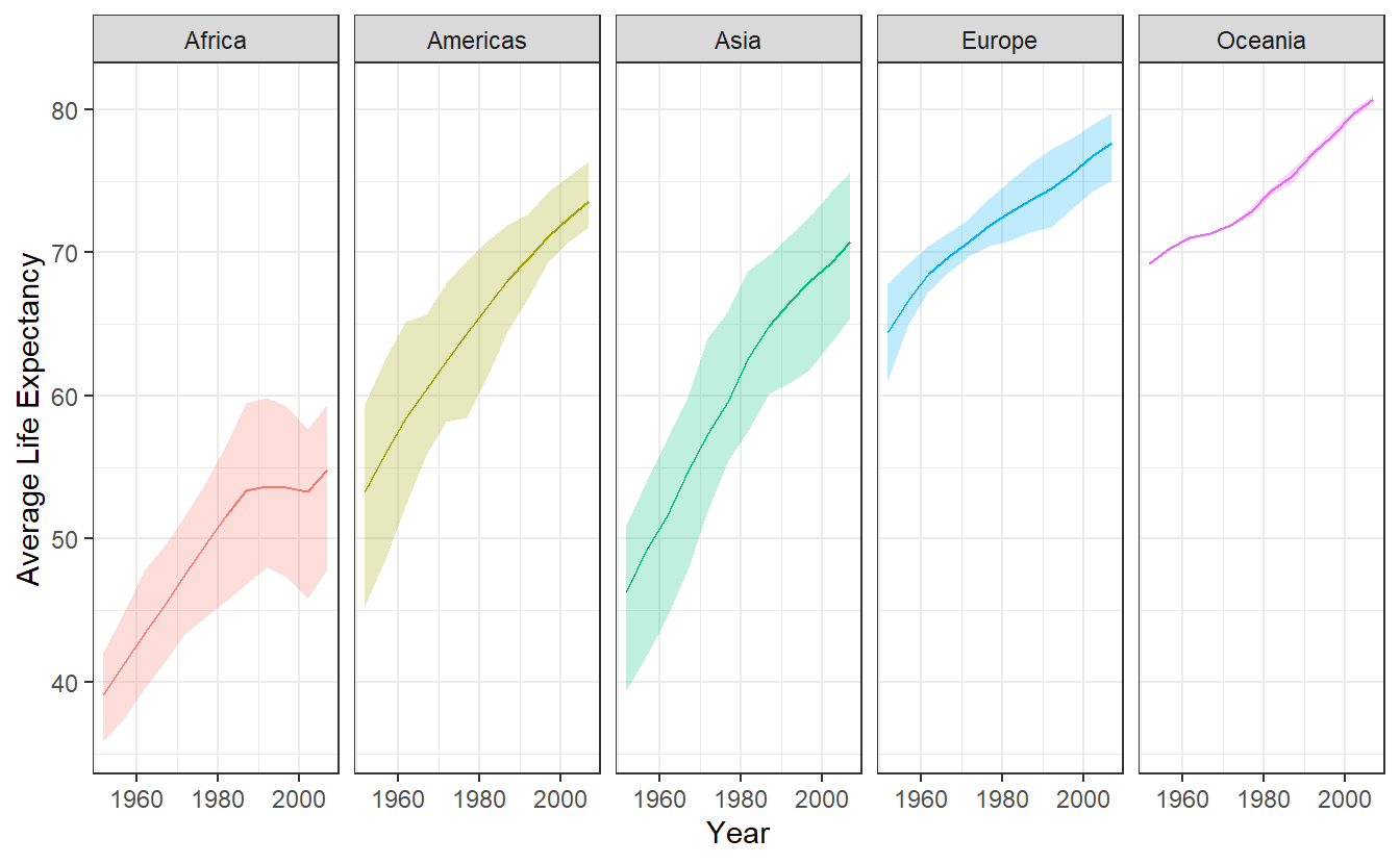
Figure 3.2: Average life expectancy over time. The shaded area corresponds to the evolution of lowerQuartile and upperQuartile of summary_evolution. The solid line corresponds to mean.
3.4.2 Remaining Groupings
When we are using multiple groupings, we have to be careful that we either explicitly determine the resulting grouping structure from summarise() or are aware of the default behavior.
This is why our previous code without the .groups argument specified as drop resulted in the following message.
summary_evolution <- gapminder::gapminder %>%
  group_by(continent, year) %>%
  summarise(
    mean = mean(lifeExp),
    lowerQuartile = quantile(lifeExp, 0.25),
    upperQuartile = quantile(lifeExp, 0.75),
  )
#> `summarise()` has grouped output by 'continent'. You can override using the `.groups` argument.
Here we see that the last grouping layer year has been peeled off and the continent grouping remains.
We have to be aware of that because otherwise the following scenario could return unexpected results.
Imagine that we want to extract the first row of the resulting tibble and we use the slice function to do so.
Thus, we would write
summary_evolution %>%
  slice(1)
#> # A tibble: 5 x 5
#> # Groups:   continent [5]
#>   continent  year  mean lowerQuartile upperQuartile
#>   <fct>     <int> <dbl>         <dbl>         <dbl>
#> 1 Africa     1952  39.1          35.8          42.1
#> 2 Americas   1952  53.3          45.3          59.4
#> 3 Asia       1952  46.3          39.4          50.9
#> 4 Europe     1952  64.4          61.1          67.9
#> 5 Oceania    1952  69.3          69.2          69.3
However, this did not yield the first row of our data but rather the first row of each continent.
This happens because slice() splits grouped tibbles groupwise which can be a useful feature if we are aware of the changed behavior.
For example, recall that in the last chapter the following plot showed two unusually small life expectancies in Africa and the Americas.
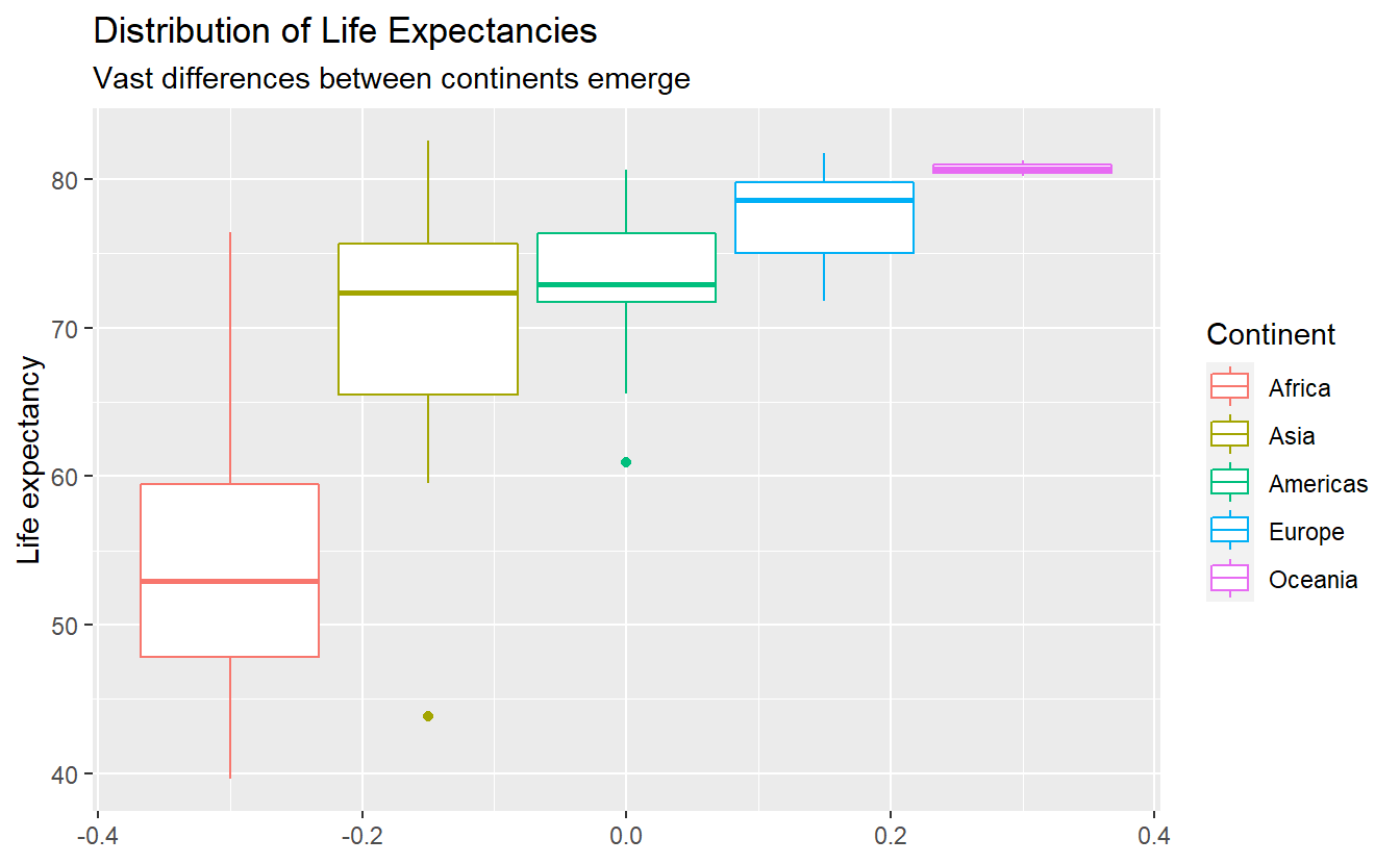
Using slice_min() on a grouped tibble can easily extract the minimal life expectancies not only for Africa or the Americas but for all five continents.
tib_2007 %>%
  group_by(continent) %>%
  slice_min(lifeExp)
#> # A tibble: 5 x 6
#> # Groups:   continent [5]
#>   country     continent  year lifeExp      pop gdpPercap
#>   <fct>       <fct>     <int>   <dbl>    <int>     <dbl>
#> 1 Swaziland   Africa     2007    39.6  1133066     4513.
#> 2 Haiti       Americas   2007    60.9  8502814     1202.
#> 3 Afghanistan Asia       2007    43.8 31889923      975.
#> 4 Turkey      Europe     2007    71.8 71158647     8458.
#> 5 New Zealand Oceania    2007    80.2  4115771    25185.
Thus, the outliers in the previous boxplot were Afghanistan and Haiti.
Further, note that mutate() behaves differently with grouped tibbles as well.
summary_evolution %>%
  mutate(newCol = mean(lowerQuartile)) %>%
  slice(1)
#> # A tibble: 5 x 6
#> # Groups:   continent [5]
#>   continent  year  mean lowerQuartile upperQuartile newCol
#>   <fct>     <int> <dbl>         <dbl>         <dbl>  <dbl>
#> 1 Africa     1952  39.1          35.8          42.1   43.6
#> 2 Americas   1952  53.3          45.3          59.4   60.3
#> 3 Asia       1952  46.3          39.4          50.9   54.2
#> 4 Europe     1952  64.4          61.1          67.9   69.9
#> 5 Oceania    1952  69.3          69.2          69.3   74.1
Notice that newCol is not the mean of all values in the lowerQuartile column.
Rather, this operation will compute the mean for each group.
This is great if this is what you want to do (e.g. if you want to compute groupwise metrics) but can go horribly awry if you are not aware of the grouping structure.
Similarly, filter() will behave groupwise with grouped tibbles as well.
In fact, filter() will behave like a grouped mutate() followed by an ungrouped filter().
summary_evolution  %>%
  filter(mean(lowerQuartile) > 55) %>%
  slice(1)
#> # A tibble: 3 x 5
#> # Groups:   continent [3]
#>   continent  year  mean lowerQuartile upperQuartile
#>   <fct>     <int> <dbl>         <dbl>         <dbl>
#> 1 Americas   1952  53.3          45.3          59.4
#> 2 Europe     1952  64.4          61.1          67.9
#> 3 Oceania    1952  69.3          69.2          69.3
Personally, I rarely use grouped mutates and filters and I make sure that I drop the groupings after summaries when I want to use mutate() or filter().
Though, there are of course use cases for these operations.
For simple operations like finding the “worst” observations from a group slice_min() is an easy way to go at it.
However, if the filtering condition on each group is not as simple, then a grouped filter could be appropriate.
3.5 Combine Data
Often, your data does not come in one single table.
For instance, take a look at the flights data from the nycflights13 package which incorporates data for all flights that departed from one of the airports in New York City (i.e. JFK, LGA or EWR) in 2013.
library(nycflights13)
flights
#> # A tibble: 336,776 x 19
#>    year month   day dep_time sched_dep_time dep_delay arr_time sched_arr_time
#>   <int> <int> <int>    <int>          <int>     <dbl>    <int>          <int>
#> 1  2013     1     1      517            515         2      830            819
#> 2  2013     1     1      533            529         4      850            830
#> 3  2013     1     1      542            540         2      923            850
#> 4  2013     1     1      544            545        -1     1004           1022
#> 5  2013     1     1      554            600        -6      812            837
#> 6  2013     1     1      554            558        -4      740            728
#> # ... with 336,770 more rows, and 11 more variables: arr_delay <dbl>,
#> #   carrier <chr>, flight <int>, tailnum <chr>, origin <chr>, dest <chr>,
#> #   air_time <dbl>, distance <dbl>, hour <dbl>, minute <dbl>, time_hour <dttm>
This is quite a lot of data so let us only look at a couple of columns.
(flights_selection <- flights %>%
  select(year:dep_time, origin, dest))
#> # A tibble: 336,776 x 6
#>    year month   day dep_time origin dest
#>   <int> <int> <int>    <int> <chr>  <chr>
#> 1  2013     1     1      517 EWR    IAH
#> 2  2013     1     1      533 LGA    IAH
#> 3  2013     1     1      542 JFK    MIA
#> 4  2013     1     1      544 JFK    BQN
#> 5  2013     1     1      554 LGA    ATL
#> 6  2013     1     1      554 EWR    ORD
#> # ... with 336,770 more rows
Notice that the columns origin and dest are only abbreviations of the airports’ names.
Luckily, the nycflights13 package also includes an airports tibble which has the corresponding airport information at hand.
airports
#> # A tibble: 1,458 x 8
#>   faa   name                          lat   lon   alt    tz dst   tzone
#>   <chr> <chr>                       <dbl> <dbl> <dbl> <dbl> <chr> <chr>
#> 1 04G   Lansdowne Airport            41.1 -80.6  1044    -5 A     America/New_Y~
#> 2 06A   Moton Field Municipal Airp~  32.5 -85.7   264    -6 A     America/Chica~
#> 3 06C   Schaumburg Regional          42.0 -88.1   801    -6 A     America/Chica~
#> 4 06N   Randall Airport              41.4 -74.4   523    -5 A     America/New_Y~
#> 5 09J   Jekyll Island Airport        31.1 -81.4    11    -5 A     America/New_Y~
#> 6 0A9   Elizabethton Municipal Air~  36.4 -82.2  1593    -5 A     America/New_Y~
#> # ... with 1,452 more rows
Imagine that for some arbitrary reason we need the full names of the airports in our columns origin and dest of our tibble flights_selection instead of the abbreviations.
We can easily combine these two tables using a join function with a column they have in common as “identifier”.
In this case, we will have to rename the faa column to origin resp. dest before we can join the tables.
airport_names <- airports %>%
  # We only want to join the names and no other information
  select(faa, name) %>%
  # Rename for common column name
  rename(origin = faa)

# Join the tables
(origin_join <- flights_selection %>%
  left_join(airport_names, by = "origin"))
#> # A tibble: 336,776 x 7
#>    year month   day dep_time origin dest  name
#>   <int> <int> <int>    <int> <chr>  <chr> <chr>
#> 1  2013     1     1      517 EWR    IAH   Newark Liberty Intl
#> 2  2013     1     1      533 LGA    IAH   La Guardia
#> 3  2013     1     1      542 JFK    MIA   John F Kennedy Intl
#> 4  2013     1     1      544 JFK    BQN   John F Kennedy Intl
#> 5  2013     1     1      554 LGA    ATL   La Guardia
#> 6  2013     1     1      554 EWR    ORD   Newark Liberty Intl
#> # ... with 336,770 more rows
Here, we joined the two tables using the left_join(x, y, by) function which joins two tables x (here flights_selection) with table y (here airport_names) using the column by (here origin).
The name left_ refers to the fact that the results will include all rows of x whereas the right_join() function will keep all rows in y.
Additionally, one could use inner_join() which includes all rows that are in both x and y.
Finally, there is also full_join() whose result includes all rows that are present in either x or y.
For a more detailed and visual explanation on the differences of the join functions refer to Chapter 13.4 of R4DS or the dplyr cheatsheet.
For our original task, we still need to join the names w.r.t. to the dest column.
This time, instead of enforcing a column name to be in common before joining, we can also match the corresponding column names through our join function.
(dest_join <- origin_join %>%
  left_join(airport_names, by = c("dest" = "origin")))
#> # A tibble: 336,776 x 8
#>    year month   day dep_time origin dest  name.x          name.y
#>   <int> <int> <int>    <int> <chr>  <chr> <chr>           <chr>
#> 1  2013     1     1      517 EWR    IAH   Newark Liberty~ George Bush Intercont~
#> 2  2013     1     1      533 LGA    IAH   La Guardia      George Bush Intercont~
#> 3  2013     1     1      542 JFK    MIA   John F Kennedy~ Miami Intl
#> 4  2013     1     1      544 JFK    BQN   John F Kennedy~ <NA>
#> 5  2013     1     1      554 LGA    ATL   La Guardia      Hartsfield Jackson At~
#> 6  2013     1     1      554 EWR    ORD   Newark Liberty~ Chicago Ohare Intl
#> # ... with 336,770 more rows
Notice that we have two columns name.x and name.y in our resulting tibble now.
This is of course due to the fact that prior to joining, both tibbles airport_names and origin_join include the column name and the join functions simply keeps them both but adds a suffix to both.
Finally, let us overwrite origin and dest with the corresponding columns and delete the superfluous columns afterwards.
(flights_full_names <- dest_join %>%
  mutate(origin = name.x, dest = name.y) %>%
  select(-c(name.x, name.y)))
#> # A tibble: 336,776 x 6
#>    year month   day dep_time origin              dest
#>   <int> <int> <int>    <int> <chr>               <chr>
#> 1  2013     1     1      517 Newark Liberty Intl George Bush Intercontinental
#> 2  2013     1     1      533 La Guardia          George Bush Intercontinental
#> 3  2013     1     1      542 John F Kennedy Intl Miami Intl
#> 4  2013     1     1      544 John F Kennedy Intl <NA>
#> 5  2013     1     1      554 La Guardia          Hartsfield Jackson Atlanta Intl
#> 6  2013     1     1      554 Newark Liberty Intl Chicago Ohare Intl
#> # ... with 336,770 more rows
Additionally, we could add separate columns or rows through bind_cols() resp. bind_rows().
Of course, we will need some sample columns/rows to add first.
# Sample column with flight numbers
flight_number <- seq_along(flights_selection$year)

# Sample row (needs to be tibble with same column names)
new_flight <-  tribble(
  ~year, ~month, ~day, ~dep_time, ~origin, ~dest, ~flight_number,
  2013, 1, 1, 500, "Ulm", "Oberdischingän", 0
)

flights_full_names %>%
  bind_cols(flight_number = flight_number) %>%
  bind_rows(new_flight) %>%
  arrange(flight_number)  # sorts output by flight_number
#> # A tibble: 336,777 x 7
#>    year month   day dep_time origin          dest                  flight_number
#>   <dbl> <dbl> <dbl>    <dbl> <chr>           <chr>                         <dbl>
#> 1  2013     1     1      500 Ulm             Oberdischingän                    0
#> 2  2013     1     1      517 Newark Liberty~ George Bush Intercon~             1
#> 3  2013     1     1      533 La Guardia      George Bush Intercon~             2
#> 4  2013     1     1      542 John F Kennedy~ Miami Intl                        3
#> 5  2013     1     1      544 John F Kennedy~ <NA>                              4
#> 6  2013     1     1      554 La Guardia      Hartsfield Jackson A~             5
#> # ... with 336,771 more rows
3.6 Case Study
Now that we are up to speed with how dplyr handles data wrangling, let us use our new-found knowledge to run a few analyses on a real data set.
Again, let us look at the flights data from the nycflights13 package.
flights
#> # A tibble: 336,776 x 19
#>    year month   day dep_time sched_dep_time dep_delay arr_time sched_arr_time
#>   <int> <int> <int>    <int>          <int>     <dbl>    <int>          <int>
#> 1  2013     1     1      517            515         2      830            819
#> 2  2013     1     1      533            529         4      850            830
#> 3  2013     1     1      542            540         2      923            850
#> 4  2013     1     1      544            545        -1     1004           1022
#> 5  2013     1     1      554            600        -6      812            837
#> 6  2013     1     1      554            558        -4      740            728
#> # ... with 336,770 more rows, and 11 more variables: arr_delay <dbl>,
#> #   carrier <chr>, flight <int>, tailnum <chr>, origin <chr>, dest <chr>,
#> #   air_time <dbl>, distance <dbl>, hour <dbl>, minute <dbl>, time_hour <dttm>
Our first goal is to us check how departure delay relates to the scheduled departure time on any given day. Therefore, let us select the relevant columns.
delays <- flights %>%
  select(year:dep_delay)
Before we work with our new table delays it is wise to check whether there are any missing values.
A useful helper function for that is is.na() that checks whether any value is NA and returns true or false accordingly.
delays %>%
  mutate(across(.fns = is.na)) %>%
  summarise(across(.fns = sum))
#> # A tibble: 1 x 6
#>    year month   day dep_time sched_dep_time dep_delay
#>   <int> <int> <int>    <int>          <int>     <int>
#> 1     0     0     0     8255              0      8255
Alright, it looks like there are a couple of rows that have missing departure times. These rows probably relate to canceled flights. There are a couple of options on how we could deal with those missing values. We could either impute them, i.e. fill in some hopefully sensible alternative value, or ignore the rows with missing values. Here will do the latter but you will work the former approach in the exercises.
Now, let us see how delays change from day to day.
We will try to look at each day through a couple of common statistical quantities.
Notice here that we want to visualize the statistical quantities over time.
Thus, it is helpful to have a meaningful time variable to use as x-aesthethic in the plots later on.
Surprisingly, working with dates and times is not a trivial task. Just imagine how many things we would possibly have to take into account when we want :
- How is a date formatted?
- How is a time formatted?
- How many days does the current month have?
- Are we dealing with a leap year?
- What time zone are we in?
- Does a specific region work with daylight saving time (DST)?
This is why the tidyverse has two packages lubridate and hms dedicated to work with time/date data.
Here, we will only need lubridate::make_date() to create a x-aesthetic but you might want to keep that in the back of your mind when you encounter time/date data.
# Compute statistical quantities
summaries_delay <- delays_departed %>%
  group_by(year, month, day) %>%
  summarise(
    min = min(dep_delay),
    max = max(dep_delay),
    upperQuart = quantile(dep_delay, 0.75),
    lowerQuart = quantile(dep_delay, 0.25),
    mean = mean(dep_delay),
    median = median(dep_delay),
    n = n(),
    .groups = "drop"
  ) %>%
  pivot_longer(
    -(year:day),
    values_to = "value",
    names_to = "summary"
  ) %>%
  mutate(date = lubridate::make_date(year, month, day))
summaries_delay
#> # A tibble: 2,555 x 6
#>    year month   day summary    value date
#>   <int> <int> <int> <chr>      <dbl> <date>
#> 1  2013     1     1 min        -15   2013-01-01
#> 2  2013     1     1 max        853   2013-01-01
#> 3  2013     1     1 upperQuart   9   2013-01-01
#> 4  2013     1     1 lowerQuart  -4   2013-01-01
#> 5  2013     1     1 mean        11.5 2013-01-01
#> 6  2013     1     1 median      -1   2013-01-01
#> # ... with 2,549 more rows

# Visualize quantities (except for amount of flights) over time
summaries_delay %>%
  filter(summary != "n") %>%
  ggplot(aes(x = date, y = value, col = summary)) +
  geom_line(show.legend = F) +
  facet_wrap(vars(summary), scale = "free_y") +
  # "free_y" makes y-axis of facets variable
  scale_x_date(date_labels = "%m") +
  # Formats x-axis to month number (works with date format)
  labs(
    x = "Month",
    y = "Delay (in min)"
  ) +
  theme_bw()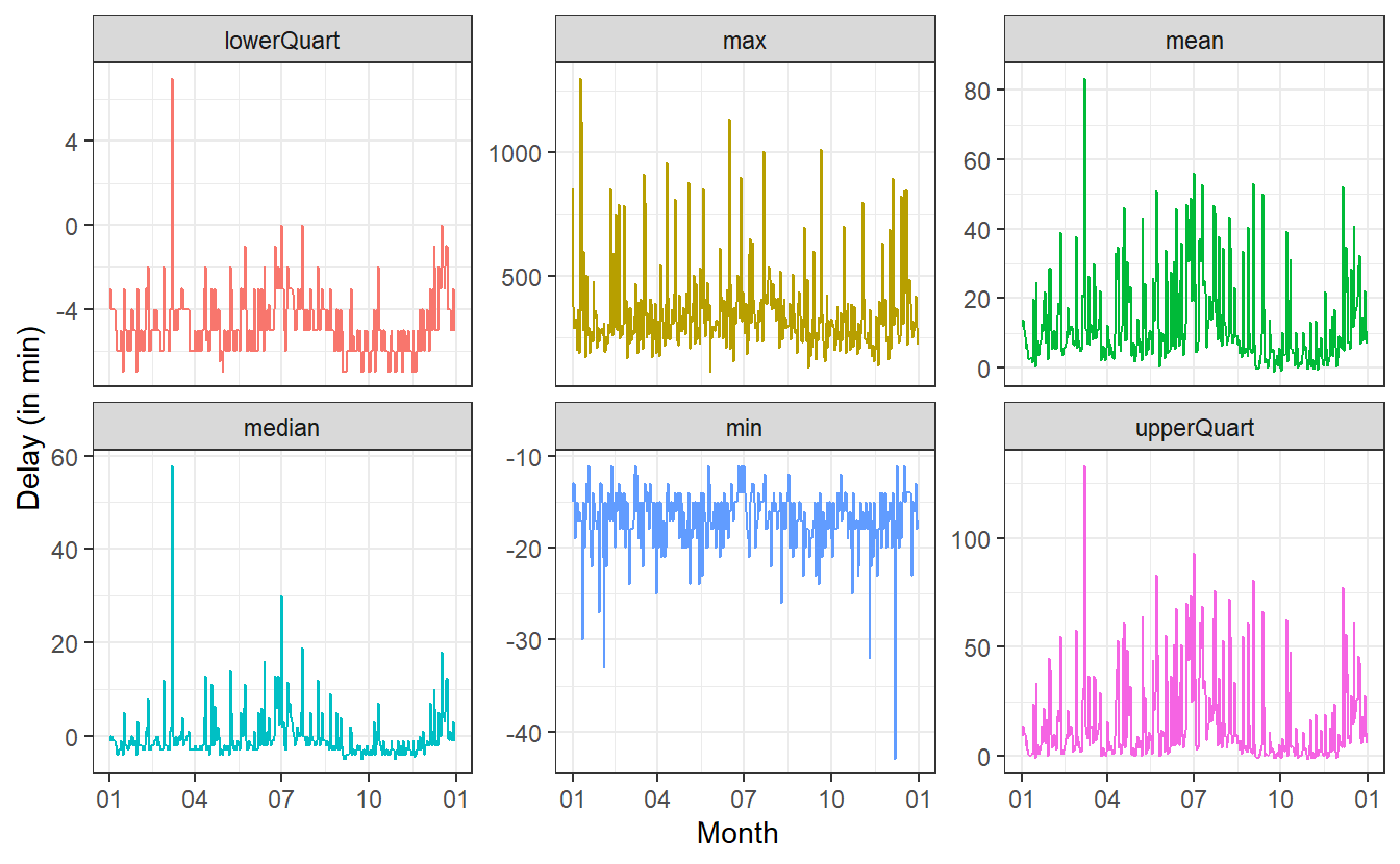
So, this is really volatile.
There appear to be massive day-to-day differences in the delays.
Before we try to interpret anything here, it might be good to smoothen the results in hope of seeing some meaningful patterns.
To do so, let us add a geom_smooth() layer.
However, geom_smooth() uses a pretty high degree of smoothness by default.
But in order to preserve some of the intrinsic volatility, we can adjust the span argument of geom_smooth().
This argument is takes values between 0 and 1 where higher values correspond to a smoother result.
While we’re at it, we might as well order the facets such that they are in “increasing” order.
This can be done by converting the summary column to factor where we predetermine the ordering of the factor’s values.
# Order of summaries
summary_levels <- c(
"min",
"lowerQuart",
"median",
"mean",
"upperQuart",
"max"
)
summaries_delay %>%
filter(summary != "n") %>%
mutate(summary = factor(summary, levels = summary_levels)) %>%
ggplot(aes(x = date, y = value, col = summary)) +
geom_line(show.legend = F, alpha = 0.35) +
geom_smooth(show.legend = F, se = F, span = 0.1, size = 1) +
facet_wrap(vars(summary), scale = "free_y") +
scale_x_date(date_labels = "%m") +
labs(
x = "Month",
y = "Delay (in min)"
) +
theme_bw()
#> `geom_smooth()` using method = 'loess' and formula 'y ~ x'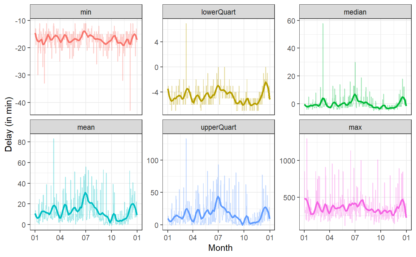 Here, I have chosen
 span = 0.1 which I feel was a good trade-off for the volatily I am still trying to catch and the smoothness I wanted to get into to the picture.
Of course, this is not an exact science but this is just for getting to know the data.
So, what can we take away from these pictures? For more details on the time axis, it will probably be good to look at some of these plots on their own. But for an overview, we can still extract some information.
Shockingly, the max-plot shows that on any given day chances are pretty high that there is a flight with a delay of 250 to 500 minutes. That is approximately 4 to 8.5 hours!
Of course, this does not mean that on each day there are a lot of planes that are delayed by so much. In fact, at least 75% of the flights on any day will have a delay of at most one hour (at least on most days) as can be seen in the upper quartile plot.
On the flipside of things, on most days 25% of the planes will arrive a couple of minutes early. Even better yet, on each day there is a plane that arrives at least 10 to 15 minutes early.
Now, let us consider the day-to-day changes of the delays. Therefore, let us ignore the minimum and the maximum of the delays and consider only the three quartiles.
summaries_delay %>%
  filter(!(summary %in% c("n", "min", "max", "mean"))) %>%
  ggplot(aes(x = date, y = value, col = summary)) +
  geom_smooth(span = 0.1) +
  geom_hline(yintercept = 0, linetype = 2) +
  theme_bw() +
  theme(legend.position = "bottom") +
  labs(x = "Month", y = "Delay") +
  scale_x_date(
    date_breaks = "1 month",
    date_labels = "%m"
  )
#> `geom_smooth()` using method = 'loess' and formula 'y ~ x'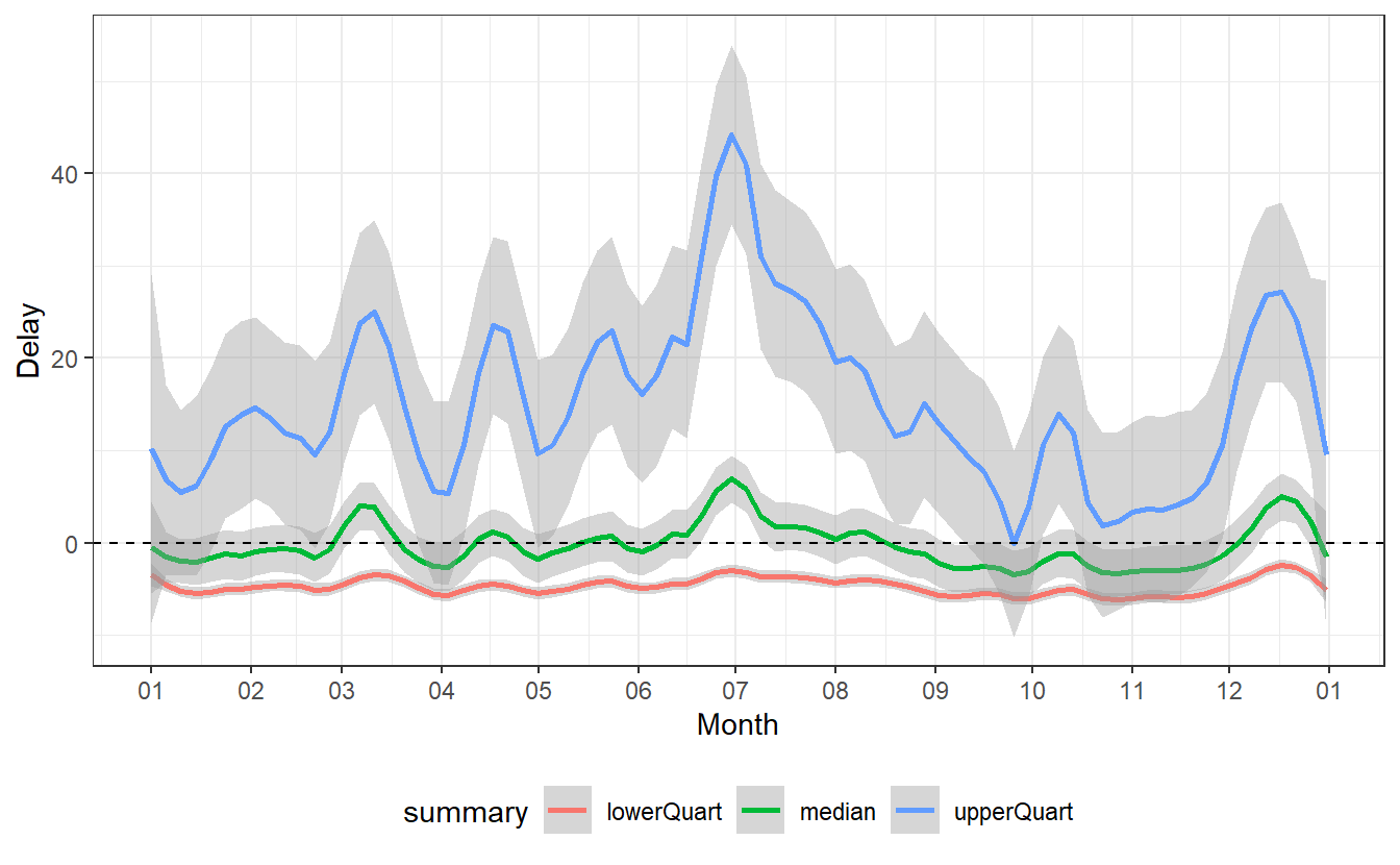
Most notably, we can detect a spike in delays at the end of June as well as a decrease in delays from that point onward for the next couple of months until the delays start to increase again toward the end of the year.
Some of these changes are pretty self-explanatory:
- At the end of the year there are certainly more people traveling home for Christmas, so there is bound to be more delays.
- The large spike at the end of June comes right after the school term ended in New York on Wednesday, June 2640. So presumably, the spike in delays is a result of many people going on vacation on the first weekend after school is out.
Other fluctuations appear counter-intuitive or seem to have no obvious reasons. Of course, someone with a more intimate knowledge on the American holidays and/or American preferences for travel could probably extract more meaning from this.
Obviously, holiday season might not be the only factor that influences delays. Instances like these are the moments where further analysis might need some expert from the field which generated the data. Alternatively, one could try to find other supporting data sets which measure other possibly relevant variables41.
One such supportive data set could be weather data.
Luckily, these are also part of the nycflights13 package and are saved as weather and includes hourly meteorological data for the airports LGA, JFK and EWR.
weather
#> # A tibble: 26,115 x 15
#>   origin  year month   day  hour  temp  dewp humid wind_dir wind_speed wind_gust
#>   <chr>  <int> <int> <int> <int> <dbl> <dbl> <dbl>    <dbl>      <dbl>     <dbl>
#> 1 EWR     2013     1     1     1  39.0  26.1  59.4      270      10.4         NA
#> 2 EWR     2013     1     1     2  39.0  27.0  61.6      250       8.06        NA
#> 3 EWR     2013     1     1     3  39.0  28.0  64.4      240      11.5         NA
#> 4 EWR     2013     1     1     4  39.9  28.0  62.2      250      12.7         NA
#> 5 EWR     2013     1     1     5  39.0  28.0  64.4      260      12.7         NA
#> 6 EWR     2013     1     1     6  37.9  28.0  67.2      240      11.5         NA
#> # ... with 26,109 more rows, and 4 more variables: precip <dbl>,
#> #   pressure <dbl>, visib <dbl>, time_hour <dttm>
To incorporate this data we will run the following analysis:
- Combine each flight with hour-wise visibility (in miles) from
weather. - Compute average delay of flights which had same visibility.
- Create a scatter plot and look for a trend.
# Step 1
visib_data <- weather %>%
  select(origin:hour, visib)

flights_departed <- flights %>%
  select(year:dep_delay, hour, origin) %>%
  filter(!is.na(dep_time))

flights_visib <- left_join(
  flights_departed,
  visib_data,
  by = c("year", "month", "day", "hour", "origin")
)
When combining the data like this we will have to be aware of possible missing values. So let’s check if there are any.
flights_visib %>%
  mutate(across(.fns = is.na)) %>%
  summarise(across(.fns = sum))
#> # A tibble: 1 x 9
#>    year month   day dep_time sched_dep_time dep_delay  hour origin visib
#>   <int> <int> <int>    <int>          <int>     <int> <int>  <int> <int>
#> 1     0     0     0        0              0         0     0      0  1528
There are a couple of missing visibility values. Let’s ignore those and implement step 2 of our analysis.
# Step 2
flights_visib <- flights_visib %>%
  filter(!is.na(visib))


avg_delays <- flights_visib %>%
  group_by(visib, origin) %>%
  summarise(avg_delay = median(dep_delay), .groups = "drop")
avg_delays
#> # A tibble: 57 x 3
#>   visib origin avg_delay
#>   <dbl> <chr>      <dbl>
#> 1  0    JFK           -4
#> 2  0    LGA           59
#> 3  0.06 JFK            0
#> 4  0.12 EWR           -2
#> 5  0.12 JFK           22
#> 6  0.12 LGA           -3
#> # ... with 51 more rows

# Step 3
avg_delays %>%
  ggplot(aes(x = visib, y = avg_delay, col = origin)) +
geom_point() 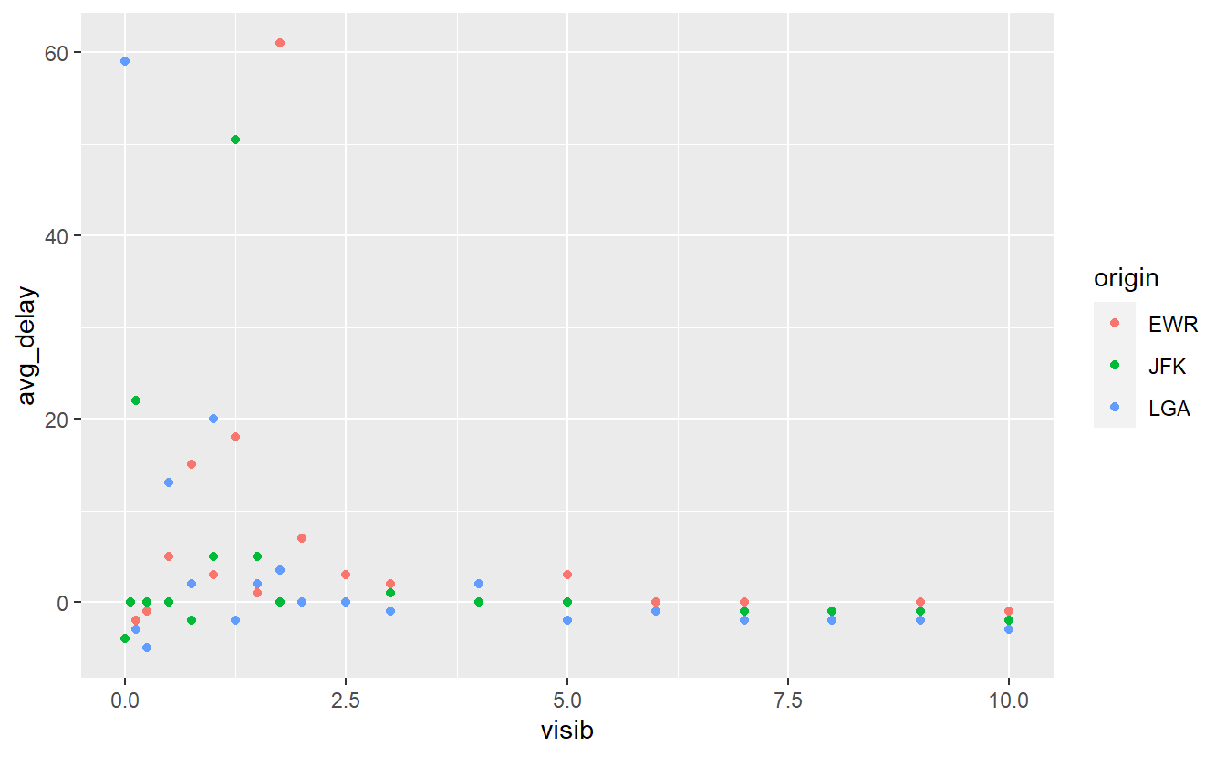
Here, we can see that there is a larger variance in the average delays when the visibility is low. This appears to be similar for all three airports. Let us fit a straight line through this in order to get a feeling for the linear trend.
avg_delays %>%
  ggplot() +
  geom_point(
    aes(x = visib, y = avg_delay, col = origin)
  ) +
  geom_smooth(
    aes(x = visib, y = avg_delay),
    method = "lm",
    col = "black"
  ) +
  labs(
    x = "Visibility (in miles)",
    y = "Average Delay (in minutes)"
  )
#> `geom_smooth()` using formula 'y ~ x'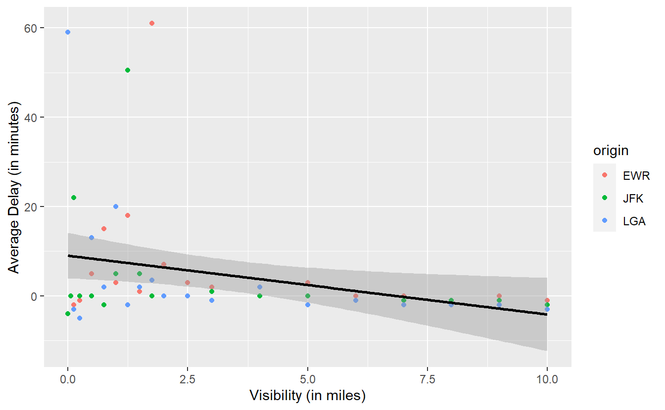
Looking at the slope of the line one might be tempted to infer that there is a negative relationship between visibility and delay, i.e. as visibility decreases, the amount of delays increases. In this case, you may want to notice the gray area around the straight line.
As we have seen in previous plots, this area is automatically generated by geom_smooth() and represents the uncertainty of the line estimate.
We do not want to go into too much detail here, so for now just notice that it is possible to draw a horizontal line through the gray area.
This implies that, given the uncertainty of our estimate, the “true” straight line representing the linear relationship between visibility and delay might just as well be a horizontal line.
Consequently, it is possible that there is no real relationship between visibility and delay. At least none that we can definitely “proof” here. In terminology from the subject of hypothesis testing, this means that the relationship is not significant. We will learn more about this concept in Chapter 6.
Here, this analysis worked because we could sensibly group by visibility although it is theoretically a continuous and not a categorical variable. In practice though, humans like to observe “nice” rounded values. Thus, it happens quite often that theoretically continuous variables are observed only at a couple of distinct values. Nevertheless, we could arrange continuous values into groups and then run the same analysis with respect to this new grouping.
In total, we have seen two small analyses here that dive into our flights data and try to extract meaning from it. We went at it via a mix of wrangling data and visualizing our new-found variables. This, in essence, is what we do within data exploration.
Finally, our goal here is to generate questions for further analyses. In this case, we started out with two very generic questions:
- How do flight delays fluctuate from day to day?
- How are delays associated to weather conditions?
But on our quest to answer them, we generated even more questions which can be thought of as somewhat more specific:
- What explains the rise and fall in average delays at certain moments throughout the year?
- How is the visibility at an airport related to delays?
On one hand, we answered the first question only partially for some obvious instances but left a lot open for debate. On the other hand, we quantified the interplay between visibility and delays somewhat rigorously but then again we also ignored a lot of other weather-related variables we had at our disposal.
In effect, these open points generate the next questions for further analyses. Consequently, data exploration becomes a cycle of generating questions, diving into them and coming up with even more questions. In the end, this will foster our understanding of the data set at hand until we believe that we understand the data sufficiently well.
We probably will not be able to explain everything that is going on in a data set but at some point there comes the time to distill our knowledge into a model that explains at least a lot of the data’s behavior. But this is a story for a later time. We will start to talk about models in Chapter 7.
3.7 Exercises
3.7.1 Select
Run ?tidyselect::language to find helper functions that go along with select()42 to extract variables from the gapminder::gapminder data.
More specifically, do not type in any specific variable names into select() and extract the variables
- whose names start with the letter c.
- whose names start with the letter c or end with p.
- whose names contain the letter t.
- which are of type
factor(a helpful function could also beis.factor()). - which are not of type
factor.
3.7.2 Filter
The stringr package contains many useful functions to deal with strings/text such as str_detect(), str_starts() and str_ends() that work well with the filter() function43.
If applicable, use these to extract from the gapminder::gapminder data all observations corresponding to
- GDPs between 600 and 2000.
- life expectancies below 60 in the 1990s.
- American countries whose names start with “U” from before 1980.
- all countries whose names end with “stan” and whose populations are greater than 5 million.
- all countries that have a “z” in their names.
3.7.3 Mutate
3.7.3.1 Simple calculation
Take a look at the mpg data set from the ggplot2 package.
The variables cty and hwy contains information on the mileage of a car in the city and on the highway, respectively.
Compute a new variable avgMileage as average of the city and highway mileage.
3.7.3.2 Conversion of data types
In the mpg data set convert all variables of type character to type factor.
This shall be done with across(), as.factor() and a selection helper (see exercises on select()) which helps to apply the function to the correct columns.
3.7.4 Summarise
3.7.4.1 Summary without across()
Take a look at the gapminder::gapminder data set. Compute the mean and median of the variables population resp. GDP for each continent in each year without using across(), i.e. compute the following tibble
#> # A tibble: 60 x 6
#>    year continent  pop_mean pop_median gdpPercap_mean gdpPercap_median
#>   <int> <fct>         <dbl>      <dbl>          <dbl>            <dbl>
#> 1  1952 Africa     4570010.   2668124.          1253.             987.
#> 2  1952 Americas  13806098.   3146381           4079.            3048.
#> 3  1952 Asia      42283556.   7982342           5195.            1207.
#> 4  1952 Europe    13937362.   7199786.          5661.            5142.
#> 5  1952 Oceania    5343003    5343003          10298.           10298.
#> 6  1957 Africa     5093033.   2885790.          1385.            1024.
#> # ... with 54 more rows
3.7.4.2 Summary with across()
Now, do the same thing with across().
The column names should be exactly the same as in the previous tibble.
Hint: You can name elements of a vector.
This could be useful in conjunction with across().
For instance, a named vector can be declared like this:
c(name1 = 123, name2 = 5)
#> name1 name2
#>   123     5
3.7.4.3 Summaries and Pivoting
For all non-factor variables in gapminder::gapminder compute the minimum, mean, median and maximum and collect the summary statistics in a tibble of the following form
#> # A tibble: 4 x 5
#>   summary  year lifeExp         pop gdpPercap
#>   <chr>   <dbl>   <dbl>       <dbl>     <dbl>
#> 1 min     1952     23.6      60011       241.
#> 2 mean    1980.    59.5   29601212.     7215.
#> 3 median  1980.    60.7    7023596.     3532.
#> 4 max     2007     82.6 1318683096    113523.
It is possible to do all of that in a single pipe consisting of three steps. You don’t have to do it like that but if you want to, here are a few hints:
- Use
summarise()in conjunction withacross(). The.colsargument ofacross()can be specified with a selection helper (see exercises onselect()). The.fnsargument can be specified with a named vector. - The output of
summarise()should resemble the output of the previous exercise with column names of the form<variable>_<summary_statistic>. Usepivot_longer()and setnames_sep = "_". Figure out how thenames_toargument should be specified now. - Finally, use
pivot_wider(). Use the column that contains the summary statistics asid_cols.
3.7.5 Visualisation with time data
Recreate Figure 3.2 from the above tibble summary_evolution.
A helpful geom could be geom_ribbon().
Be aware that your x-axis labels should be legible.
3.7.6 Flight data
Take another look at the flights data set from the nycflights13 package.
Generate a boxplot that illustrates whether there are differences between week days w.r.t. the daily amount of flights, i.e. try to find an answer to the question “Does the weekday influence the amount of flights on a given day?”.
A helpful function could be wday() from the lubridate package.