9 Classification
One of the most famous data sets that comes pre-installed with R is the data set iris which contains measurements (in cm) of the variables Sepal.Length, Sepal.Width, Petal.Length and Petal.Width of 50 flowers from each of the species Iris setosa, Iris versicolor and Iris virginica70.
Obviously, the aforementioned variables contain measurements of width and length of the flowers’ sepals and petals71.
All in all, our data set looks like this:
head(iris)
#>   Sepal.Length Sepal.Width Petal.Length Petal.Width Species
#> 1          5.1         3.5          1.4         0.2  setosa
#> 2          4.9         3.0          1.4         0.2  setosa
#> 3          4.7         3.2          1.3         0.2  setosa
#> 4          4.6         3.1          1.5         0.2  setosa
#> 5          5.0         3.6          1.4         0.2  setosa
#> 6          5.4         3.9          1.7         0.4  setosa
A quick exploratory data analysis reveals the following plot
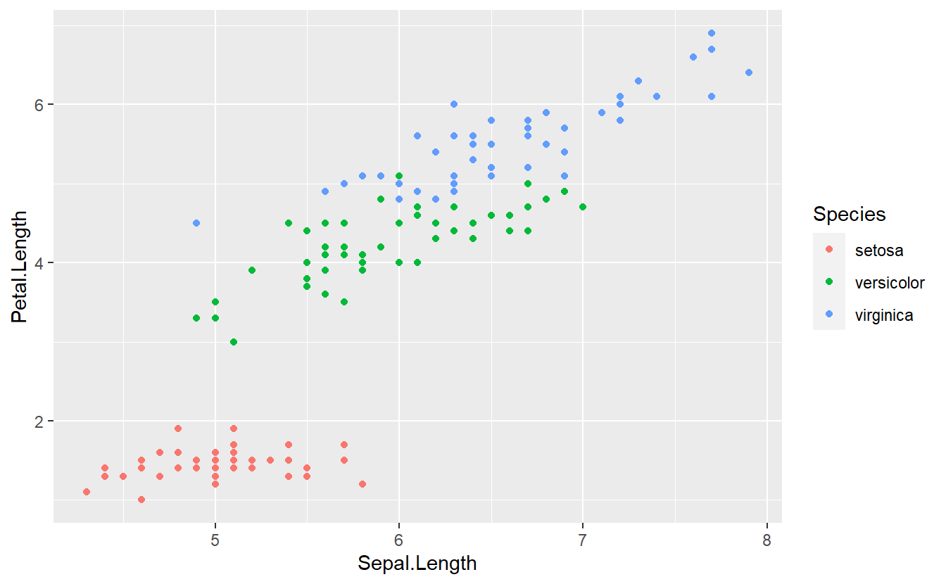
With a single glance you may detect that it should be theoretically quite easy to differentiate between flowers of the species setosa and the two other species on the basis of the variable Petal.Length.
One rule you might come up with to differentiate between setosa and non-setosa is the following:
If the petal’s length is smaller than 2.5, then the corresponding flower likely belongs to the species setosa. Similarly, if the condition is not fulfilled, then the flower likely does not belong to the species setosa.
What we have just come up with is known as a classification rule in the machine learning community. Broadly speaking, by trying to assign an observation to a specific group based on the variables of that observation, we have effectively worked on a so-called classification problem. More specifically, here we have worked on a binary classification problem since we only tried to differentiate between two groups.
In theory, of course, we could also try to come up with more rules to classify our observations into one of the three categories setosa, versicolor or virginica. Judging from the above figure, this might be harder because the observations corresponding to versicolor and virginica are very close together in the plane and there is no obvious rule which divides the observations into two classes.
So instead, let us try to stick to our binary classification problem for simplicity. Also, let us try to use something more along statistical lines to classify our data rather than judging from a picture. On this endeavor, we will learn a technique that is related to linear regression.
9.1 Logistic Regression
Before we get started, let us transform the data such that our labels match our problems. Here, we will go with a simple 0/1 encoding of the group labels. Consequently, 1 will stand for setosa and 0 will stand for non-setosa.
tib <- iris %>%
  mutate(group = if_else(Species == "setosa", 1, 0))

tib %>%
  ggplot(aes(Sepal.Length, Petal.Length, col = factor(group))) +
  geom_point()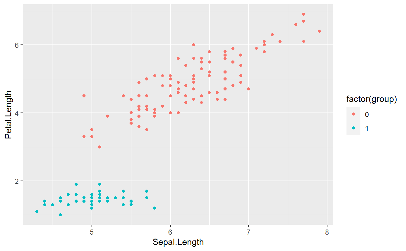
Now, we might be tempted to think of the group labels as numeric values and try to fit the label via a linear regression like so
linMod <- lm(data = tib, group ~ Petal.Length)
summary(linMod)
#>
#> Call:
#> lm(formula = group ~ Petal.Length, data = tib)
#>
#> Residuals:
#>      Min       1Q   Median       3Q      Max
#> -0.52074 -0.12516  0.05895  0.11866  0.44350
#>
#> Coefficients:
#>               Estimate Std. Error t value Pr(>|t|)
#> (Intercept)   1.262463   0.035218   35.85   <2e-16 ***
#> Petal.Length -0.247240   0.008487  -29.13   <2e-16 ***
#> ---
#> Signif. codes:  0 '***' 0.001 '**' 0.01 '*' 0.05 '.' 0.1 ' ' 1
#>
#> Residual standard error: 0.1829 on 148 degrees of freedom
#> Multiple R-squared:  0.8515, Adjusted R-squared:  0.8505
#> F-statistic: 848.6 on 1 and 148 DF,  p-value: < 2.2e-16
Unfortunately, the predictions will never give us an exact prediction of 0 or 1, as can be seen here:
tib %>%
  mutate(predictions = predict(linMod)) %>%
  ggplot(aes(y = predictions, col = factor(group))) +
  geom_boxplot() +
  geom_hline(yintercept = 1, linetype = 2) +
  geom_hline(yintercept = 0, linetype = 2)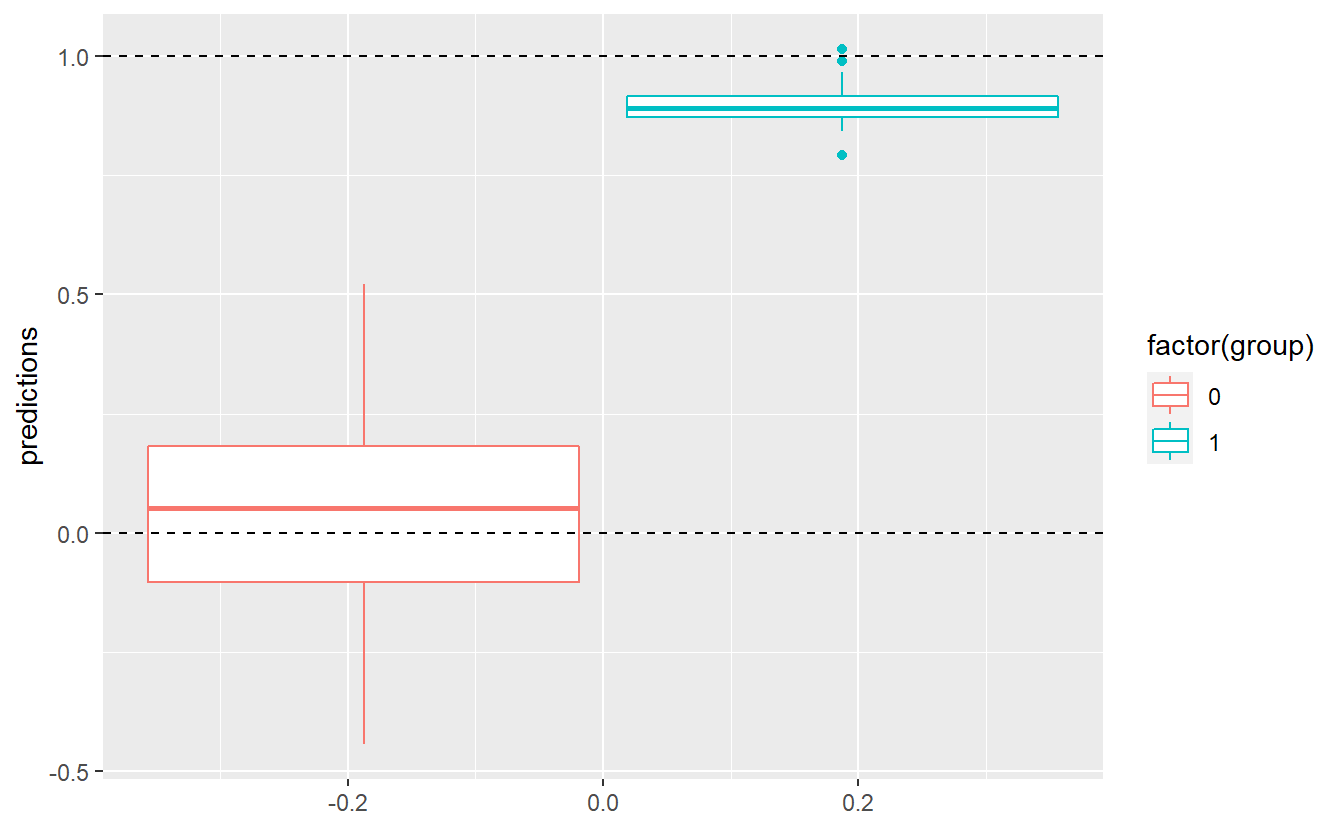
Still, we could come up with a threshold \(C\) and classify an observation into group 0 if the corresponding predicted value of our fitted linear model is below this value \(C\). Otherwise, we classify an observation into group 1. For instance, we could assume \(C = 0.5\). Then, our classification delivers the following results
C <- 0.5
intercept <- coefficients(linMod)[1]
slope <- coefficients(linMod)[2]
tib %>%
  mutate(predictions = predict(linMod)) %>%
  mutate(predGroup = ifelse(predictions >= C, "1", "0")) %>%
  ggplot(aes(x = Petal.Length, y = group, col = predGroup)) +
  geom_point() +
  geom_abline(intercept = intercept, slope = slope) +
  geom_hline(yintercept = 0.5, linetype = 2)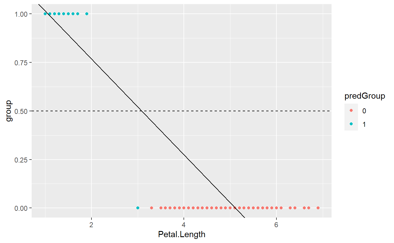
Here, we can visually see that one observation was misclassified. Also, the depicted regression line indicates that this is a result of the observation’s fitted value being greater than \(C = 0.5\).
In the end, in this particular example we got a pretty decent classification. Nevertheless, our methodology was kind of “quick and dirty” and is far from optimal (not least because our arbitrarily chosen constant \(C\) does not have any interpretation and came out of the blue).
Here, a major point of criticism is the fact that we ran a linear regression on a categorical response variables. In this case, this fact was a bit obscured by the fact that we used 0 and 1 as group labels but still we are dealing with a fundamentally categorical variable.
So, to overcome this problem we could interpret our fitted values as something along the lines of “probability that the corresponding observation belongs to group 1”. However, this interpretation is fundamentally troublesome as well because the fitted values of a linear regression are not restricted to \([0, 1]\).
Thankfully, there is a solution for this particular issue and it comes in the form of the so-called logistic regression whose name comes from the fact that at some point this regression uses the logistic function \[\begin{align*} f(x) = \frac{L}{1 + e^{-k(x - x_0)}}, \quad x \in \mathbb{R}, \end{align*}\] where \(L\) describes the maximum value of \(f\), \(x_0\) the “midpoint” of the resulting curve and \(k\) the growth rate of said curve. For \(L = 1\), \(k = 1\) and \(x_0 = 0\), \(f\) looks like this:
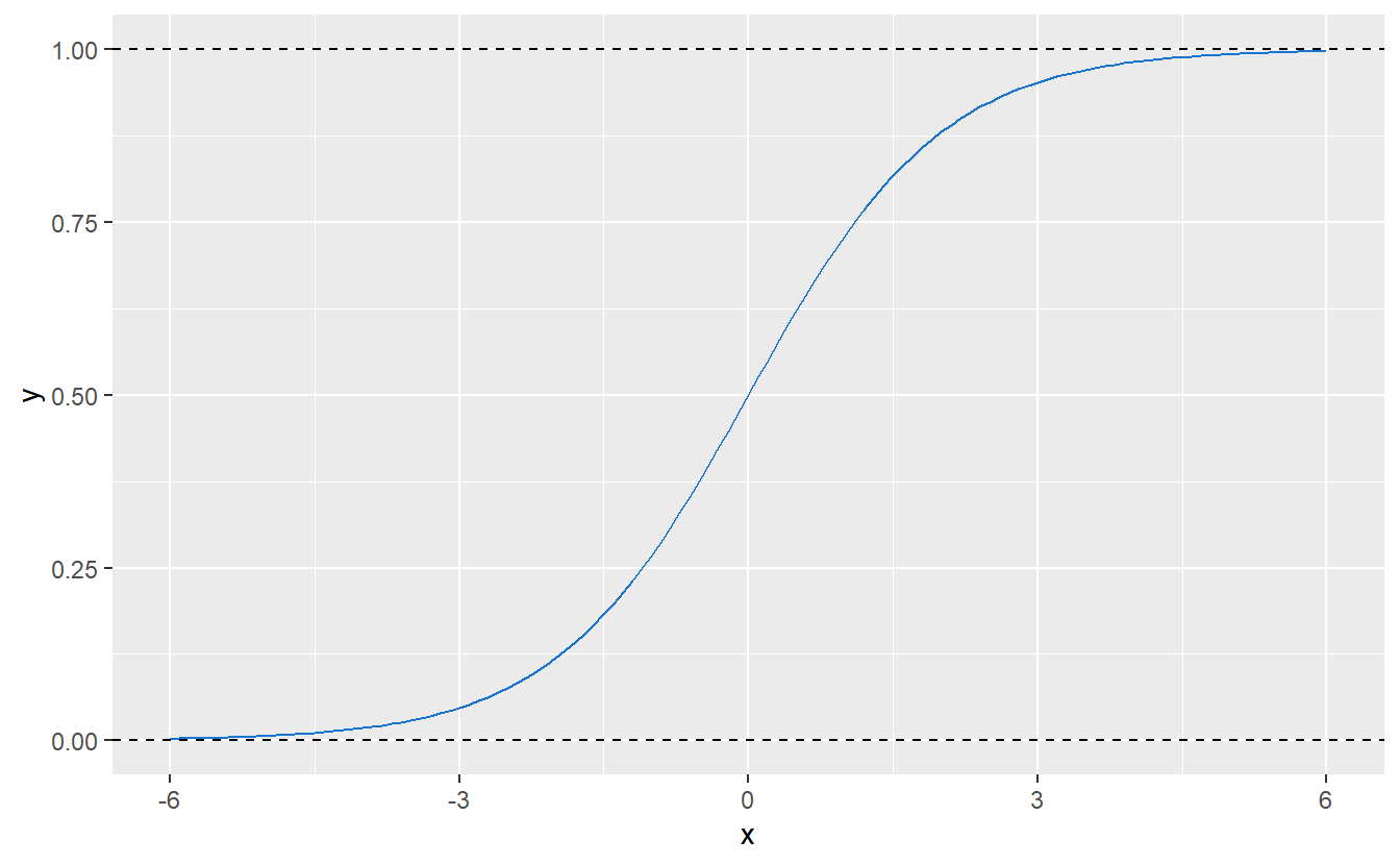
Figure 9.1: Logistic function with parameters \(L = 1\), \(k = 1\) and \(x_0 = 0\).
Consequently, this kind of function could be used to “transform” any arbitrary real value (such as a fitted value resulting from a linear regression) to \([0, 1]\). So, in simple terms one can think of logistic regression as running a linear regression and then transforming the fitted values to the interval \([0, 1]\).
Mathematically though, there is a subtle difference between this and actual logistic regression. Thus, let us take a step back to ponder on the differences. Recall that the standard linear regression is built around the notion of error terms \(\varepsilon_i \sim \mathcal{N}(0, \sigma^2)\), iid. with \(\sigma^2 > 0\), and the response variable \(Y\) is described as \[\begin{align*} Y = X\beta + \varepsilon, \end{align*}\] where \(X\) is the design matrix and \(\beta\) the parameters of this linear model.
What follows from this is that, given observed predictors \(X = x\), it holds that \[\begin{align*} \mathbb{E}[Y|X = x] = x^T\beta. \end{align*}\] Conversely, notice though that from \(\mathbb{E}[Y|X = x] = x^T\beta\) it does not follow that \(Y = X\beta + \varepsilon\). So, in the second formulation (without residuals \(\varepsilon\)) we try to estimate the expected value of a random variable \(Y\) through the linear predictor \[\begin{align*} \eta = \beta_0 + \beta_1 x_1 + \ldots + \beta_p x_p = x^T\beta. \end{align*}\]
Now, what so-called generalized linear models (GLMs) do, is they try to still use a linear predictor as before but link the expected value \(\mathbb{E}[Y|X = x]\) to the linear predictor \(\eta\) via a link function \(g\), i.e. \[\begin{align*} g(\mathbb{E}[Y|X = x]) = \eta = \beta_0 + \beta_1 x_1 + \ldots + \beta_p x_p = x^T\beta. \end{align*}\] Similarly, since \(g\) is a one-to-one mapping we can use its inverse, i.e. the response function \(h = g^{-1}\). Therewith, one can easily establish that \[\begin{align*} \mathbb{E}[Y|X = x] = h(\eta) = h(\beta_0 + \beta_1 x_1 + \ldots + \beta_p x_p) = h(x^T\beta). \end{align*}\]
For all of this to be well-defined, usually one assumes the response variable \(Y\) to be a distribution from an exponential family. Note that an exponential family is a parametric set of probability distributions of a certain form. Further, this certain form is fulfilled by a large number of known distribution families such as normal, exponential, Binomial and Poisson distributions.
So, in this framework, our regular linear regression is simply a GLM with normal response and identity link function, i.e. \(g(x) = x\). Similarly, logistic regression is nothing but a GLM using a Bernoulli response variable with a logistic response function as defined in Figure 9.1. The corresponding link function is known as logit function and is given by \[\begin{align*} h^{-1}(x) = \log \bigg( \frac{x}{1 - x} \bigg). \end{align*}\]
As you may suspect, in principle one could exchange the so-called link function for other functions depending on what range of value ones needs later on. And that would make you precisely right. This is actually one reasons why GLMs are so flexible and popular.
Finally, let us go for a spin with our new logistic model.
In R, this can be quite easily done via the glm() function using the argument family = "binomial".
Also, even though we have a new model now, we will still need to determine a threshold \(C\) to differentiate between groups.
However, since the new fitted values can be interpreted as probabilities, we have a more intuitive basis for choosing said threshold.
Here, let us stick to C = 0.5.
glmMod <- glm(
  data = tib,
  factor(group) ~ Petal.Length,
  family = "binomial"
)

logit_fit <- tibble(
  x = seq(0, 7, 0.1),
  fit = predict(
    glmMod,
    newdata = tibble(Petal.Length = x),
    type = "response"
  )
)

tib %>%
  mutate(predictions = predict(glmMod)) %>%
  mutate(predGroup = ifelse(predictions >= C, "1", "0")) %>%
  ggplot(aes(x = Petal.Length, y = group)) +
  geom_line(data = logit_fit, aes(x, fit)) +
  geom_point(aes(col = predGroup))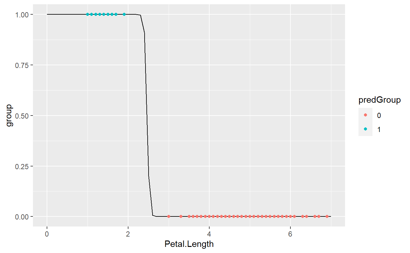
As we can see, we got a perfect match now.
So how did glm() fit this?
Instead of using a least-squares approach which one could expect since the ordinary linear regression used this, here the model is fitted via a so-called maximum likelihood method.
As the name implies this approach tries to find the parameter vector \(\beta\) that maximizes the “probability of correct classification” in this model. More formally, let \(p(x_i, \beta)\) denote the probability that an observation vector72 \(x_i\) belongs to group 1 given a parameter vector \(\hat{\beta}\). Then, the probability \(p(x_i, \beta)\) should be quite close to 1 if the corresponding group label \(y_i\) fulfills \(y_i = 1\) and close to 0 otherwise.
Consequently, the likelihood of “correct classification” depending on the parameter vector \(\beta\) and all observations \(x_i\) can be maximized if all probabilities \(p(x_i, \beta)\) are maximized for all \(i\) such that \(y_i = 1\) and minimized otherwise. Now, the latter minimization can be turned into a maximization problem by instead maximizing \(1 - p(x_i, \beta)\) whenever \(y_i = 0\).
Putting this all together yields the so-called likelihood function \[\begin{align*} L(x_1, \ldots, x_n; \beta) = \prod_{i\, :\, y_i = 1} p(x_i, \beta) \prod_{i\, :\, y_i = 0} \big(1 - p(x_i, \beta)\big) \end{align*}\] which is maximized iteratively via an optimization algorithm which is beyond the scope of these lecture notes.73
Now that we understand how this model is fitted, let us come back to the threshold \(C\) that is used to distinguish when a fitted probability is large enough to warrant a classification as group 1. Earlier, we used \(C = 0.5\) and that can be reasonable in a lot of cases because this simply means that the probability that our observation belongs to group 1 is larger than the corresponding probability for group 0.
However, when the real-world effects of an incorrect classification within one group is more costly than within the other group, it can be a good idea to be cautions and change the threshold \(C\) to account for this. Imagine that it can possibly have severe consequences to classify a flower that is not of the species setosa as being of that species but it has only very mild consequences if we classify a setosa flower as being not setosa. Surely, we can increase the threshold to, say, \(C = 0.9\) in order to be very sure that what we classify as setosa really is setosa.
9.2 Classification Metrics
In a classical binary classification problem, we try to differentiate between two groups. Usually, these groups are labeled as positive or negative. Note that it can make sense to consider both perspectives, i.e. both categories can be labeled as positive or negative (not at the same time, of course).
Now, our classification algorithm may classify our observations into one of these two groups, i.e. the algorithm will return either “positive” or “negative”. Consequently, we can check whether our algorithm was correct for both labels separately, i.e. we differentiate between
- true positive (TP): Observation “is” positive and classification returns positive,
- true negative (TN): Observation “is” negative and classification returns negative,
- false positive (FP): Observation “is” negative and classification returns positive,
- false negative (FN): Observation “is” positive and classification returns negative.
Since, we get one of those four labels for each observation/classification we can count how often each case occurs and document this in what is known as a contingency table.
| Predicted positive | Predicted negative | |
|---|---|---|
| Actually positive | TP | FN |
| Actually negative | FP | TN |
Ideally, of course, we would only get true positives and true negatives but that is rarely possible in the real world. Often, these four counts are used to summarize the classification performance into a single number. Common summaries include
- Accuracy: \(\frac{\text{TP + TN}}{\text{TP + TN + FP + FN}}\)
- True positive rate (TPR) / Recall / Sensitivity: \(\frac{\text{TP}}{\text{TP + FN}}\)
- True negative rate (TNR) / Specificity / Selectivity: \(\frac{\text{TN}}{\text{TN + FP}}\)
- Positive predictive value (PPV) / Precision: \(\frac{\text{TP}}{\text{TP + FP}}\)
Note that here the abbreviations mean the counts of all respective labels, i.e. TP is the count of all TP and not the label of a single observation. Further, these quantities may feel abstract, but they can actually interpreted quite nicely74.
For instance, think of trying to diagnose whether a person has a specific disease via a medical test. In this scenario, if the person has the disease, we regard that person as positive and negative otherwise. Similarly, a positive test result suggest that the person indeed has said disease and does not have it if the test result is negative.
Then we can interpret the above quantities as follows:
- Accuracy: Fraction of correct test results, i.e. positive for people who have the disease and negative for those who don’t.
- Sensitivity: Fraction of correct test results among the sick.
- Specificity: Fraction of correct test results among the healthy.
- Precision: Fraction of correct test results among those who tested positive.
Again, in an ideal world we could could get all of these quantities to 100%. Sadly, this is not possible in the real world and we will have to find a trade-off between quantities like these.
Here, one may be inclined to think of accuracy as a sufficient metric since it divides the “true” counts by all counts and thus measures the degree of how often our classification was correct. This is what we are interested in, right?
While it is true that we are interested in how often we were right, we are also interested in how “good” our classifier is. Sometimes these two goals are at odds. Think of a data set where 90% of the observations “are” negative and 10% “are” positive75. Clearly, an algorithm that classifies all observations as negative will have a high accuracy which means that our classification was right quite often but still the classifier is rubbish.
This is a typical case of class imbalance and there are other classification metrics out there that try to deal with that. For instance, another common classification metric is the so-called \(F_1\)-score which is defined as \[\begin{align*} F_1 = \frac{ 2 \cdot \text{Precision}\cdot \text{Recall} }{ \text{Precision} + \text{Recall} }. \end{align*}\] Thus, the \(F_1\)-score is the harmonic mean of precision and recall and takes values between zero and one. Consequently, \(F_1\)-scores can take values up to one which would mean that we have perfect precision and recall.
Though widespread, the \(F_1\)-score is not a perfect measure either. For instance, one criticism of this measure is that it completely ignores the classifcation’s performance w.r.t. true negatives (since neither recall nor precision uses it). This means that the \(F_1\)-score neglects for instance the specificity of an classification.
Thus, going back to the medical test setting, this metric might neglect to check the fraction of correct test results among the healthy. Of course, this could potentially have unnecessary harmful effects for the patient (more testing, stress, etc.), so we might want to take that into consideration when evaluating the quality of a medical test.
Though, in other applications it might be valid to ignore some of these metrics to some extend. Imagine that a bank is trying to figure out which clients are currently interested in a loan and could also afford this. Then, if the bank wants to avoid losses more than it wants to potentially earn money from a loan, what counts is that the clients the bank decides to contact really can afford and want the loan (positive).
This way, the bank tries to be sure that they find the clients who won’t default on their loan. In effect, the bank might be overly cautious and will incorrectly classify more clients as not being able to afford the loan (negative). In summary, the bank will want to maximize its precision, possibly at the cost of its specificity and sensitivity.
Note that all of these considerations also come into play when choosing a classification threshold \(C\) as above in the setosa example.
Let’s see how all of this comes together with the Default data set from the excellent book Introduction to Statistical Learning by James et al.
The data set is publicly available via the R package ISLR and contains simulated data on ten thousand customers w.r.t. to their credit card debt.
(tib_default <- as_tibble(ISLR::Default))
#> # A tibble: 10,000 x 4
#>   default student balance income
#>   <fct>   <fct>     <dbl>  <dbl>
#> 1 No      No         730. 44362.
#> 2 No      Yes        817. 12106.
#> 3 No      No        1074. 31767.
#> 4 No      No         529. 35704.
#> 5 No      No         786. 38463.
#> 6 No      Yes        920.  7492.
#> # ... with 9,994 more rows
Here, the variables describe the following:
-
default: A factor with levels No and Yes indicating whether the customer defaulted on their debt -
student: A factor with levels No and Yes indicating whether the customer is a student -
balance: The average balance that the customer has remaining on their credit card after making their monthly payment -
income: Income of customer
Also, a short exploratory data analysis reveals the following information:
summary(tib_default)
#>  default    student       balance           income
#>  No :9667   No :7056   Min.   :   0.0   Min.   :  772
#>  Yes: 333   Yes:2944   1st Qu.: 481.7   1st Qu.:21340
#>                        Median : 823.6   Median :34553
#>                        Mean   : 835.4   Mean   :33517
#>                        3rd Qu.:1166.3   3rd Qu.:43808
#>                        Max.   :2654.3   Max.   :73554
p_balance <- tib_default %>%
  ggplot(aes(x = default, y = balance, col = student)) +
  geom_boxplot()
p_income <- tib_default %>%
  ggplot(aes(x = default, y = income, col = student)) +
  geom_boxplot()

library(patchwork)
p_balance + p_income + plot_layout(guides = "collect")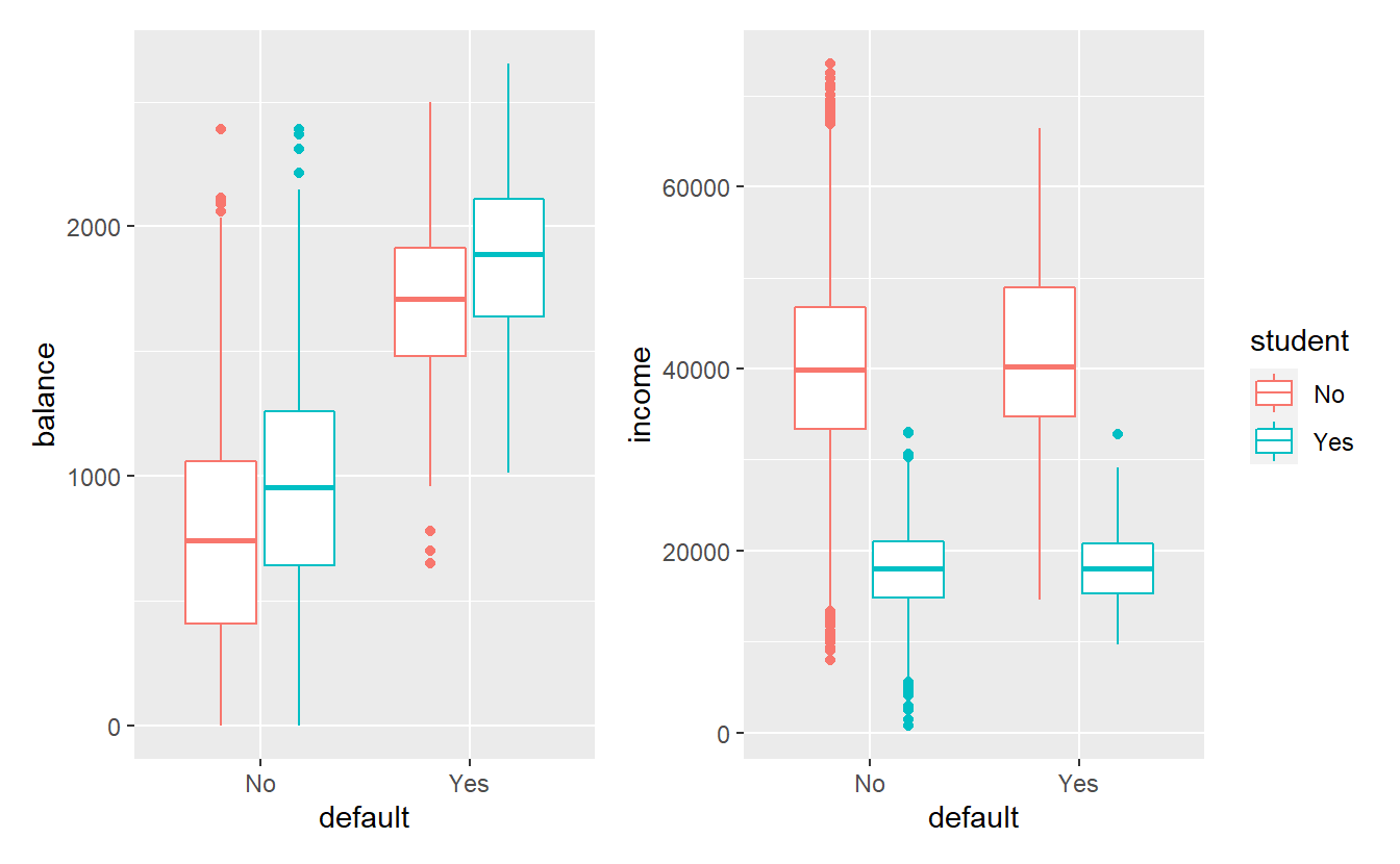
Consequently, this data set is heavily skewed, i.e. it contains vastly different numbers from the default and non-default groups.
Also, in this data set it appears like balance and student have the most influence on the variable default.
So, let us run a logistic regression to predict default via balance and student.
mod_default <- glm(
  data = tib_default,
  default ~ balance + student,
  family = "binomial"
)
summary(mod_default)
#>
#> Call:
#> glm(formula = default ~ balance + student, family = "binomial",
#>     data = tib_default)
#>
#> Deviance Residuals:
#>     Min       1Q   Median       3Q      Max
#> -2.4578  -0.1422  -0.0559  -0.0203   3.7435
#>
#> Coefficients:
#>               Estimate Std. Error z value Pr(>|z|)
#> (Intercept) -1.075e+01  3.692e-01 -29.116  < 2e-16 ***
#> balance      5.738e-03  2.318e-04  24.750  < 2e-16 ***
#> studentYes  -7.149e-01  1.475e-01  -4.846 1.26e-06 ***
#> ---
#> Signif. codes:  0 '***' 0.001 '**' 0.01 '*' 0.05 '.' 0.1 ' ' 1
#>
#> (Dispersion parameter for binomial family taken to be 1)
#>
#>     Null deviance: 2920.6  on 9999  degrees of freedom
#> Residual deviance: 1571.7  on 9997  degrees of freedom
#> AIC: 1577.7
#>
#> Number of Fisher Scoring iterations: 8
As before, let us take a threshold \(C = 0.5\) and use it to classify our data.
This time, though, we will look at our classification results via a confusion matrix instead of a plot.
In R, this can be quite easily compute with conf_mat() from the yardstick package.
This package is part of the tidymodels framework which attempts to deliver a unifying approach to common machine learning and modeling tasks via tidyverse principles.
We will learn more about this in the next chapter.
For now let us apply some yardsticks.
C <- 0.5
tib_default <- tib_default %>%
  mutate(predictions = predict(mod_default, type = "response")) %>%
  mutate(predDefault = factor(ifelse(predictions >= C, "Yes", "No")))

library(yardstick)
conf_mat(
  data = tib_default,
  truth = default,
  estimate = predDefault
)
#>           Truth
#> Prediction   No  Yes
#>        No  9628  228
#>        Yes   39  105
Here, you can see that we missed about two thirds of the customers that defaulted, so let us try to lower the threshold C.
C <- 0.25
tib_default <- tib_default %>%
  mutate(predictions = predict(mod_default, type = "response")) %>%
  mutate(predDefault = factor(ifelse(predictions >= C, "Yes", "No")))

conf_mat(
  data = tib_default,
  truth = default,
  estimate = predDefault
)
#>           Truth
#> Prediction   No  Yes
#>        No  9475  150
#>        Yes  192  183
Clearly, this helped and we picked out more of the defaulting customers. Sadly, this came at the price of also incorrectly classifying more non-defaulting customers. As you could see changing the threshold influenced the whole confusion matrix. Mentally, tracking all changes for different thresholds \(C\) it tricky, so let us use some of our summary metrics.
Luckily, it is quite easy to compute multiple metrics in one go via metric_set() of the yardstick package.
This delivers a function that evaluates all metrics that we indicated via metric_set.
These metrics need to be functions of the same form as conf_mat(), i.e. using arguments data, truth and estimate in the same way.
Thankfully, most standard metrics come already implemented in this format via the yardstick package.
# Use pre-defined functions for standard metrics.
# Nomen est omen.
my_metrics <- metric_set(
  accuracy,
  specificity,
  recall,
  precision,
  f_meas,
  mcc # Matthews correlation coefficient - see exercises
)

my_metrics(
  data = tib_default,
  truth = default,
  estimate = predDefault
)
#> # A tibble: 6 x 3
#>   .metric   .estimator .estimate
#>   <chr>     <chr>          <dbl>
#> 1 accuracy  binary         0.966
#> 2 spec      binary         0.550
#> 3 recall    binary         0.980
#> 4 precision binary         0.984
#> 5 f_meas    binary         0.982
#> 6 mcc       binary         0.500
So, let’s track these summaries for different thresholds \(C\). With list-like columns, this is pretty straight forward and can be done in a single pipe.
# Define dummy function that does the classification for us
classify_with_threshold <- function(data, model, C) {
  data %>%
    mutate(predictions = predict(model, type = "response")) %>%
    mutate(predDefault = factor(ifelse(predictions >= C, "Yes", "No"))) %>%
    return()
}

all_classifications <- tibble(C = seq(0.05, 0.95, 0.01)) %>%
  mutate(
    classification = map(
      C,
      ~classify_with_threshold(tib_default, mod_default, .)
    )
  )

all_metrics <- all_classifications %>%
  mutate(
    metrics = map(
      classification,
      ~my_metrics(data = ., truth = default, estimate = predDefault)
    )
  ) %>%
  select(C, metrics) %>%
  unnest(metrics)
all_metrics
#> # A tibble: 546 x 4
#>       C .metric   .estimator .estimate
#>   <dbl> <chr>     <chr>          <dbl>
#> 1  0.05 accuracy  binary         0.899
#> 2  0.05 spec      binary         0.847
#> 3  0.05 recall    binary         0.900
#> 4  0.05 precision binary         0.994
#> 5  0.05 f_meas    binary         0.945
#> 6  0.05 mcc       binary         0.406
#> # ... with 540 more rows
Now, this can be easily plotted via ggplot().
all_metrics %>%
  ggplot(aes(C, .estimate, col = .metric)) +
  geom_line(size = 1, show.legend = F) +
facet_wrap(vars(.metric)) 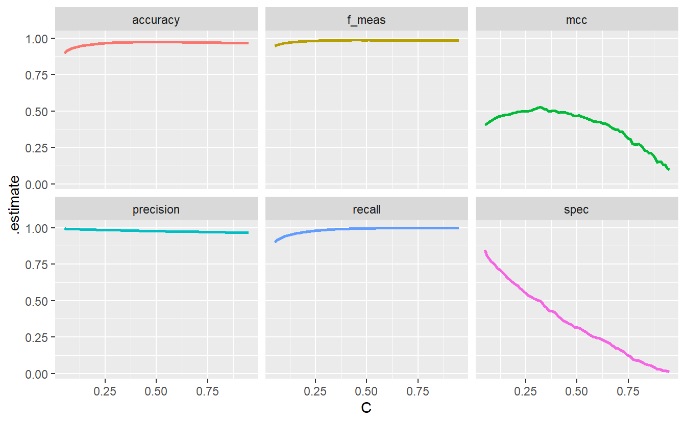
This demonstrates how different metrics can tell different stories which is worth keeping in mind. Notice hat the specificity goes down the drain as \(C\) decreases. This is because with a decreasing threshold we lower the bar for customers to be classified as at the risk of default and classify more customers as such. Consequently, the classification among those who do not default gets worse which is what the specificity plot shows.
However, had we only looked at accuracy, the f_measure, precision and recall our classification would have looked fine and dandy. Therefore, it is wise to try to consider all potential cases (TP, FP, TN, FN). Here, the aforementioned four metrics neglect the true negatives and thus do not show the whole picture.
Of course, it is hard to consolidate all eventualities into one single number. Nevertheless, the additional metric MCC or Matthews correlation coefficient that was plotted here, tries to do just that. That’s a bit oversimplified but here this explanation will do. You get to investigate yourself what the MCC is in the exercises.
In any case, we could use the threshold \(C\) that maximizes the MCC as our “final” threshold. This would give us \(C = 0.32\) as can be seen here.
all_metrics %>%
  group_by(.metric) %>%
  slice_max(.estimate, with_ties = F)
#> # A tibble: 6 x 4
#> # Groups:   .metric [6]
#>       C .metric   .estimator .estimate
#>   <dbl> <chr>     <chr>          <dbl>
#> 1  0.44 accuracy  binary         0.974
#> 2  0.45 f_meas    binary         0.986
#> 3  0.32 mcc       binary         0.527
#> 4  0.05 precision binary         0.994
#> 5  0.91 recall    binary         1.00
#> 6  0.05 spec      binary         0.847
A different and possibly more common approach is to find a trade-off between sensitivity and specificity via a so-called receiver operating characteristic (ROC) curve. Basically, to generate a ROC curve, we compute the sensitivity and specificity for many different thresholds \(C\) and use these to draw a curve like so.
all_classifications$classification[[1]] %>%
  # roc_curve computes the sensitivity and specificity for different
  # thresholds which autoplot() can deal with.
  roc_curve(truth = default, predictions, event_level = "second") %>%
  autoplot() +
  geom_path(
    data = tibble(x = c(0, 0, 1), y = c(0, 1, 1)),
    aes(x, y),
    col = "red",
    alpha = 0.5
  )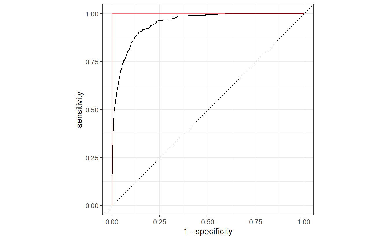
If our classification algorithm were rubbish and basically classifies 0 or 1 randomly with equal probability, then the corresponding ROC curve would be very close to the dashed diagonal. Conversely, the ideal ROC curve looks similar to this one and tries to get as close as possible to the point \((0, 1)\), i.e. it tries to get as close as possible to the red line.
Thus, the threshold that delivers the point on the ROC curve that is closest to \((0, 1)\) could be considered an “optimal” trade-off.
Here this point is easily computed using the computed values from roc_curve().
all_classifications$classification[[1]] %>%
  roc_curve(truth = default, predictions, event_level = "second") %>%
  mutate(diff = (1 - specificity)^2 + (1 - sensitivity)^2) %>%
  slice_min(diff)
#> # A tibble: 1 x 4
#>   .threshold specificity sensitivity   diff
#>        <dbl>       <dbl>       <dbl>  <dbl>
#> 1     0.0317       0.863       0.904 0.0281
On a side note, it is worth noting that this ROC curve also delivers another metric on the classifier’s performance, namely by the area under the curve (AUC). As said before, if our algorithm classifies randomly, then the resulting ROC curve will be close to the diagonal line. Consequently, this would lead to an AUC value of \(0.5\) which is far from the perfect AUC value of 1. Here, our AUC is given by
all_classifications$classification[[1]] %>%
  roc_auc(truth = default, predictions, event_level = "second")
#> # A tibble: 1 x 3
#>   .metric .estimator .estimate
#>   <chr>   <chr>          <dbl>
#> 1 roc_auc binary         0.950
Also, notice that here we have always used event_level = "second" to compute the ROC curve and its AUC.
This refers to what level of the response factor is considered as the “event”.
If we had not set event_level = "second", then the ROC curve would have been flipped like so.
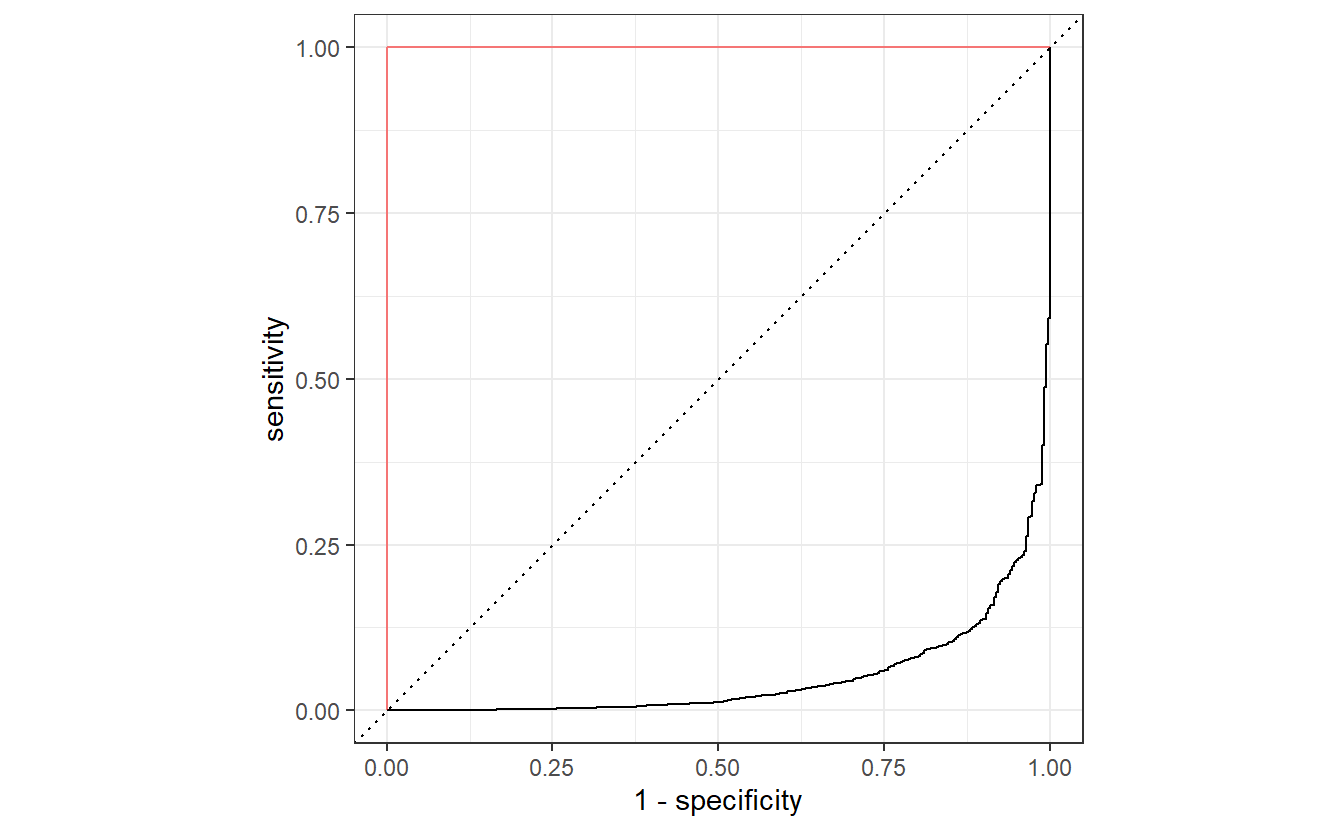
By now, you know that this would correspond to a worse than random classification with a really low AUC value. However, this is easily remedied as we can always invert the classification accordingly, i.e. what has been classified as positive will be classified as negative and vice versa.
This can be easily achieved by transforming computing the “anti-probabilities” and using these to plot the ROC curve.
This will deliver the same result as if we had used event_level = "second".
all_classifications$classification[[1]] %>%
  mutate(anti_prob = 1 - predictions) %>%
  roc_curve(truth = default, anti_prob) %>%
  autoplot() +
  geom_path(
    data = tibble(x = c(0, 0, 1), y = c(0, 1, 1)),
    aes(x, y),
    col = "red",
    alpha = 0.5
  )
Yet another approach to choose \(C\) could be achieved via a scenario analysis of the real-world implication of correct/incorrect classifications. For instance, imagine the following scenario:
The bank that classifies their customers via this classification approach will incur a loss of say \(\$4000\) if a client defaults. Also, those customers who the bank thinks will not default, will be offered a loan (which we, for simplicity, assume they accept automatically) that generates a profit of \(\$2000\) for the bank if the customer does indeed not default. Finally, the bank will terminate the contract with anyone it thinks will default. This will result in a reputation damage for the bank that can be quantified as \(\$1000\) for any customer whose contract they terminate (but will save them from the resulting default costs of some customers).
Thus, \(C\) can be chosen such that it maximizes \[\begin{align} 2000 \text{TN} - 4000 \text{FN} - 1000 (\text{TP} + \text{FP}) \end{align}\]
For a specific threshold \(C\) this quantity can be quite easily computed with help from the confusion matrix.
The function tidy() from the broom package (also part of tidymodels) will help to get the classification results into a tibble for later evaluation.
default_result <- (-4000)
loan_result <- 2000
reputation_result <- (-1000)

C <- 0.5
classification <- classify_with_threshold(tib_default, mod_default, C)

conf_tibble <- conf_mat(
  data = classification,
  truth = default,
  estimate = predDefault
) %>%
  broom::tidy() %>%
  mutate(name = c("TN", "FP", "FN" ,"TP"))
conf_tibble
#> # A tibble: 4 x 2
#>   name  value
#>   <chr> <int>
#> 1 TN     9628
#> 2 FP       39
#> 3 FN      228
#> 4 TP      105

conf_tibble %>%
  mutate(
    result = c(
      loan_result,
      reputation_result,
      default_result,
      reputation_result
    )
  ) %>%
  summarize(sum(value * result))
#> # A tibble: 1 x 1
#>   `sum(value * result)`
#>                   <dbl>
#> 1              18200000
9.3 Exercises
9.3.1 Fitting a Logistic Regression
Take a look at the SUVs from the mpg data set.
suv_dat <- mpg %>%
  filter(class == "suv") %>%
  mutate(year = factor(year))

ggplot(suv_dat, aes(displ, hwy, col = year)) +
geom_jitter() 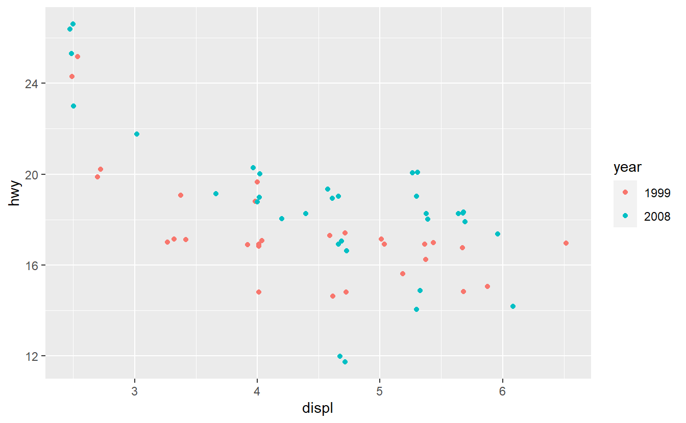
Fit a logistic model to classify the SUVs as either being from 1999 or 2008 using the hwy and displ variables only.
Further, generate the corresponding ROC curve and compute the AUC value.
Based on that judge whether your classification delivers good results.
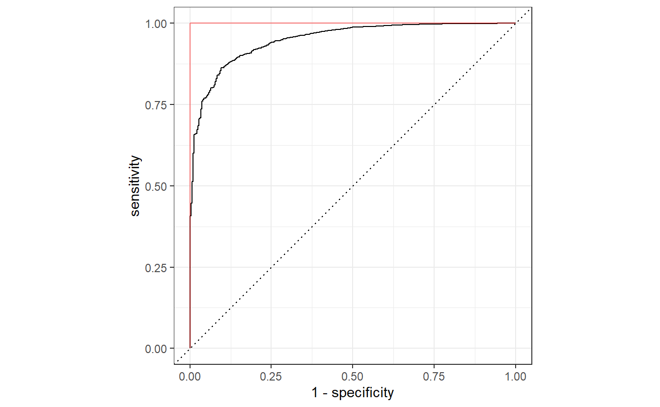
After you have done that, imagine that you want to improve your AUC value by using only one additional predictor. Therefore, you run some data exploration and generate the following plots.
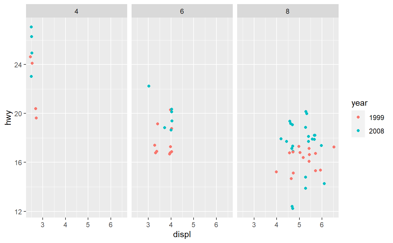
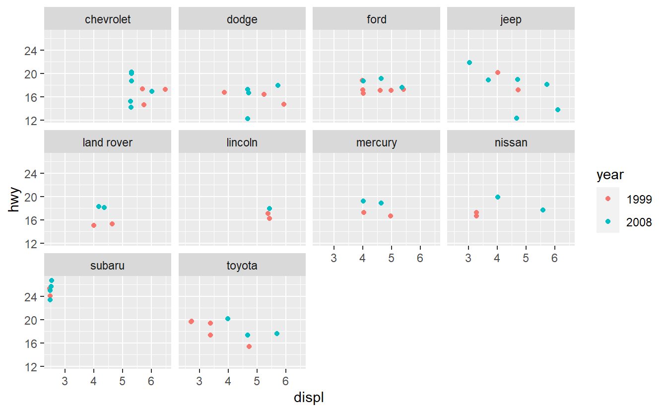
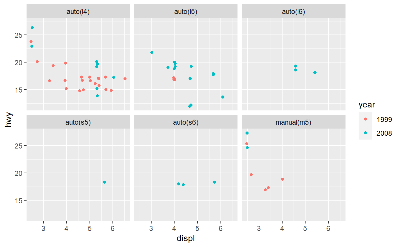
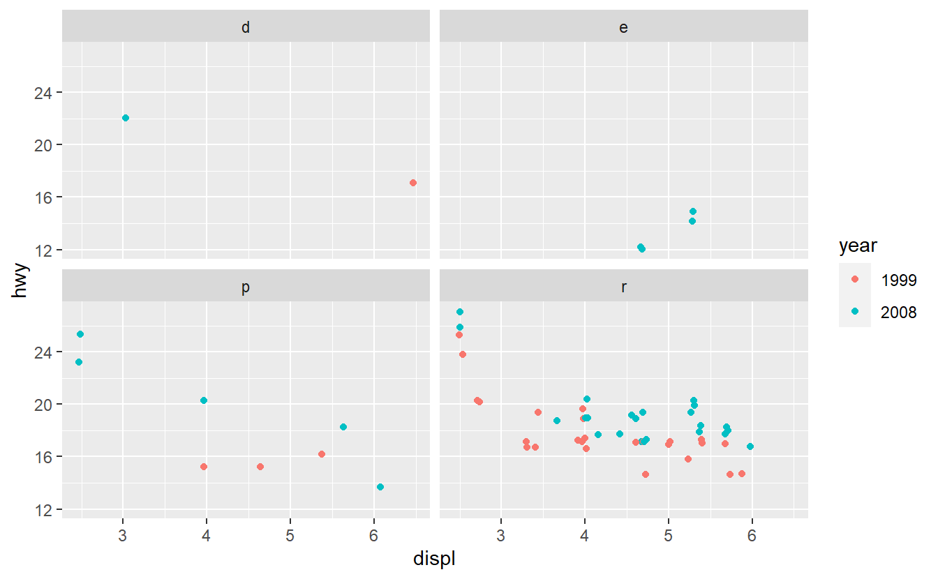
Based on these plots, use your best guess to add the predictor that will improve the AUC the most. Once you have run your best-guess model, check if the additional variable you chose really increased the AUC the most compared to the other variables.
9.3.2 Matthews Correlation Coefficient (MCC)
According to Wikipedia the MCC can be computed as \[\begin{align*} \text{MCC} = \sqrt{ \text{PPV} \cdot \text{TPR} \cdot \text{TNR} \cdot \text{NPV} } - \sqrt{ \text{FDR} \cdot \text{FNR} \cdot \text{FPR} \cdot \text{FOR} }, \end{align*}\] where the abbreviated variables (in the order of appearance in the previous formula) stand for the so-called positive predictive value, the true positive rate, the true negative rate, the negative predictive value, the false discovery rate, the false negative rate, the false positive rate, and the false omission rate.
Research what each of those terms mean w.r.t. binary classifcations, i.e. find formulas for each term w.r.t. TP, TN, FP and FN. Further, give an intuitive explanation of PPV, TPR, etc. similar to how I explained some of these quantities earlier using a fictitious example of diagnosing a disease with some medical test.
Here, you should use the following fictitious classification scenario. Say, we have a data set that looks similar to this one but with more observations (rows).
#> # A tibble: 4 x 2
#>   NameID       last_100_songs
#>   <chr>        <list>
#> 1 John         <tibble [100 x 6]>
#> 2 Jacob        <tibble [100 x 6]>
#> 3 Jingleheimer <tibble [100 x 6]>
#> 4 Schmidt      <tibble [100 x 6]>
Now, imagine that data in the variable last_100_songs contains information on the last 100 songs someone listened to (on Spotify or wherever) and that we have a classification algorithm that uses this information to classify each person as either a Taylor Swift76 Fan or not.
In this classification (and in life generally), being a Taylor Swift fan can be regarded as positive.
Finally, also find out the range of values of the MCC and what the “extreme values” of the MCC can mean intuitively.
9.3.3 Scenario Threshold Analysis
Using the bank example right before Section 9.3, find the threshold \(C\) that maximizes \[\begin{align} 2000 \text{TN} - 4000 \text{FN} - 1000 (\text{TP} + \text{FP}). \end{align}\]